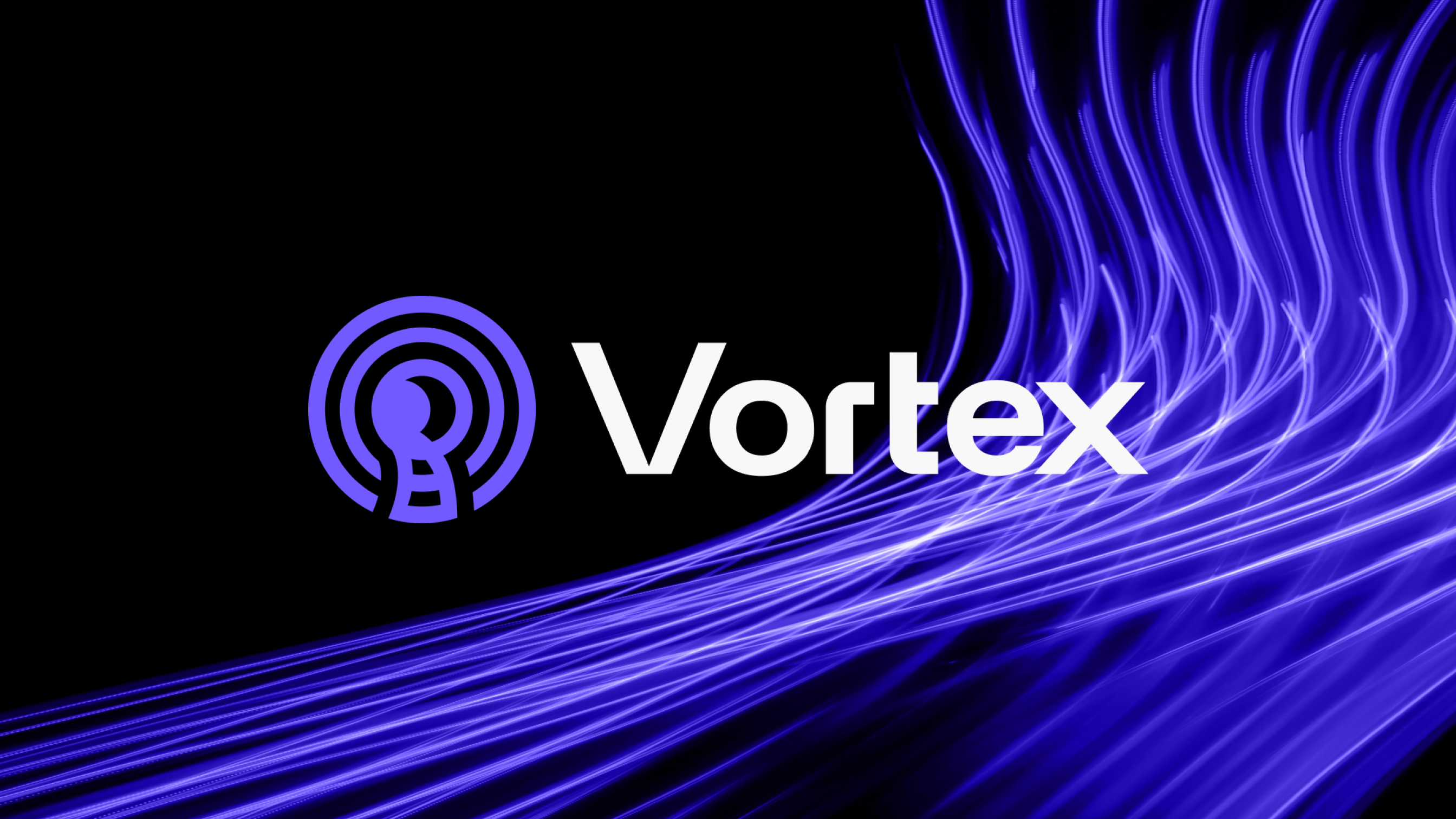
Vortex
Vortex protects your online activity by encrypting your internet connection, keeping your data private and secure. It blocks intrusive ads, trackers, and malicious sites, preventing distractions and unwanted access.
PROJECT SCOPE
Art Direction, Visual Identity, Website Design, App Design, Workshops, Design System
TEAM
1 Project Manager, 1 Tech Lead, 1 Marketing Director, 1 Content Writer 1 Designer, 3 Developers
INDUSTRY
SaaS Platform in Cybersecurity Industry
YEAR
2024
Context
Vortex had no existing brand, features were still being shaped, and there was no design direction in place. They brought us in at the very start to create the visual identity, but as we worked together, our role expanded to cover the full product experience. We helped define the brand strategy, design the identity, and build out the design system, website, and app.
What’s been done?
To build Vortex from zero to launch, we defined the brand, designed the full product experience, and created a scalable design system for the app.
01
Brand Strategy
Through three stakeholder workshops, we defined the brand’s tone, visual language, and key communication principles. We clarified that the brand should feel fast, secure, and trustworthy, which set the foundation for the digital product. We interviewed a two groups of user to make sure we are aligned with their expectations.
02
Brand Design
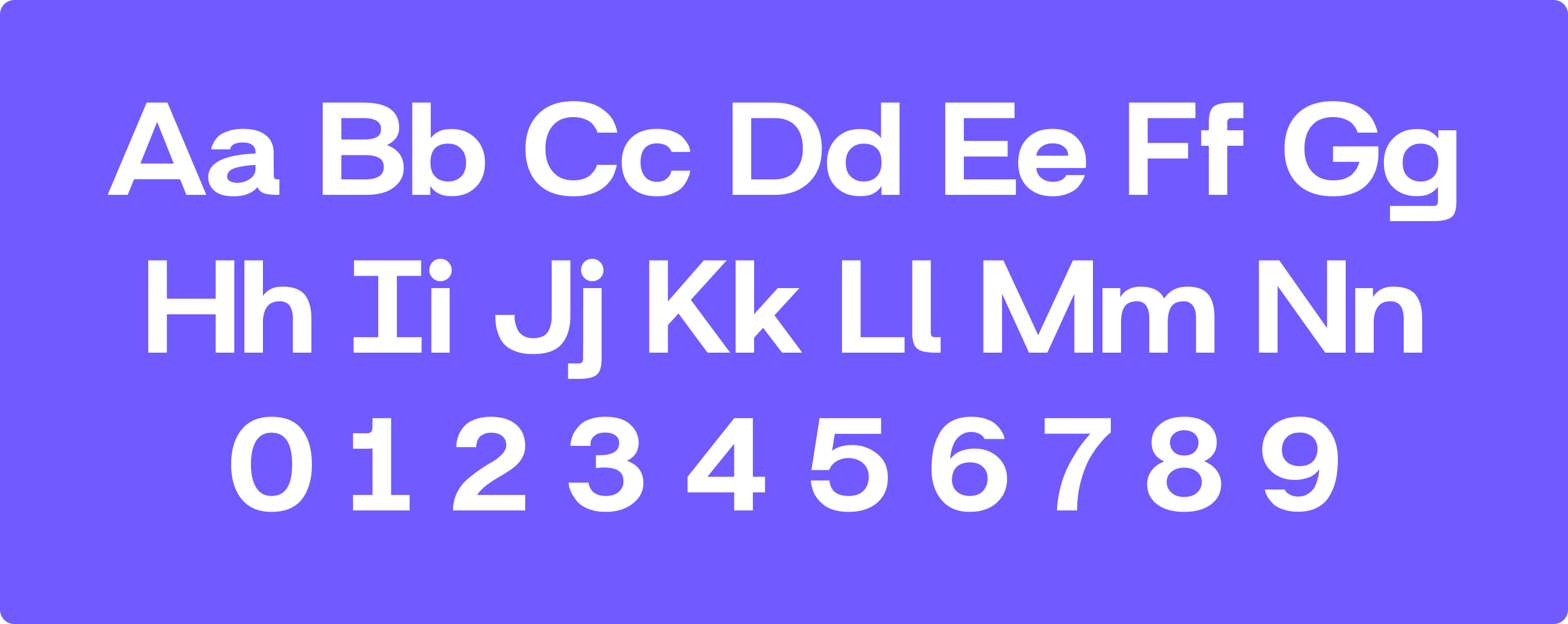
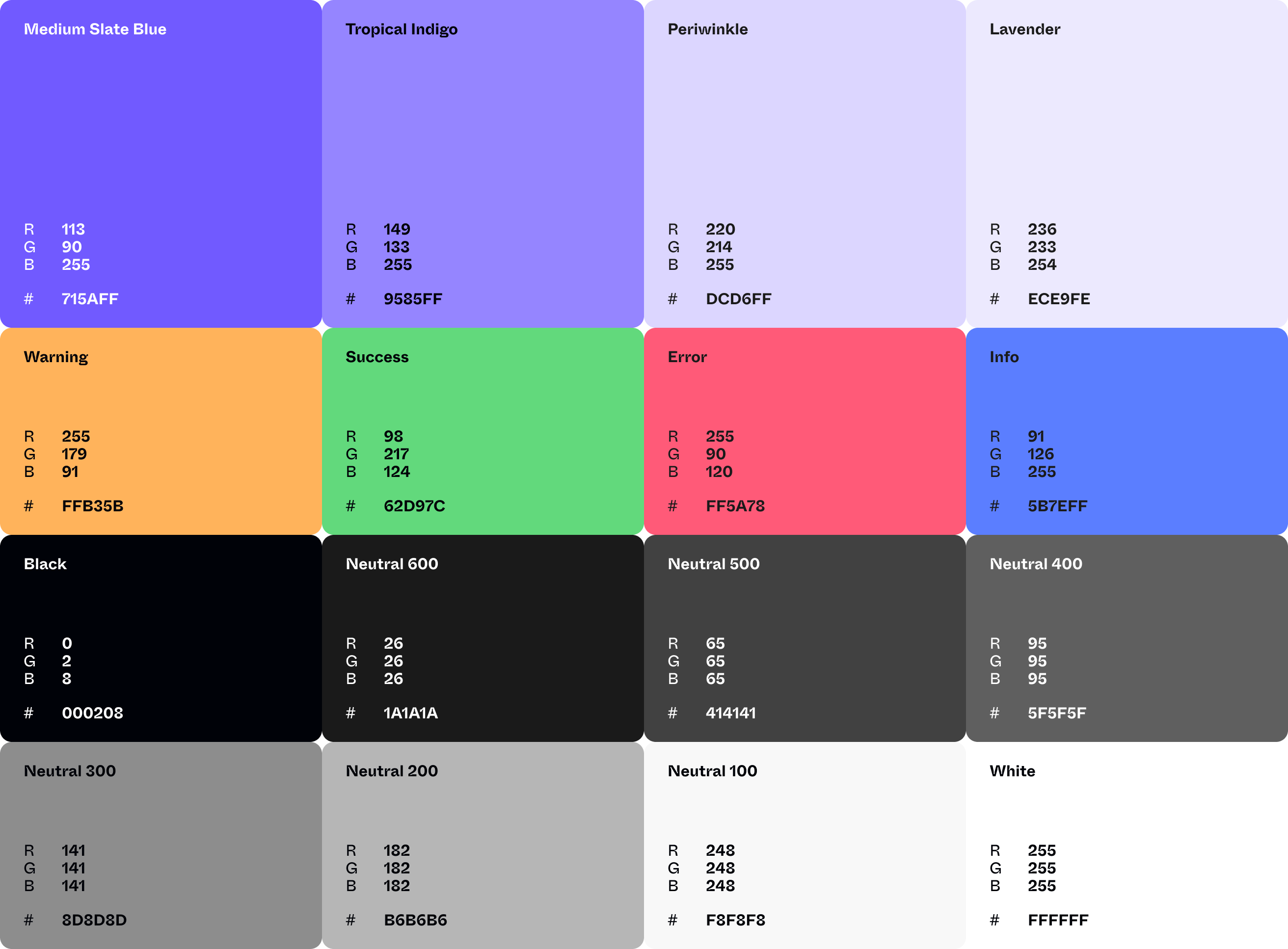
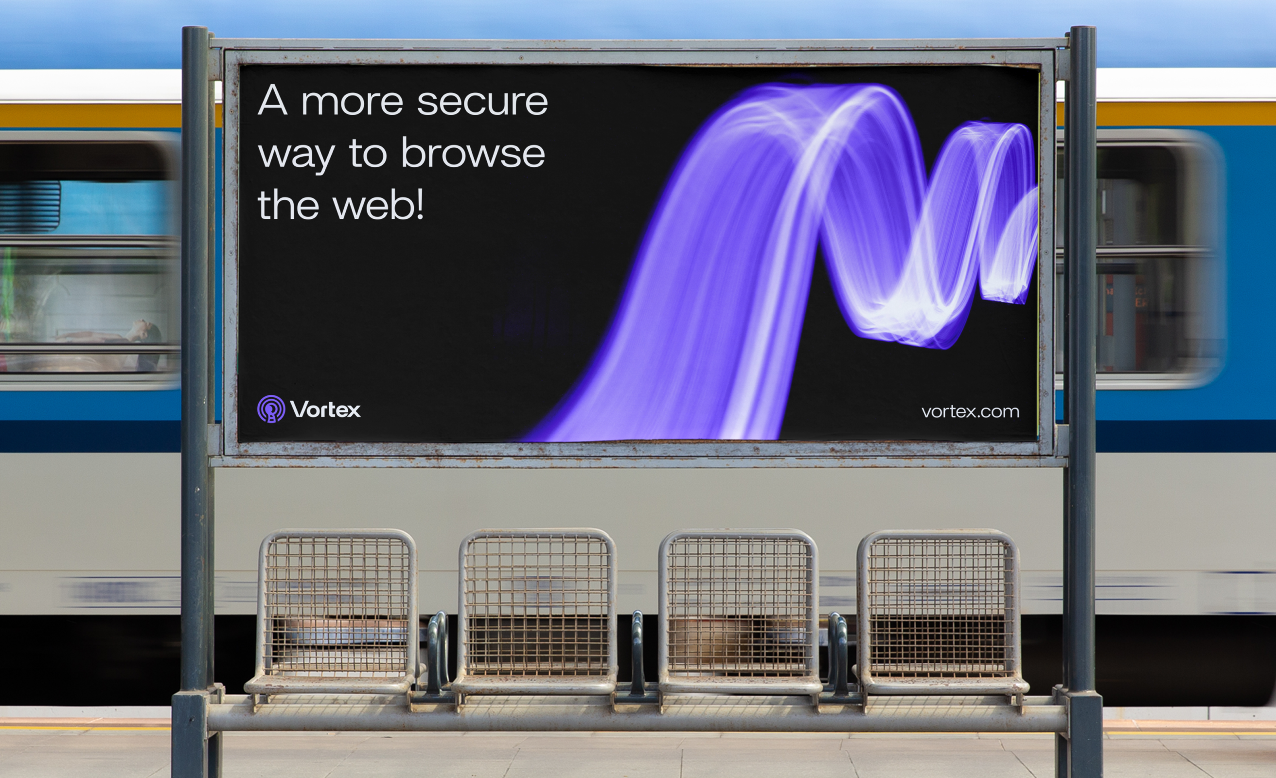
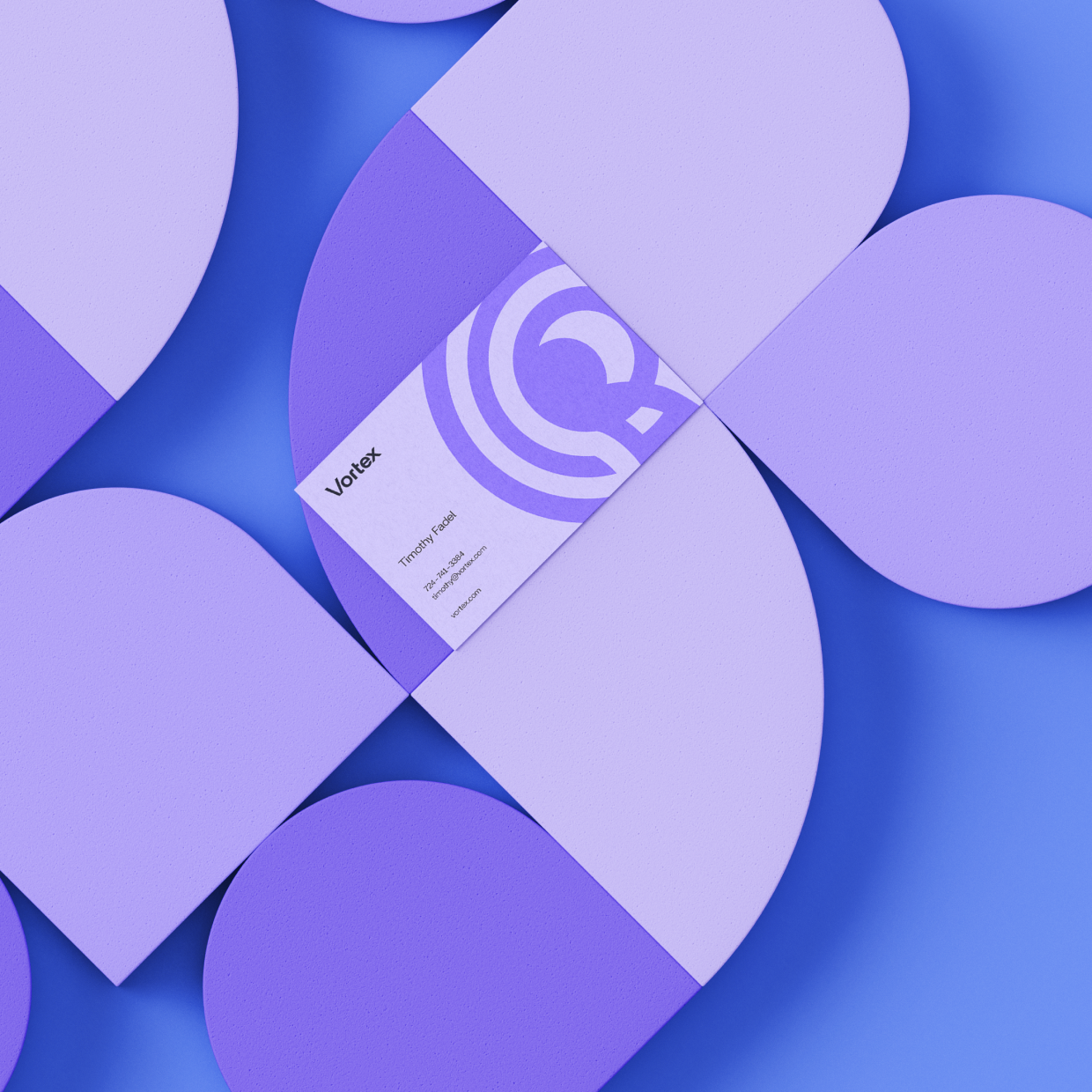
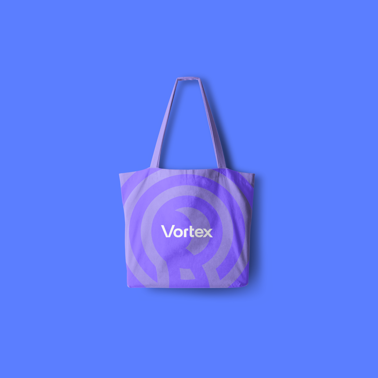
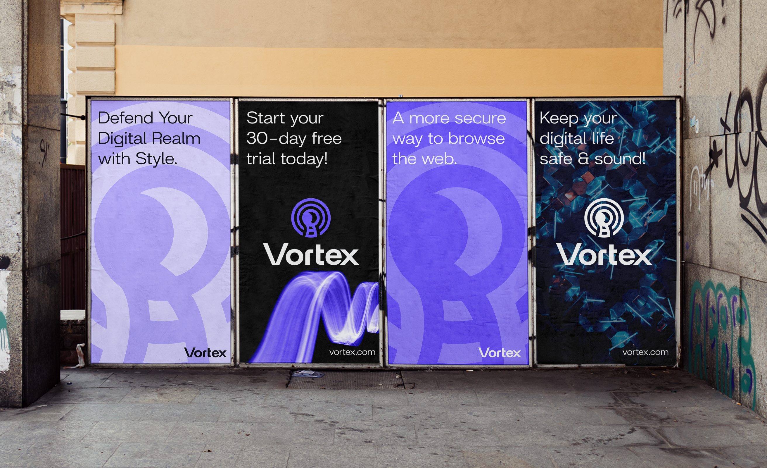
We created a bold, modern identity, including a logo, colour system, typography, social media templates, employee merch, and a comprehensive brand book. The visuals were designed to stand out in tech-driven spaces, instantly communicating a sense of security and trust.
03
Product Design
Leading UX research with 24 users, we identified personas and key priorities. The research revealed that speed and simplicity were the key, so we designed a streamlined flow that allows users to connect instantly. Every screen, from onboarding to server selection, was shaped by real user insights.

Visual Identity
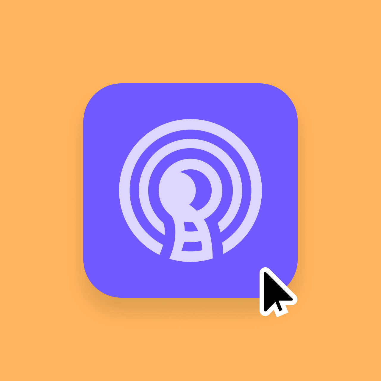
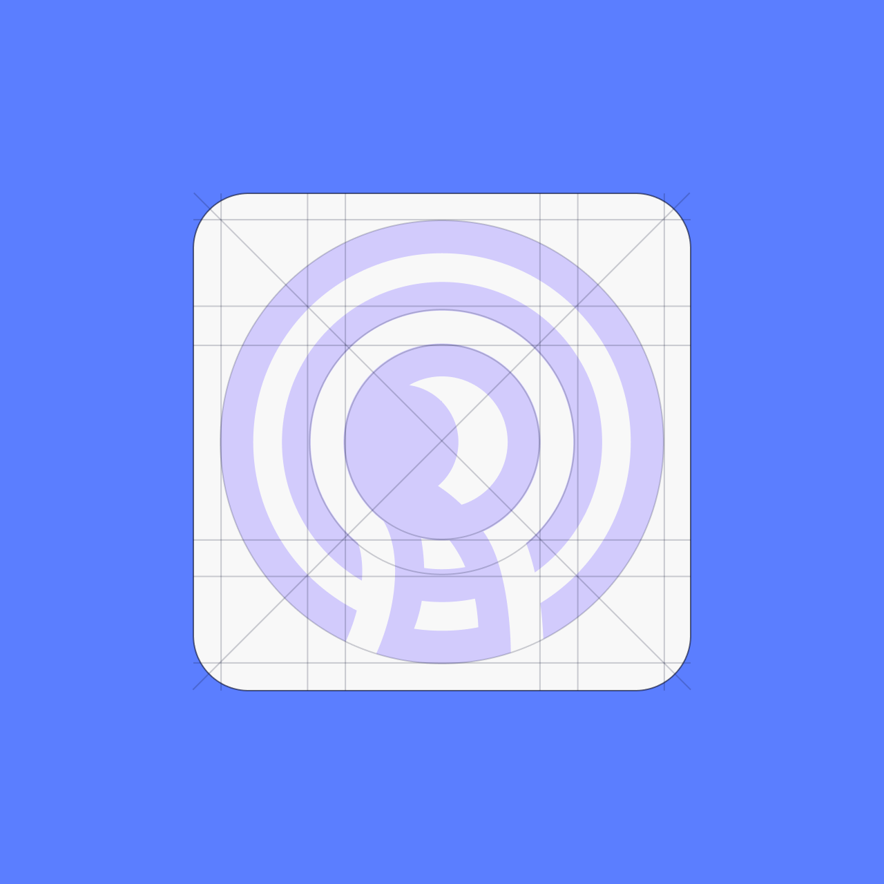
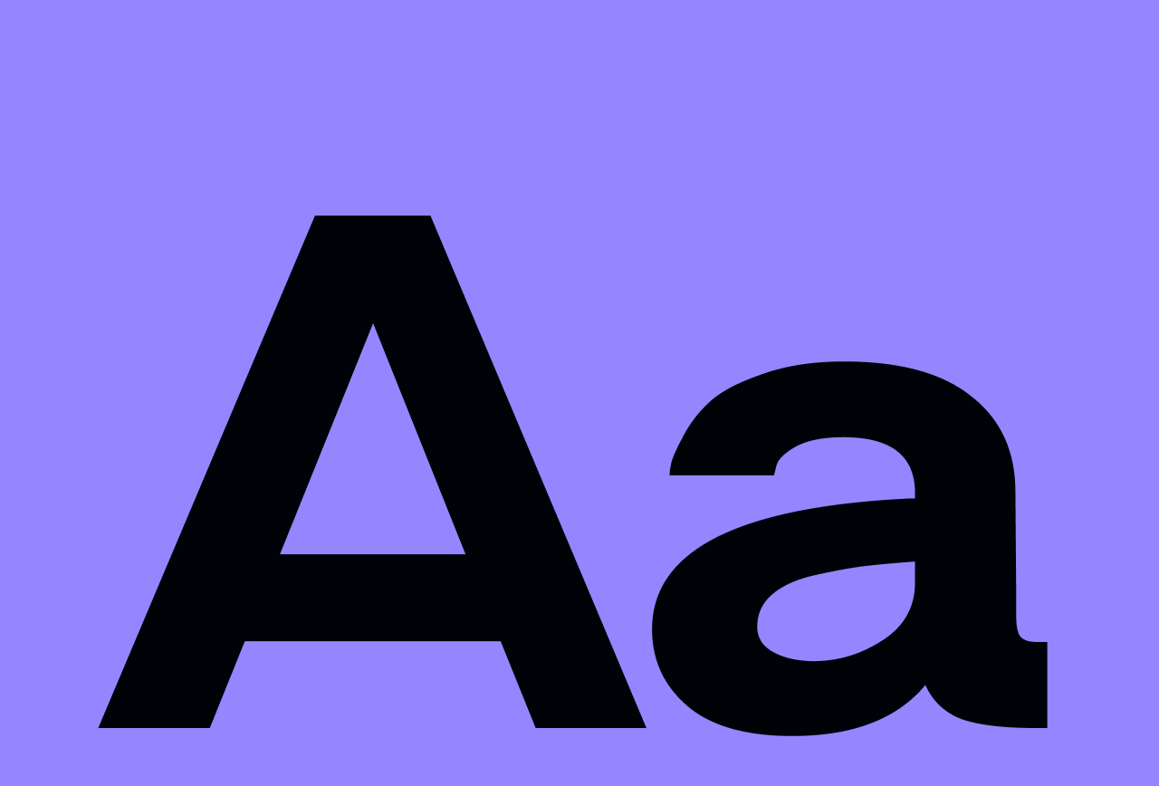
The design of the Vortex logo is inspired by whirlpools, representing a growing signal and embodying an active sense of movement and power. Each aspect was carefully crafted, creating an immersive brand identity that reflects Vortex’s core values.
Designing for Real Users from Day One
To build a product that truly meets user needs, we interviewed 24 people across different demographics and usage patterns. Their insights helped shape two detailed personas, each grounded in real behaviors, motivations, and challenges. These personas became the foundation for all design decisions, helping us stay focused on solving the right problems throughout the project.
Building the Foundation for Scalable Design
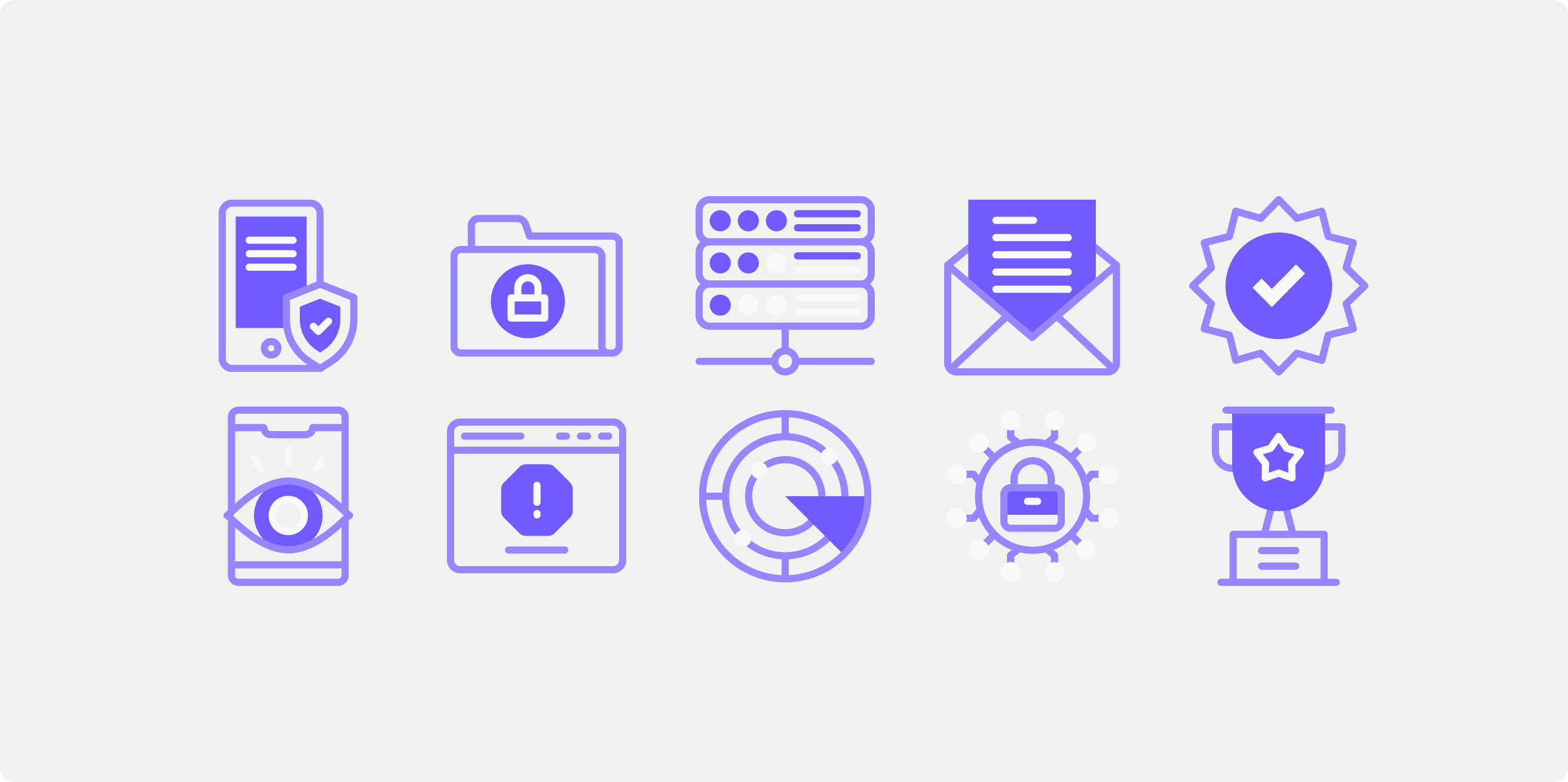
To ensure a consistent and cohesive user experience across the app, we created a robust atomic design system. It was built using tokens and variables for color, typography, spacing, borders, and radii. These foundations supported the development of flexible UI components, including buttons, input fields, cards, checkboxes, uploaders, menus, and snackbars, allowing us to scale design efficiently and maintain quality across screens.
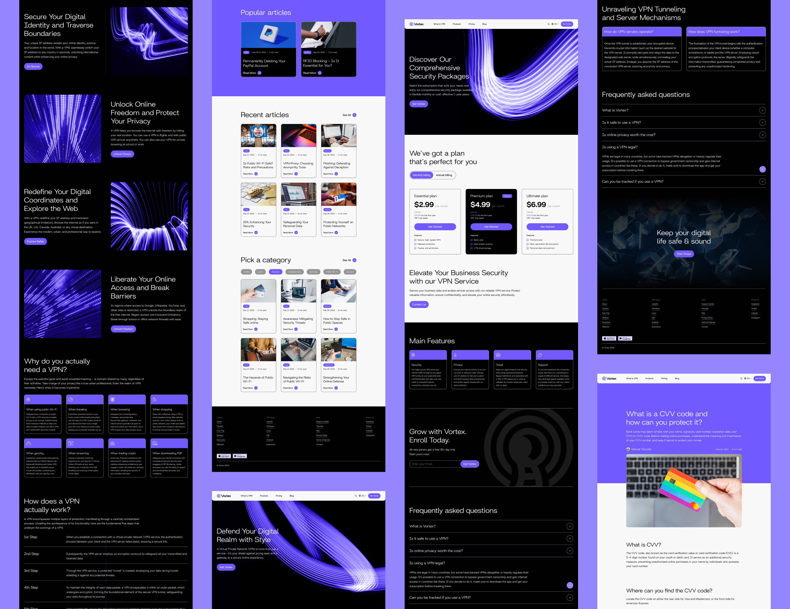
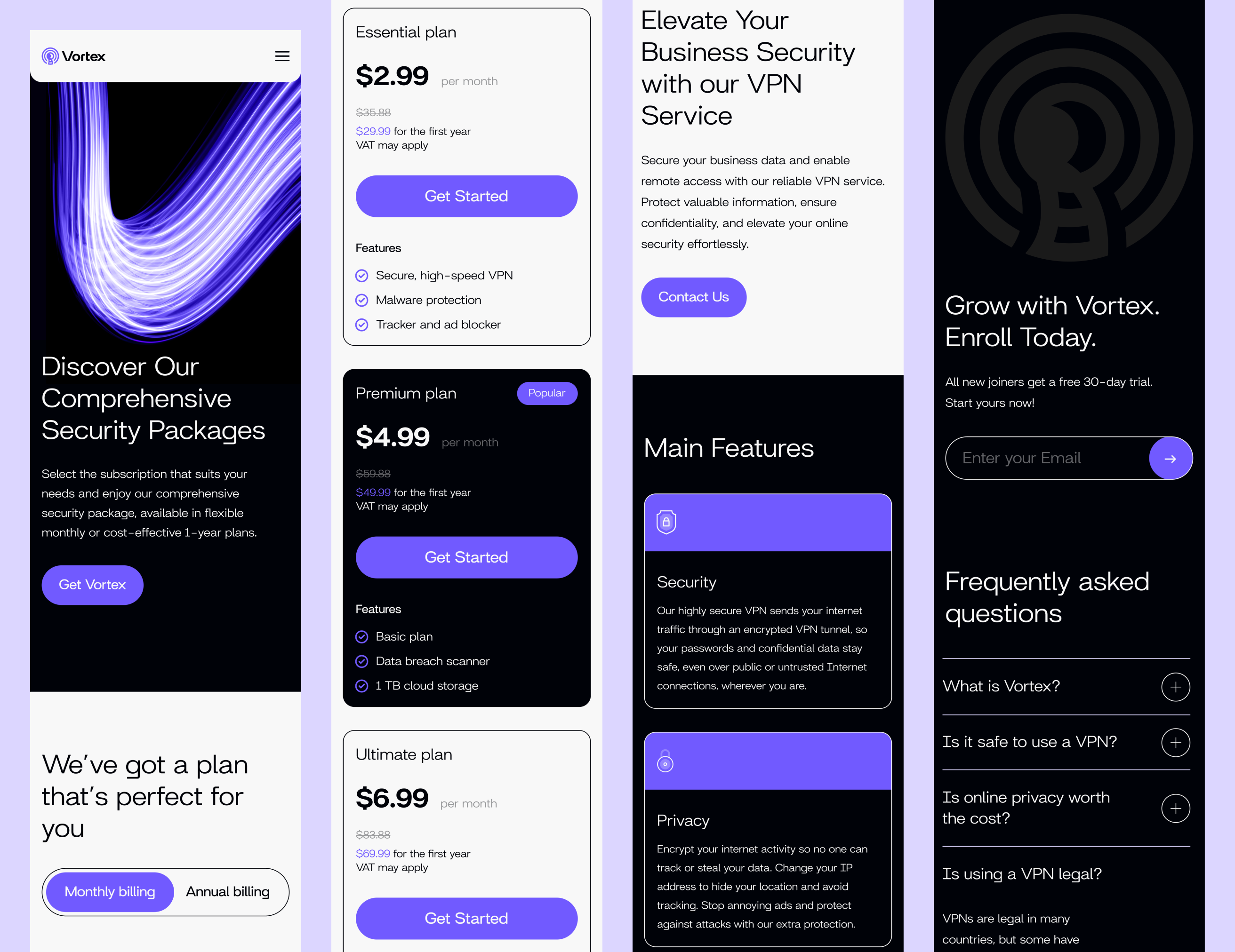
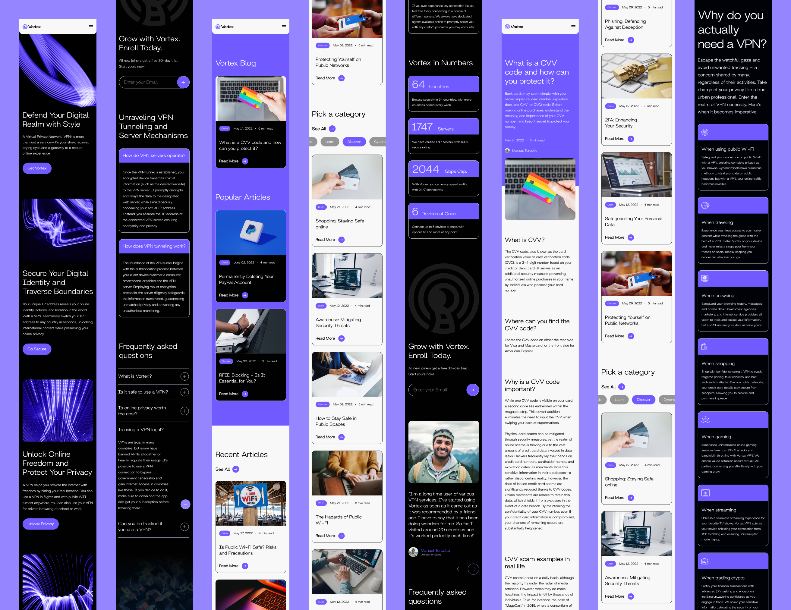
Website Redesign
The website redesign aimed to appeal to both venue owners and partygoers. For venue owners, we focused on showcasing how Vortex could enhance their events and increase engagement. For partygoers, we highlighted the fun, vibrant atmosphere, making the app inviting and easy to use. The design balanced visual impact with clear, intuitive navigation for both audiences.
Designing a Product from the Ground Up
The product had no content, structure, or user experience in place. We started from a blank slate, defining core features, creating a unified design system, and aligning the brand across both app and web. Every decision was informed by research, user testing, and a clear focus on usability.
There were a few bumps in the road:
01
No Existing Content or Structure
The product lacked UX writing and structure, so every screen had to be built from scratch with no reference points.
02
Undefined Features and Flows
There was no clear direction for features or user journeys, requiring us to define functionality while staying aligned with the vision.
03
Fragmented Visual Identity
The brand lacked cohesion across channels, causing visual inconsistencies between the app, website, and overall identity.
04
Unclear Navigation and Low Usability
Early app concepts lacked structure and intuitive navigation, making it difficult for users to move through key flows smoothly.
Here’s how we smoothed things out:
01
Tested Visual Directions Early
We worked closely with stakeholders to map out core features and wrote UX copy directly into wireframes, ensuring clarity on every screen.
02
Benchmarked Features
We conducted competitor research and benchmarking to define the feature set. We ran UX workshops to map user flows and align expectations.
03
Fragmented Visual Identity
We explored and tested two brand directions, then implemented a unified visual language applied consistently through a scalable design system.
04
Unclear Navigation and Low Usability
We designed and tested wireframes and prototypes with users, iterating on feedback to deliver a clean, intuitive, and user-friendly app experience.
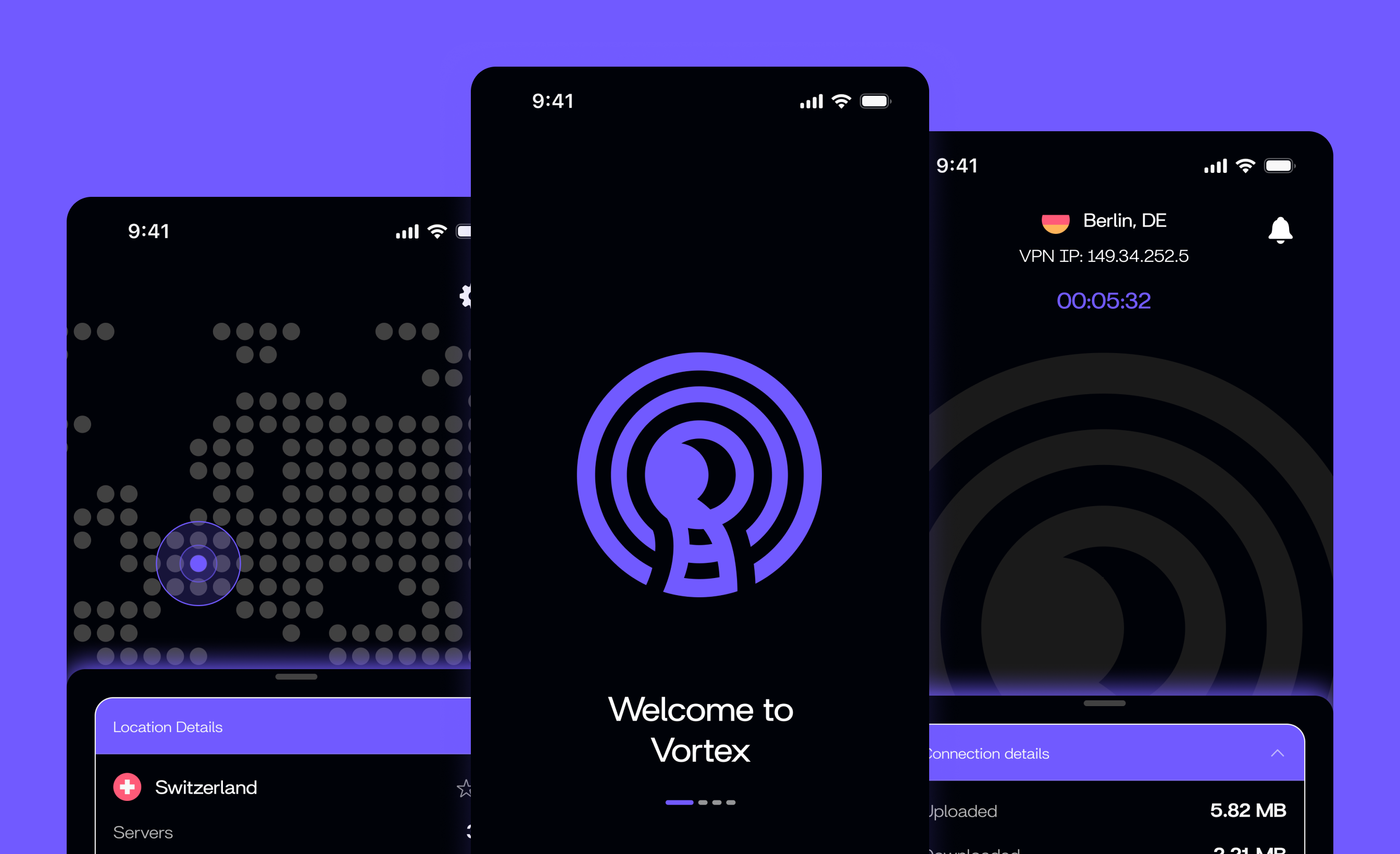
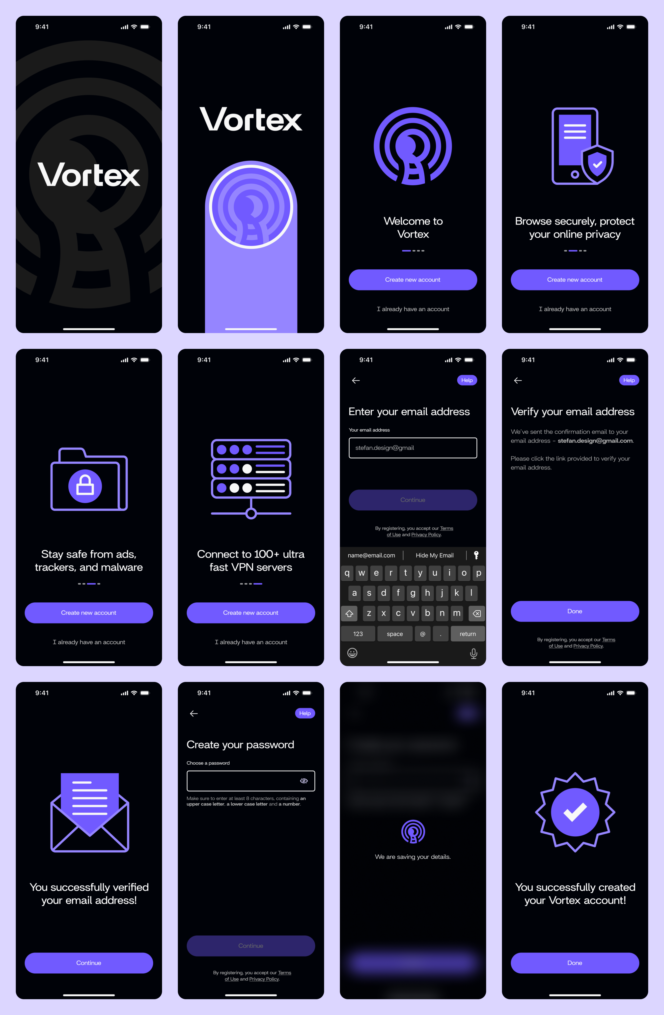
Onboarding & Sign Up
We designed the onboarding and sign up flows to reduce friction, requiring only essential input to get users started quickly. The walkthrough highlights the app’s core value with short, focused screens. Every step is optimised for clarity, balancing speed with essential guidance to reduce cognitive load and drop-off.
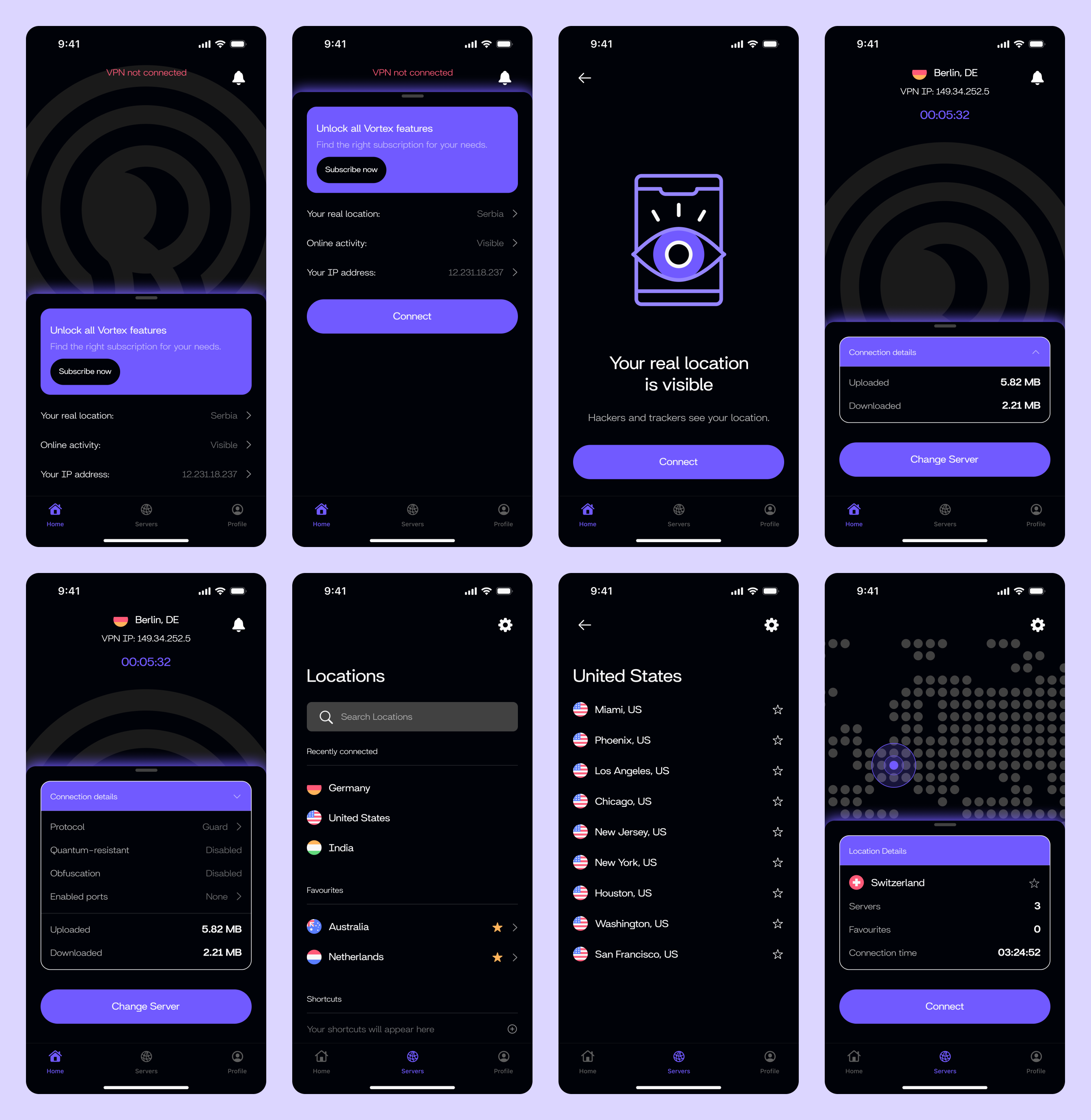
Home & Connect
This screen offers real-time information about the VPN connection, including upload/download stats and server location. We designed the interface to be clean and focused, allowing users to easily switch servers or reconnect with a single tap. Clear status indicators and smooth transitions help build trust and make the app feel responsive and secure.
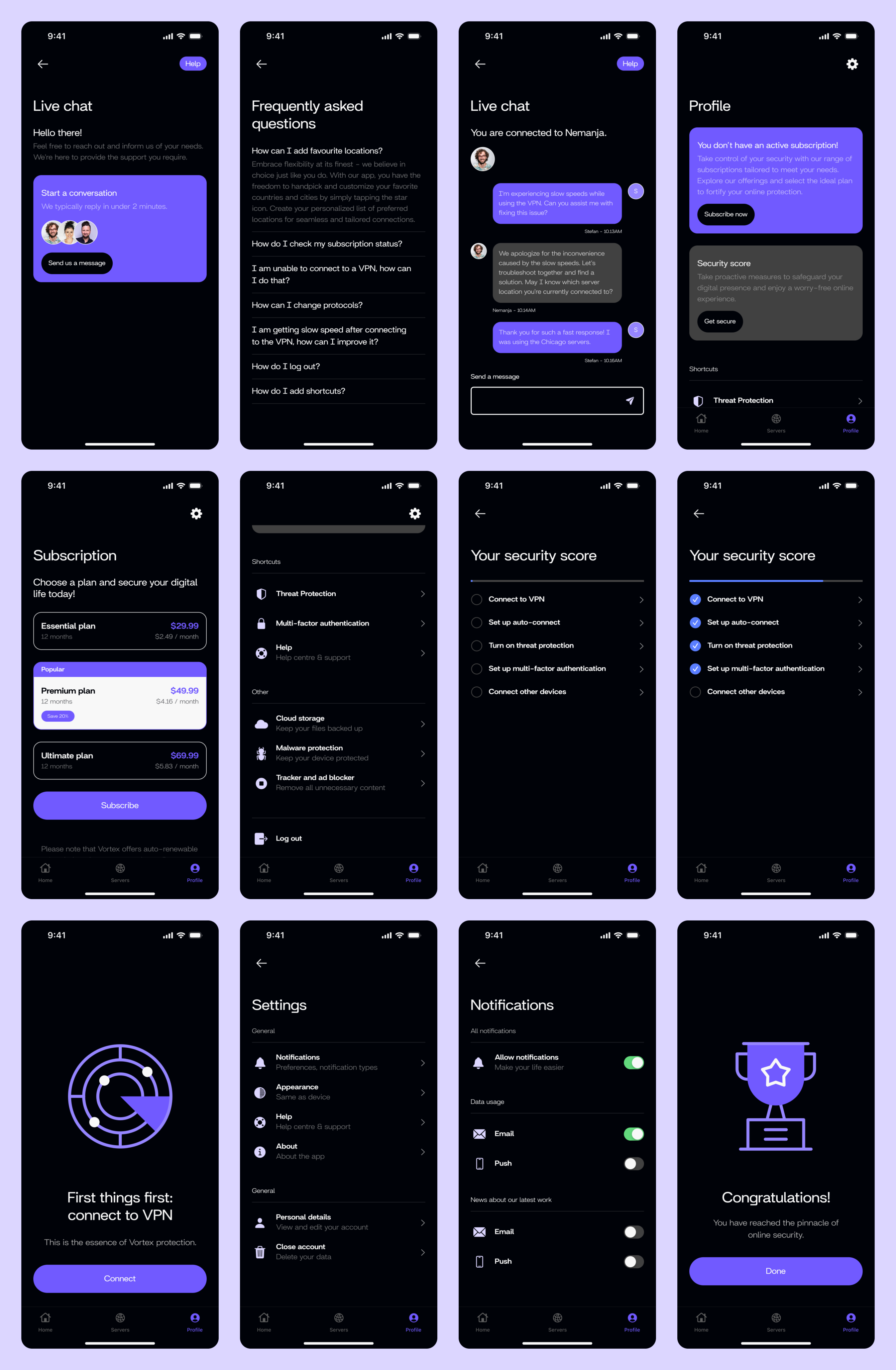
Profile & Settings
The profile section gives users control over their experience. We grouped settings into clear, logical categories to reduce decision fatigue. Users can manage subscriptions, add devices, and access features like cloud storage or support. The layout follows predictable patterns, ensuring users don’t need to relearn anything as they explore more advanced settings.
Impact
Over the course of four months, we led the product and brand design for Vortex VPN, working through multiple testing rounds to refine the experience. User feedback was clear: the design worked, and the response was overwhelmingly positive.
01
78% Positive First Impressions
More than three-quarters of users said they would choose Vortex based on the visual design and intuitive nature of the app, describing it as trustworthy and professional compared to other VPN options.
02
91% Navigation Satisfaction
An overwhelming majority of users found the app easy to navigate, praising the clarity of its layout and intuitive experience. Specific feedback highlighted the logical grouping of settings and the simplicity of the connection process.
03
62% Purchase Intent
Nearly two-thirds of testers said they would use Vortex once available, showing strong confidence in the product's usability and value. This represents exceptional pre-launch interest for a product in the competitive VPN market.
See more work.
Gleam
Strategy
Branding
App
Design System
View Case
→
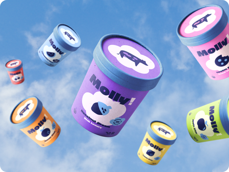
Molly
Strategy
Branding
PACKAGING
View Case
→

Bidde
Strategy
Branding
website
marketing
View Case
→


MENU
HOME
WORK
SERVICES
ABOUT
GET IN TOUCH
Ig: @TeenyStudio
Ln: @Teeny-Studio
Vortex
Vortex protects your online activity by encrypting your internet connection, keeping your data private and secure. It blocks intrusive ads, trackers, and malicious sites, preventing distractions and unwanted access.
PROJECT SCOPE
Art Direction, Visual Identity, Website Design, App Design, Workshops, Design System
TEAM
1 Project Manager, 1 Tech Lead, 1 Marketing Director, 1 Content Writer 1 Designer, 3 Developers
INDUSTRY
SaaS Platform in Cybersecurity Industry
YEAR
2024
Context
Vortex had no existing brand, features were still being shaped, and there was no design direction in place. They brought us in at the very start to create the visual identity, but as we worked together, our role expanded to cover the full product experience. We helped define the brand strategy, design the identity, and build out the design system, website, and app.
What’s been done?
To build Vortex from zero to launch, we defined the brand, designed the full product experience, and created a scalable design system for the app.
01
Brand Strategy
Through three stakeholder workshops, we defined the brand’s tone, visual language, and key communication principles. We clarified that the brand should feel fast, secure, and trustworthy, which set the foundation for the digital product. We interviewed a two groups of user to make sure we are aligned with their expectations.
02
Brand Design
We created a bold, modern identity, including a logo, colour system, typography, social media templates, employee merch, and a comprehensive brand book. The visuals were designed to stand out in tech-driven spaces, instantly communicating a sense of security and trust.
03
Product Design
Leading UX research with 24 users, we identified personas and key priorities. The research revealed that speed and simplicity were the key, so we designed a streamlined flow that allows users to connect instantly. Every screen, from onboarding to server selection, was shaped by real user insights.
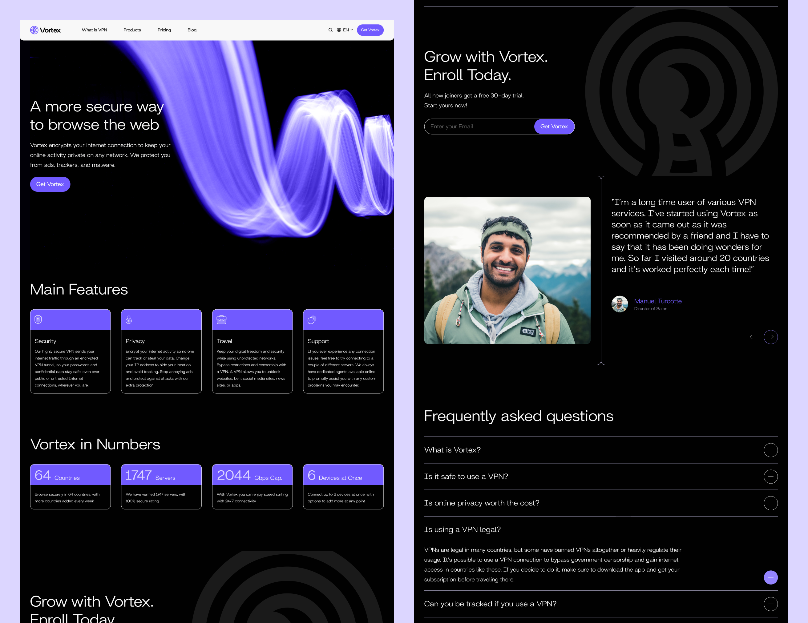
Visual Identity
The design of the Vortex logo is inspired by whirlpools, representing a growing signal and embodying an active sense of movement and power. Each aspect was carefully crafted, creating an immersive brand identity that reflects Vortex’s core values.
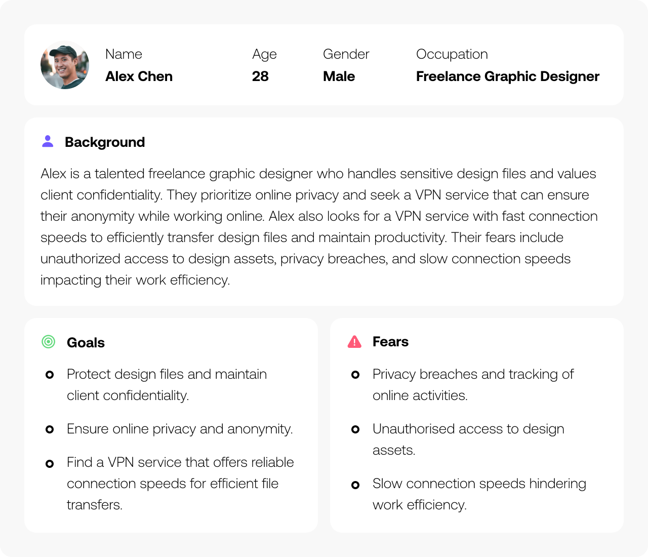
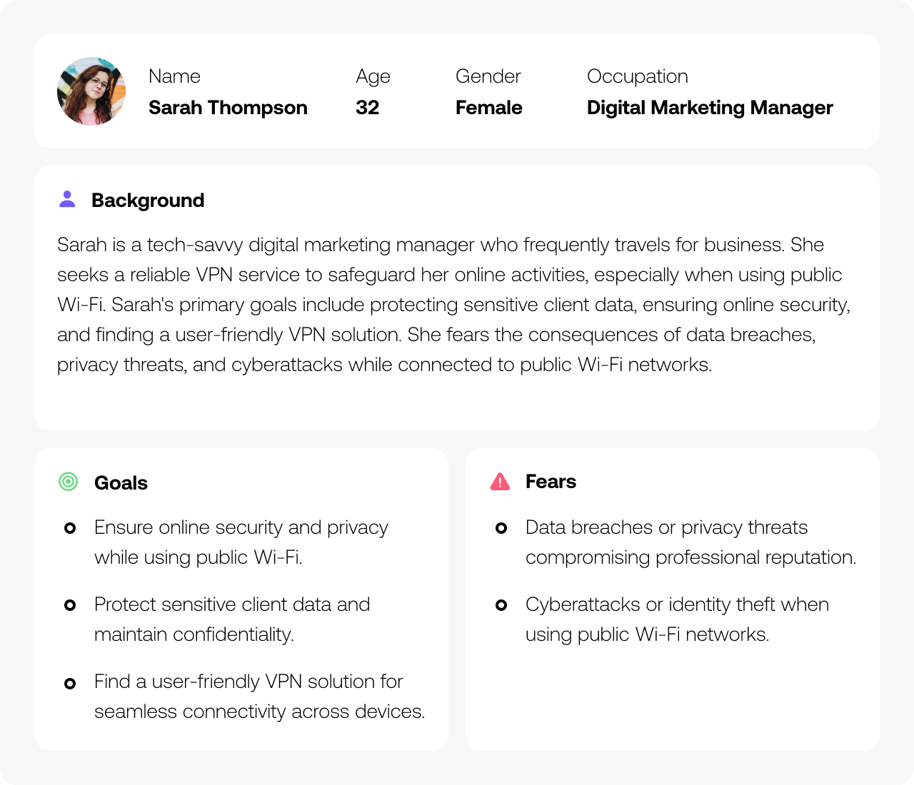
Designing for Real Users from Day One
To build a product that truly meets user needs, we interviewed 24 people across different demographics and usage patterns. Their insights helped shape two detailed personas, each grounded in real behaviors, motivations, and challenges. These personas became the foundation for all design decisions, helping us stay focused on solving the right problems throughout the project.
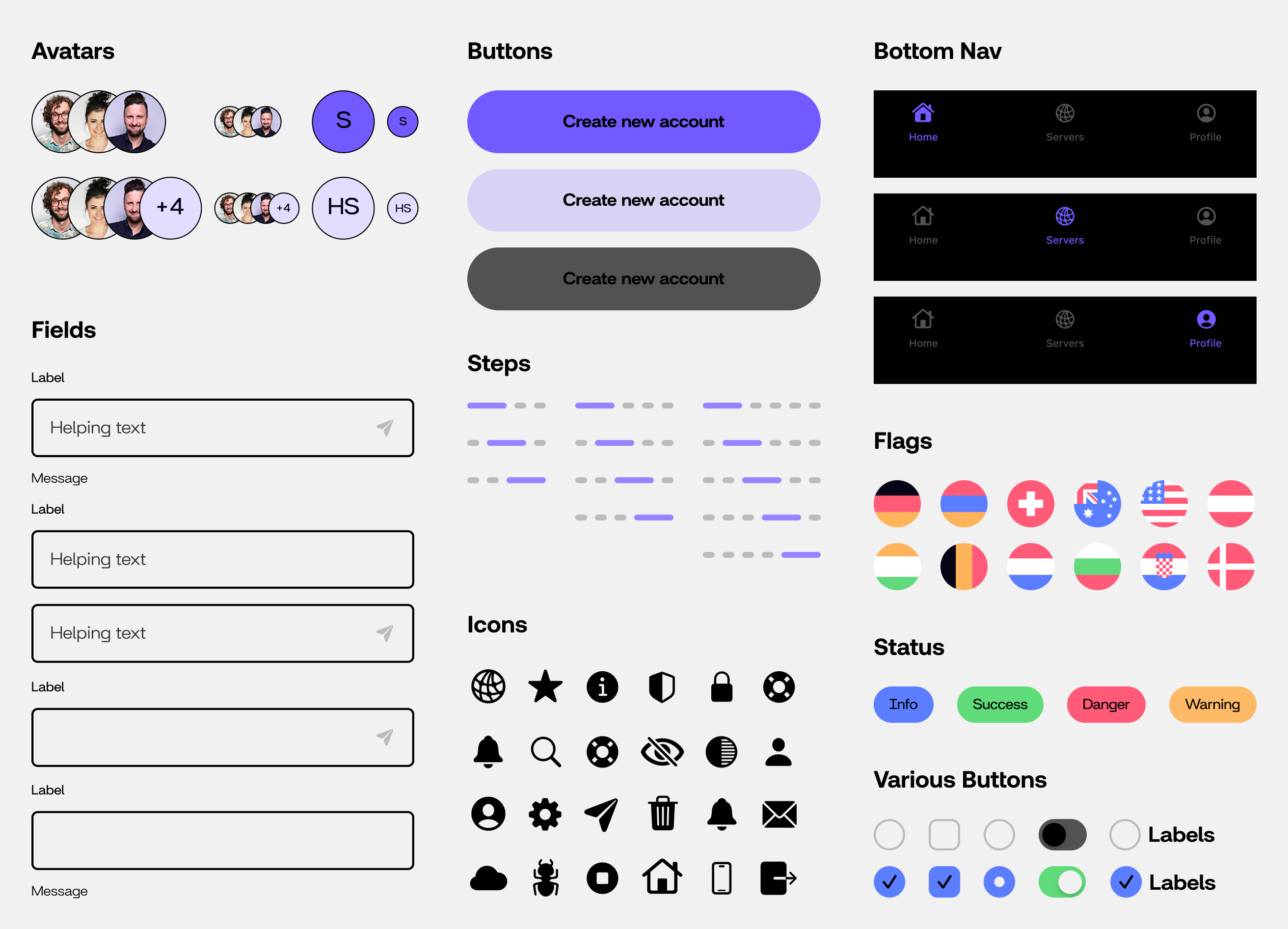
Building the Foundation for Scalable Design
To ensure a consistent and cohesive user experience across the app, we created a robust atomic design system. It was built using tokens and variables for color, typography, spacing, borders, and radii. These foundations supported the development of flexible UI components, including buttons, input fields, cards, checkboxes, uploaders, menus, and snackbars, allowing us to scale design efficiently and maintain quality across screens.
Website Redesign
The website redesign aimed to appeal to both venue owners and partygoers. For venue owners, we focused on showcasing how Vortex could enhance their events and increase engagement. For partygoers, we highlighted the fun, vibrant atmosphere, making the app inviting and easy to use. The design balanced visual impact with clear, intuitive navigation for both audiences.
Designing a Product from the Ground Up
The product had no content, structure, or user experience in place. We started from a blank slate, defining core features, creating a unified design system, and aligning the brand across both app and web. Every decision was informed by research, user testing, and a clear focus on usability.
There were a few bumps in the road:
01
No Existing Content or Structure
The product lacked UX writing and structure, so every screen had to be built from scratch with no reference points.
02
Undefined Features and Flows
There was no clear direction for features or user journeys, requiring us to define functionality while staying aligned with the vision.
03
Fragmented Visual Identity
The brand lacked cohesion across channels, causing visual inconsistencies between the app, website, and overall identity.
04
Unclear Navigation and Low Usability
Early app concepts lacked structure and intuitive navigation, making it difficult for users to move through key flows smoothly.
Here’s how we smoothed things out:
01
Tested Visual Directions Early
We worked closely with stakeholders to map out core features and wrote UX copy directly into wireframes, ensuring clarity on every screen.
02
Benchmarked Features
We conducted competitor research and benchmarking to define the feature set. We ran UX workshops to map user flows and align expectations.
03
Fragmented Visual Identity
We explored and tested two brand directions, then implemented a unified visual language applied consistently through a scalable design system.
04
Unclear Navigation and Low Usability
We designed and tested wireframes and prototypes with users, iterating on feedback to deliver a clean, intuitive, and user-friendly app experience.
Onboarding & Sign Up
We designed the onboarding and sign up flows to reduce friction, requiring only essential input to get users started quickly. The walkthrough highlights the app’s core value with short, focused screens. Every step is optimised for clarity, balancing speed with essential guidance to reduce cognitive load and drop-off.
Home & Connect
This screen offers real-time information about the VPN connection, including upload/download stats and server location. We designed the interface to be clean and focused, allowing users to easily switch servers or reconnect with a single tap. Clear status indicators and smooth transitions help build trust and make the app feel responsive and secure.
Profile & Settings
The profile section gives users control over their experience. We grouped settings into clear, logical categories to reduce decision fatigue. Users can manage subscriptions, add devices, and access features like cloud storage or support. The layout follows predictable patterns, ensuring users don’t need to relearn anything as they explore more advanced settings.
Impact
Over the course of four months, we led the product and brand design for Vortex VPN, working through multiple testing rounds to refine the experience. User feedback was clear: the design worked, and the response was overwhelmingly positive.
01
78% Positive First Impressions
More than three-quarters of users said they would choose Vortex based on the visual design and intuitive nature of the app, describing it as trustworthy and professional compared to other VPN options.
02
91% Navigation Satisfaction
An overwhelming majority of users found the app easy to navigate, praising the clarity of its layout and intuitive experience. Specific feedback highlighted the logical grouping of settings and the simplicity of the connection process.
03
62% Purchase Intent
Nearly two-thirds of testers said they would use Vortex once available, showing strong confidence in the product's usability and value. This represents exceptional pre-launch interest for a product in the competitive VPN market.
See more work.
Gleam
Strategy
Branding
App
Design System
View Case
→
Molly
Strategy
Branding
PACKAGING
View Case
→
Bidde
Strategy
Branding
website
marketing
View Case
→

Want to work together?
Book a free 30-minute consultation. We'll talk about your project, answer your questions, and see if we're a good fit.
BOOK A CALL
Vortex
Vortex protects your online activity by encrypting your internet connection, keeping your data private and secure. It blocks intrusive ads, trackers, and malicious sites, preventing distractions and unwanted access.
PROJECT SCOPE
Art Direction, Visual Identity, Website Design, App Design, Workshops, Design System
TEAM
1 Project Manager, 1 Tech Lead, 1 Marketing Director, 1 Content Writer 1 Designer, 3 Developers
INDUSTRY
SaaS Platform in Cybersecurity Industry
YEAR
2024
Context
Vortex had no existing brand, features were still being shaped, and there was no design direction in place. They brought us in at the very start to create the visual identity, but as we worked together, our role expanded to cover the full product experience. We helped define the brand strategy, design the identity, and build out the design system, website, and app.
What’s been done?
To build Vortex from zero to launch, we defined the brand, designed the full product experience, and created a scalable design system for the app.
01
Brand Strategy
Through three stakeholder workshops, we defined the brand’s tone, visual language, and key communication principles. We clarified that the brand should feel fast, secure, and trustworthy, which set the foundation for the digital product. We interviewed a two groups of user to make sure we are aligned with their expectations.
02
Brand Design
We created a bold, modern identity, including a logo, colour system, typography, social media templates, employee merch, and a comprehensive brand book. The visuals were designed to stand out in tech-driven spaces, instantly communicating a sense of security and trust.
03
Product Design
Leading UX research with 24 users, we identified personas and key priorities. The research revealed that speed and simplicity were the key, so we designed a streamlined flow that allows users to connect instantly. Every screen, from onboarding to server selection, was shaped by real user insights.
Visual Identity
The design of the Vortex logo is inspired by whirlpools, representing a growing signal and embodying an active sense of movement and power. Each aspect was carefully crafted, creating an immersive brand identity that reflects Vortex’s core values.
Designing for Real Users from Day One
To build a product that truly meets user needs, we interviewed 24 people across different demographics and usage patterns. Their insights helped shape two detailed personas, each grounded in real behaviors, motivations, and challenges. These personas became the foundation for all design decisions, helping us stay focused on solving the right problems throughout the project.
Building the Foundation for Scalable Design
To ensure a consistent and cohesive user experience across the app, we created a robust atomic design system. It was built using tokens and variables for color, typography, spacing, borders, and radii. These foundations supported the development of flexible UI components, including buttons, input fields, cards, checkboxes, uploaders, menus, and snackbars, allowing us to scale design efficiently and maintain quality across screens.
Website Redesign
The website redesign aimed to appeal to both venue owners and partygoers. For venue owners, we focused on showcasing how Vortex could enhance their events and increase engagement. For partygoers, we highlighted the fun, vibrant atmosphere, making the app inviting and easy to use. The design balanced visual impact with clear, intuitive navigation for both audiences.
Designing a Product from the Ground Up
The product had no content, structure, or user experience in place. We started from a blank slate, defining core features, creating a unified design system, and aligning the brand across both app and web. Every decision was informed by research, user testing, and a clear focus on usability.
There were a few bumps in the road:
01
No Existing Content or Structure
The product lacked UX writing and structure, so every screen had to be built from scratch with no reference points.
02
Undefined Features and Flows
There was no clear direction for features or user journeys, requiring us to define functionality while staying aligned with the vision.
03
Fragmented Visual Identity
The brand lacked cohesion across channels, causing visual inconsistencies between the app, website, and overall identity.
04
Unclear Navigation and Low Usability
Early app concepts lacked structure and intuitive navigation, making it difficult for users to move through key flows smoothly.
Here’s how we smoothed things out:
01
Tested Visual Directions Early
We worked closely with stakeholders to map out core features and wrote UX copy directly into wireframes, ensuring clarity on every screen.
02
Benchmarked Features
We conducted competitor research and benchmarking to define the feature set. We ran UX workshops to map user flows and align expectations.
03
Fragmented Visual Identity
We explored and tested two brand directions, then implemented a unified visual language applied consistently through a scalable design system.
04
Unclear Navigation and Low Usability
We designed and tested wireframes and prototypes with users, iterating on feedback to deliver a clean, intuitive, and user-friendly app experience.
Onboarding & Sign Up
We designed the onboarding and sign up flows to reduce friction, requiring only essential input to get users started quickly. The walkthrough highlights the app’s core value with short, focused screens. Every step is optimised for clarity, balancing speed with essential guidance to reduce cognitive load and drop-off.
Home & Connect
This screen offers real-time information about the VPN connection, including upload/download stats and server location. We designed the interface to be clean and focused, allowing users to easily switch servers or reconnect with a single tap. Clear status indicators and smooth transitions help build trust and make the app feel responsive and secure.
Profile & Settings
The profile section gives users control over their experience. We grouped settings into clear, logical categories to reduce decision fatigue. Users can manage subscriptions, add devices, and access features like cloud storage or support. The layout follows predictable patterns, ensuring users don’t need to relearn anything as they explore more advanced settings.
Impact
Over the course of four months, we led the product and brand design for Vortex VPN, working through multiple testing rounds to refine the experience. User feedback was clear: the design worked, and the response was overwhelmingly positive.
01
78% Positive First Impressions
More than three-quarters of users said they would choose Vortex based on the visual design and intuitive nature of the app, describing it as trustworthy and professional compared to other VPN options.
02
91% Navigation Satisfaction
An overwhelming majority of users found the app easy to navigate, praising the clarity of its layout and intuitive experience. Specific feedback highlighted the logical grouping of settings and the simplicity of the connection process.
03
62% Purchase Intent
Nearly two-thirds of testers said they would use Vortex once available, showing strong confidence in the product's usability and value. This represents exceptional pre-launch interest for a product in the competitive VPN market.
See more work.
Gleam
Strategy
Branding
App
Design System
View Case
→
Molly
Strategy
Branding
PACKAGING
View Case
→
Bidde
Strategy
Branding
website
marketing
View Case
→
Want to work together?
Book a free 30-minute consultation. We'll talk about your project, answer your questions, and see if we're a good fit.
BOOK A CALL