Molly!
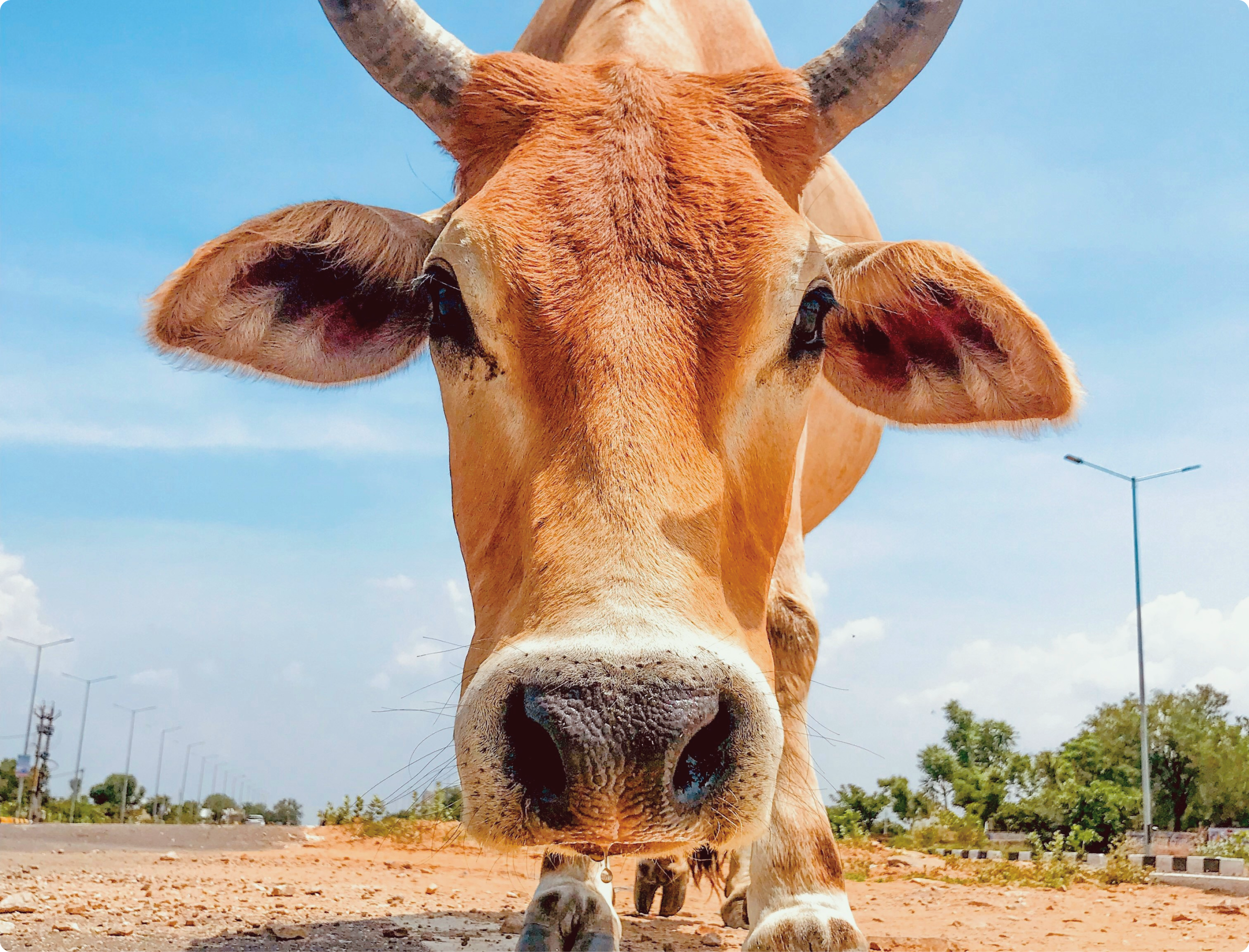
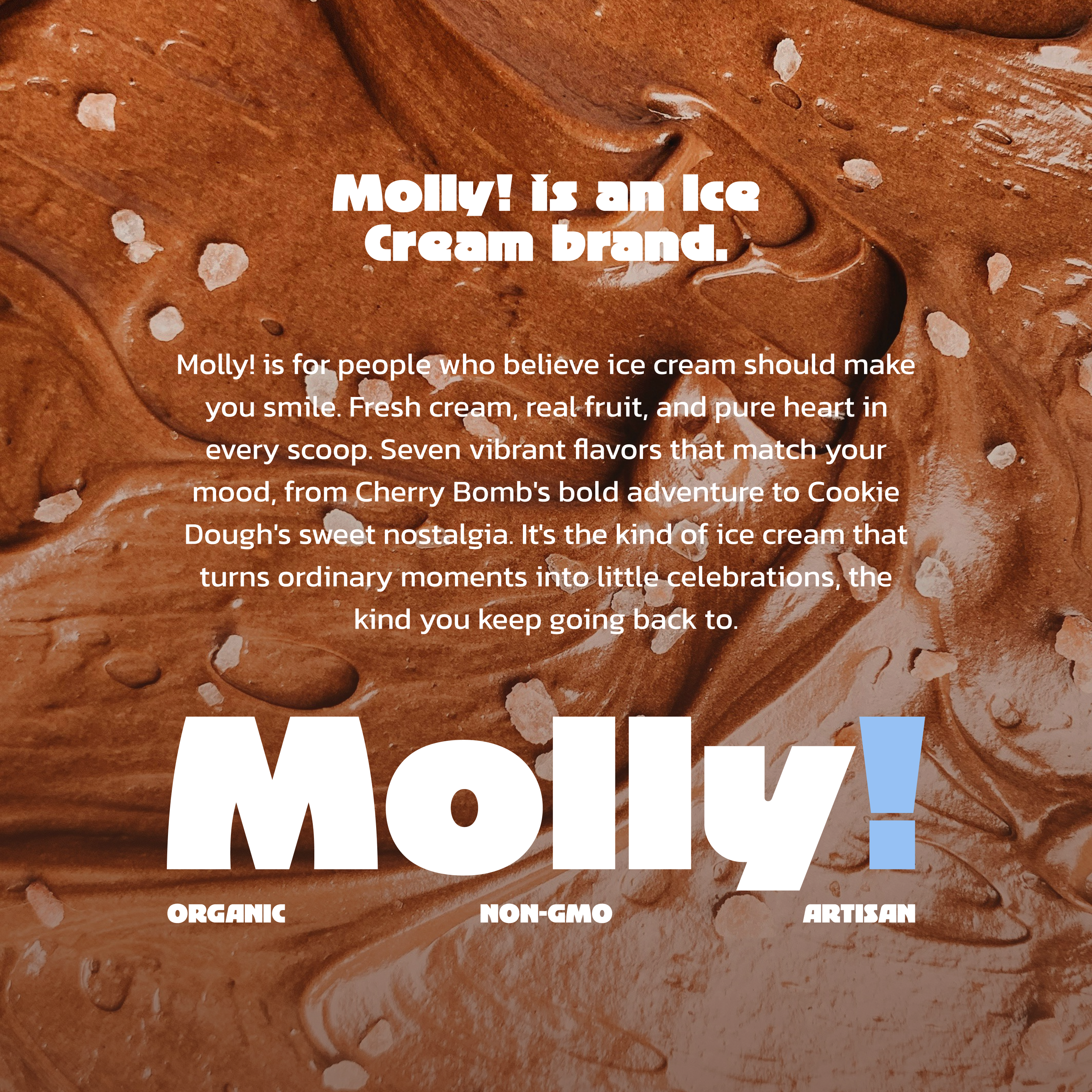
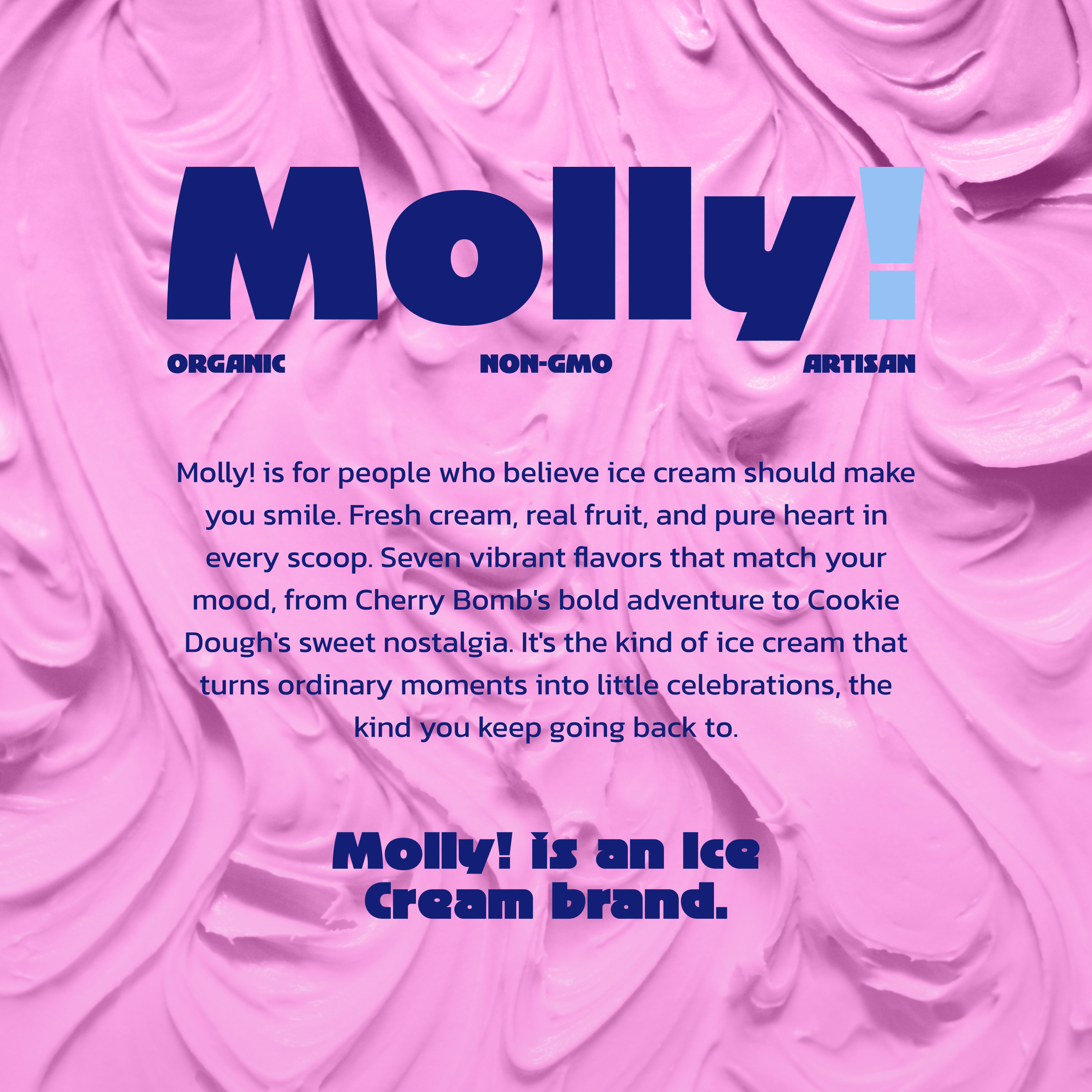
Molly! is an organic ice cream brand that crafts premium frozen treats using locally sourced milk from their own farm cows. They believe great ice cream starts with happy cows and ends with happy customers.
PROJECT SCOPE
Logo Design, Brand Identity, Packaging Design, Social Media Design, Business Stationery
TEAM
3 Founders, 1 Marketing Lead, 1 Copywriter, 1 Designer
INDUSTRY
Organic Food & Dairy Products
YEAR
2025
Context
Molly! was using plain white containers and generic stickers for their locally-sold ice cream. The owners wanted professional branding that matched their personality without losing the approachable, fun vibe that made their product special. They needed packaging that could scale from farmer's market stands to retail shelves.
What’s been done?
We built a complete brand system from naming to packaging, focusing on flavor differentiation and shelf presence.
01
Brand Strategy
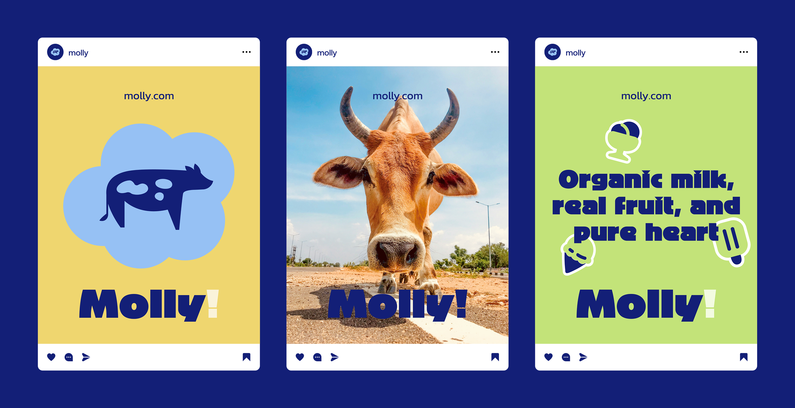
We positioned the brand around local authenticity and joyful experiences rather than competing on health benefits. The strategy centered on the cow mascot as a trust symbol while using humor and color to differentiate from clinical dairy competitors.
02
Brand Design
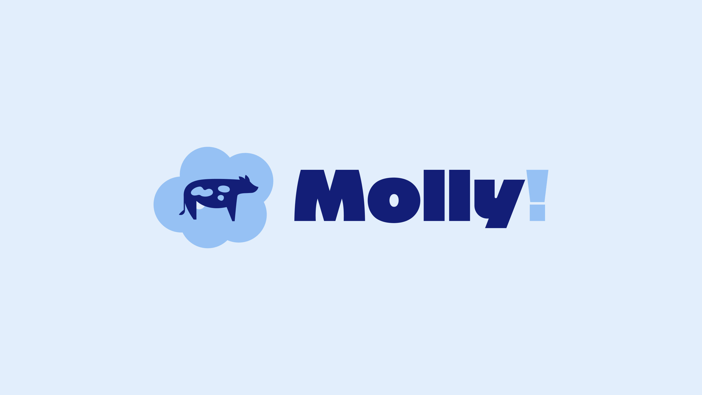
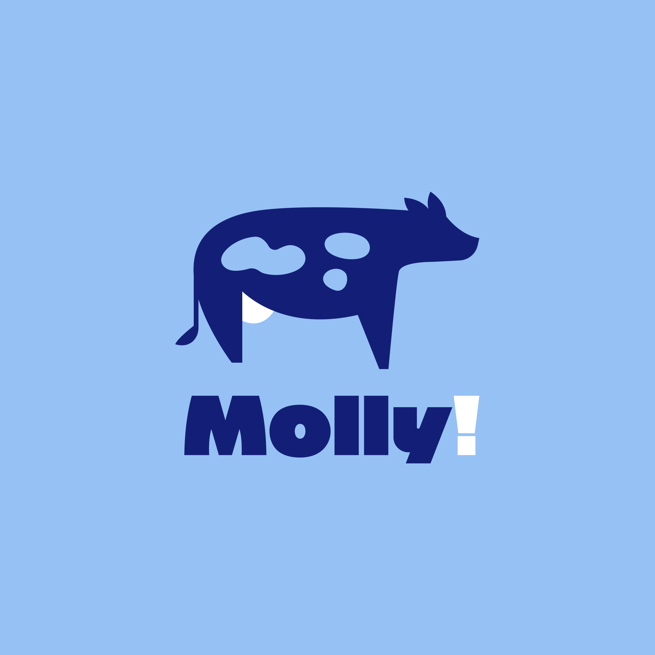
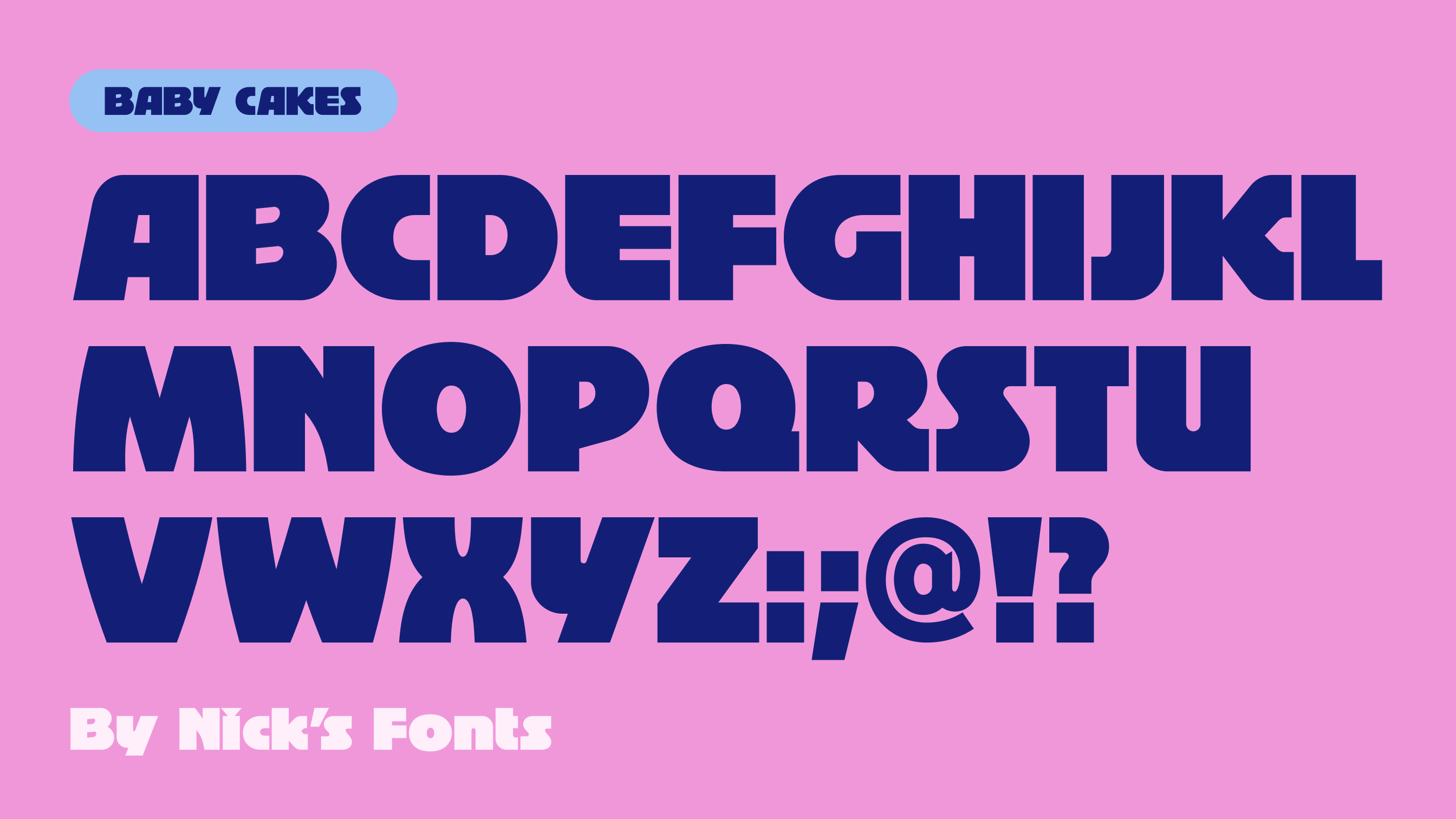
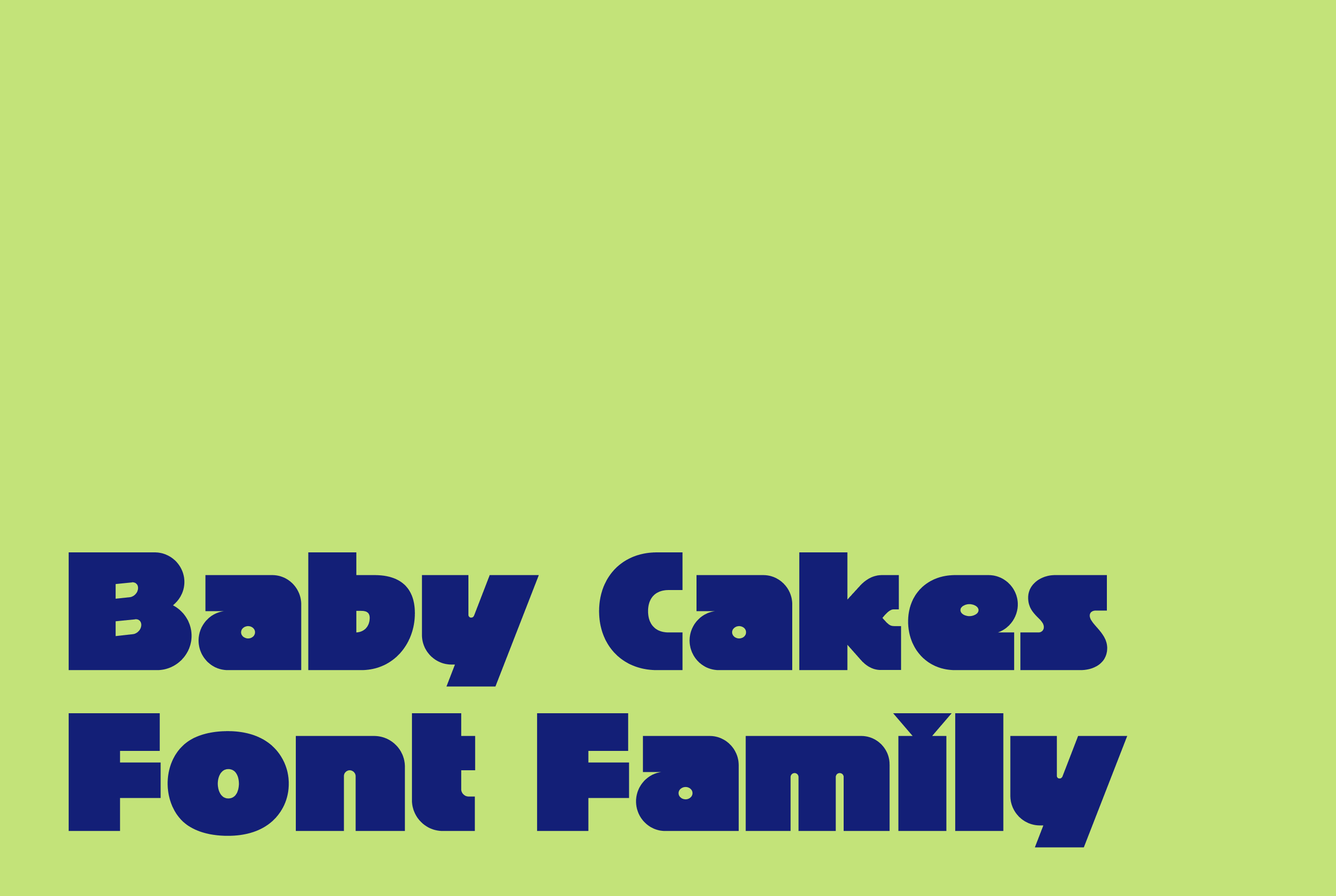
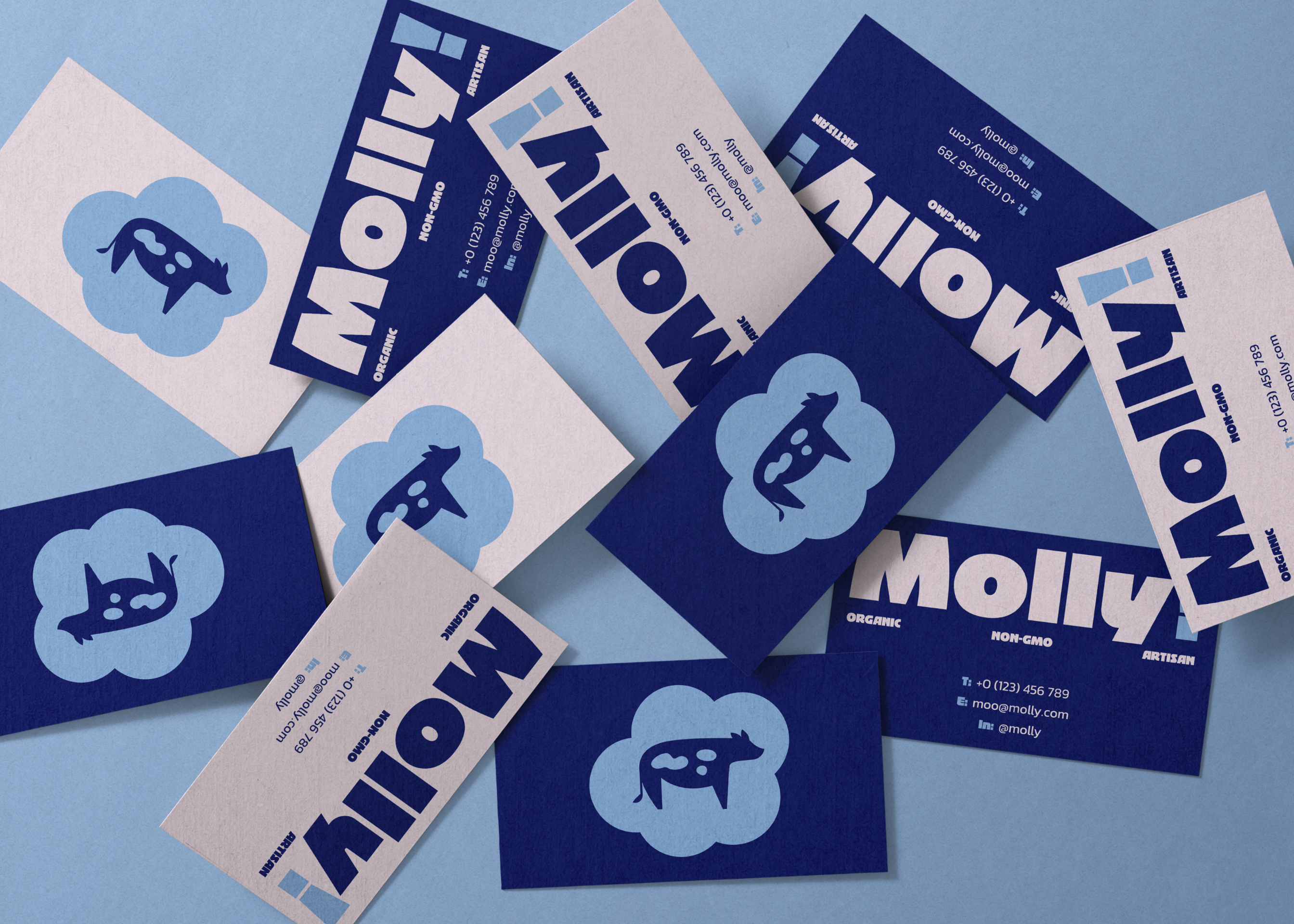
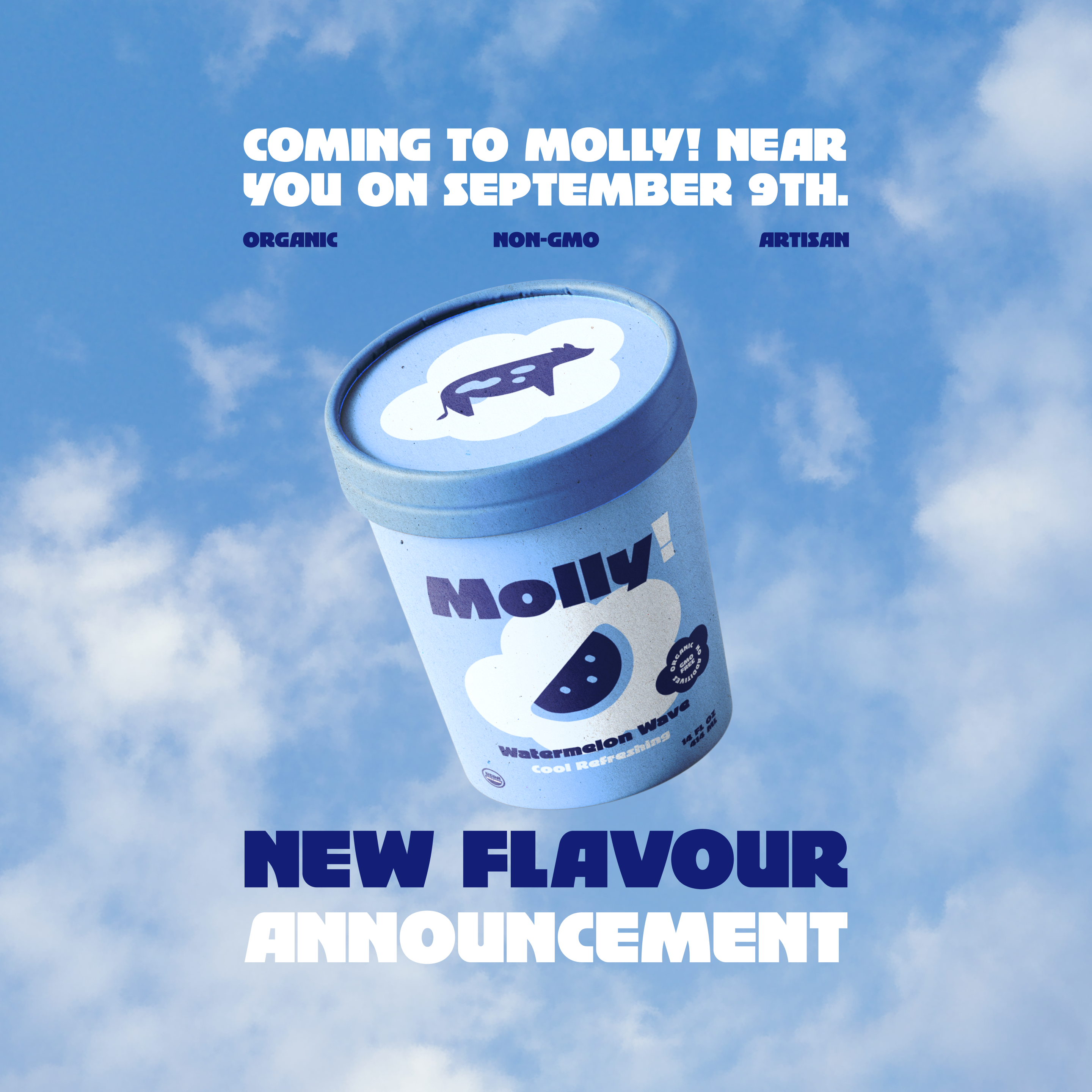
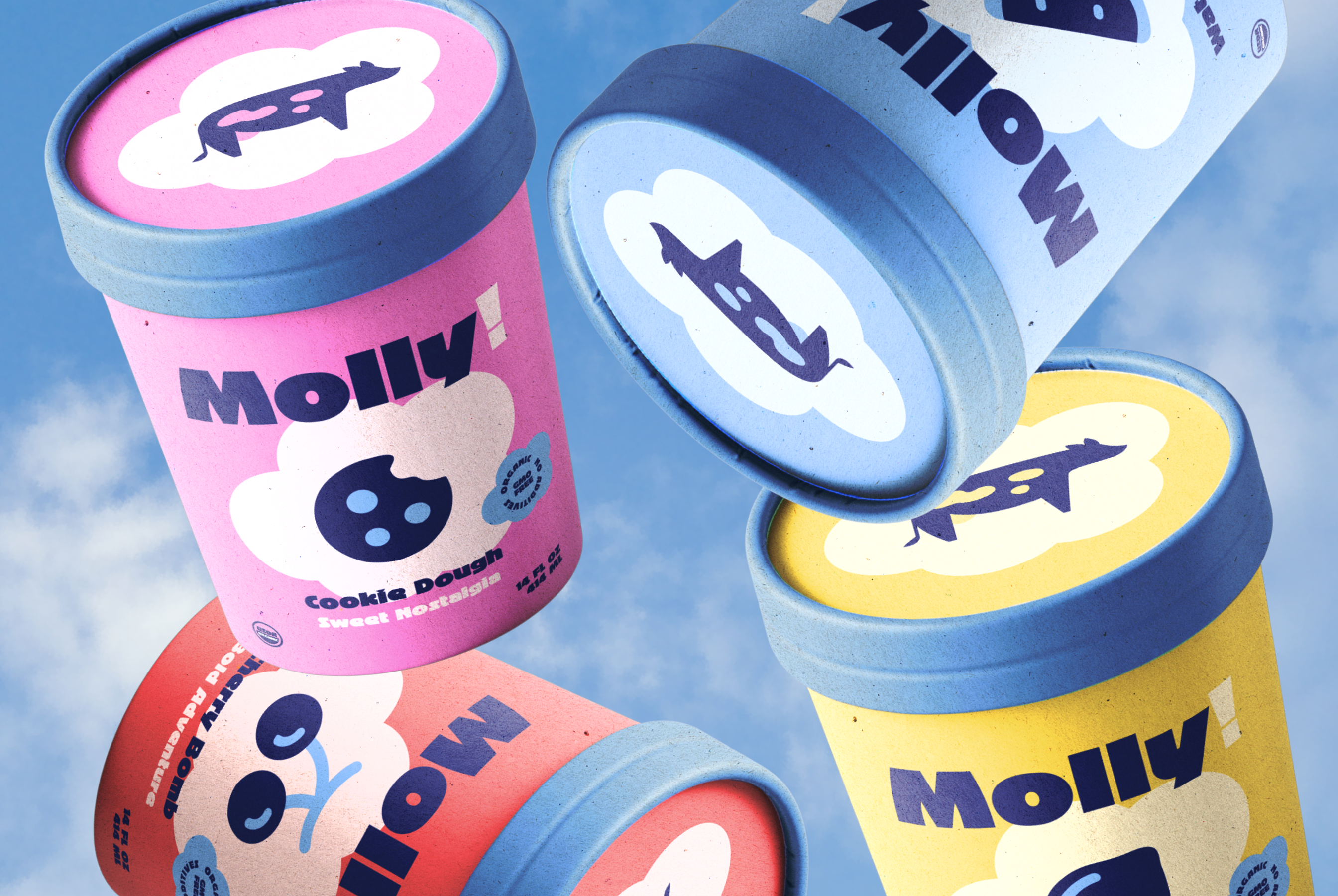
The identity uses a geometric cow mascot with five expression variations for different contexts. The wordmark incorporates hand-lettered elements that reference farm signage, while maintaining scalability for small format applications.
03
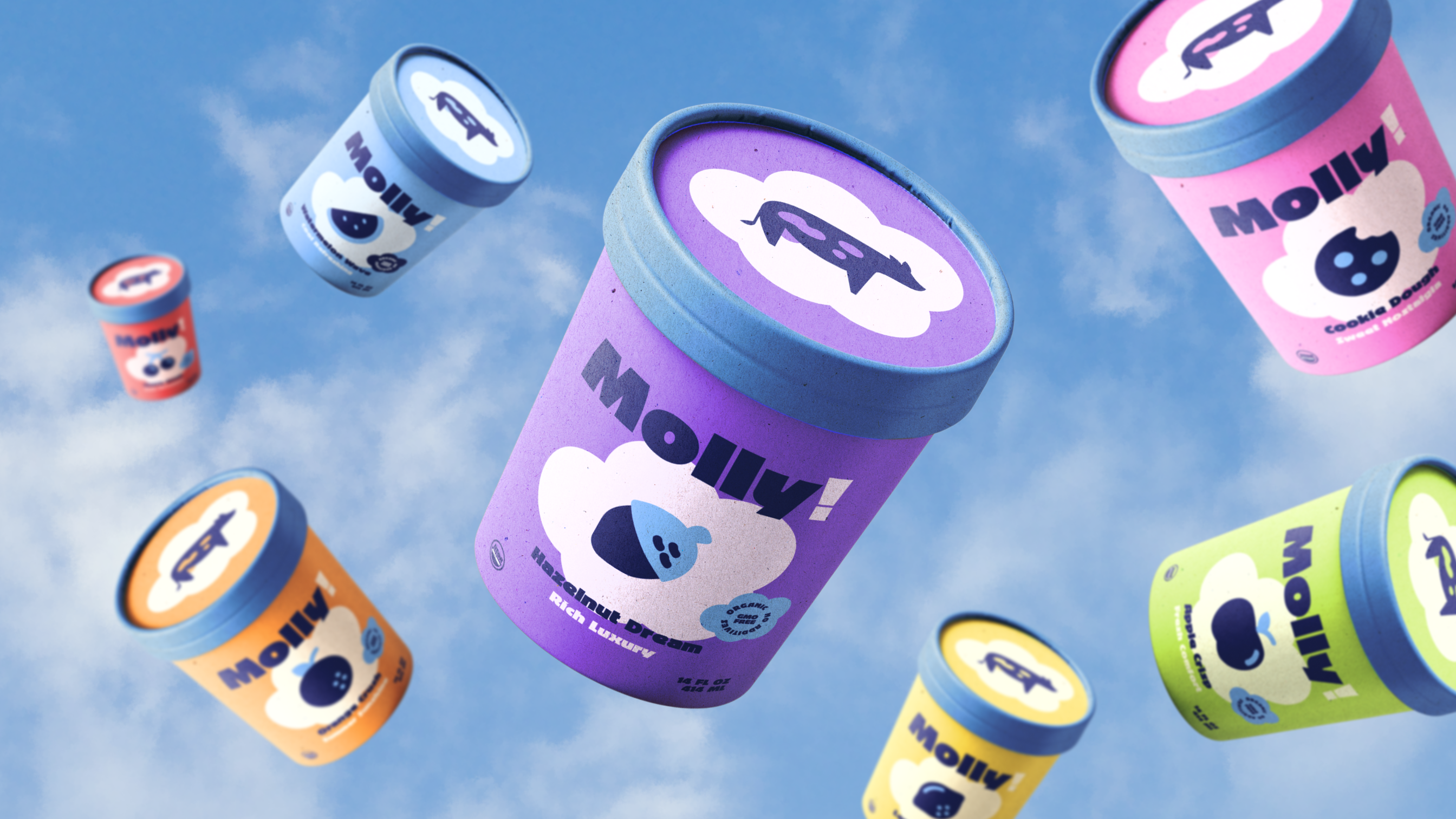
Packaging Design
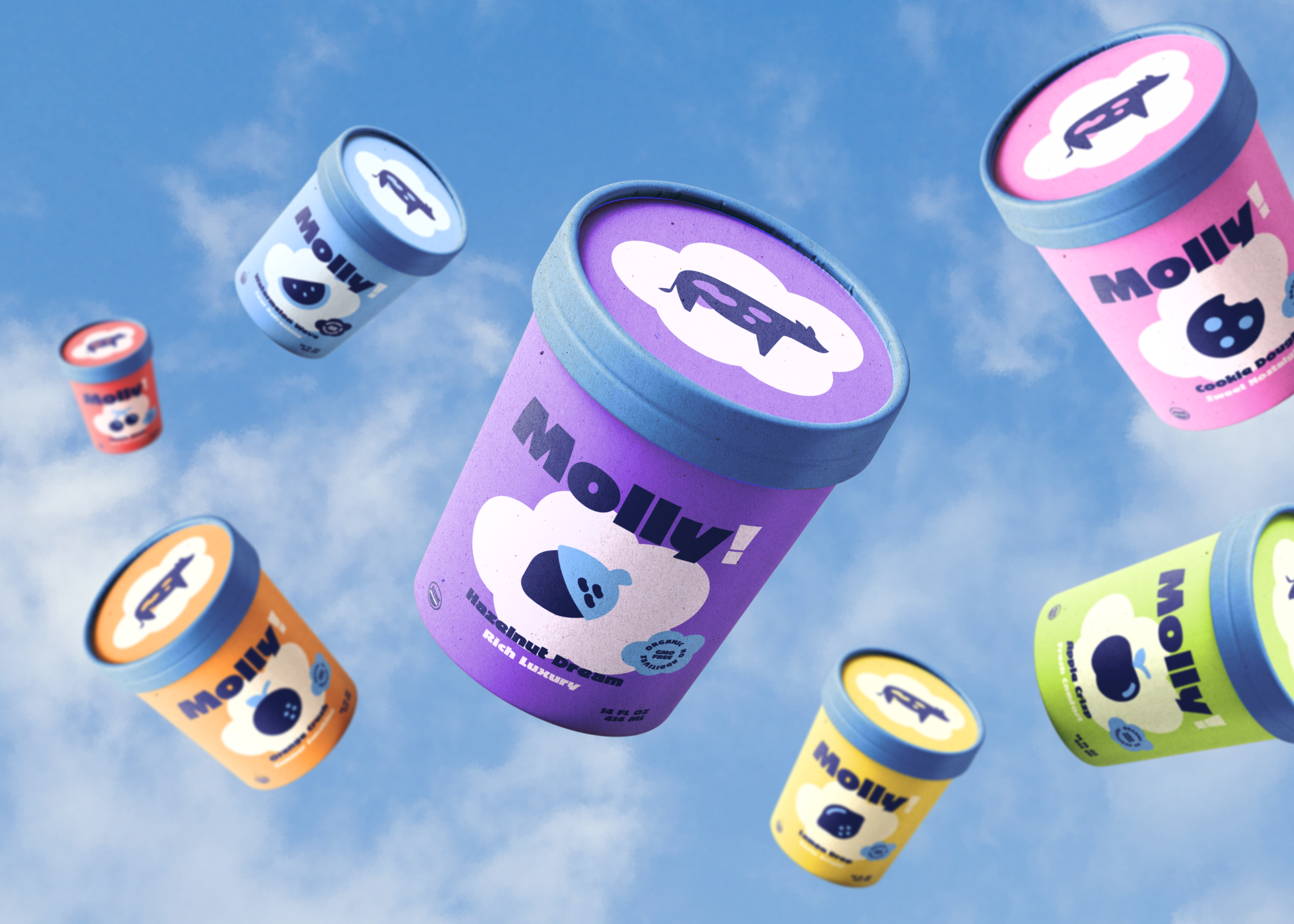
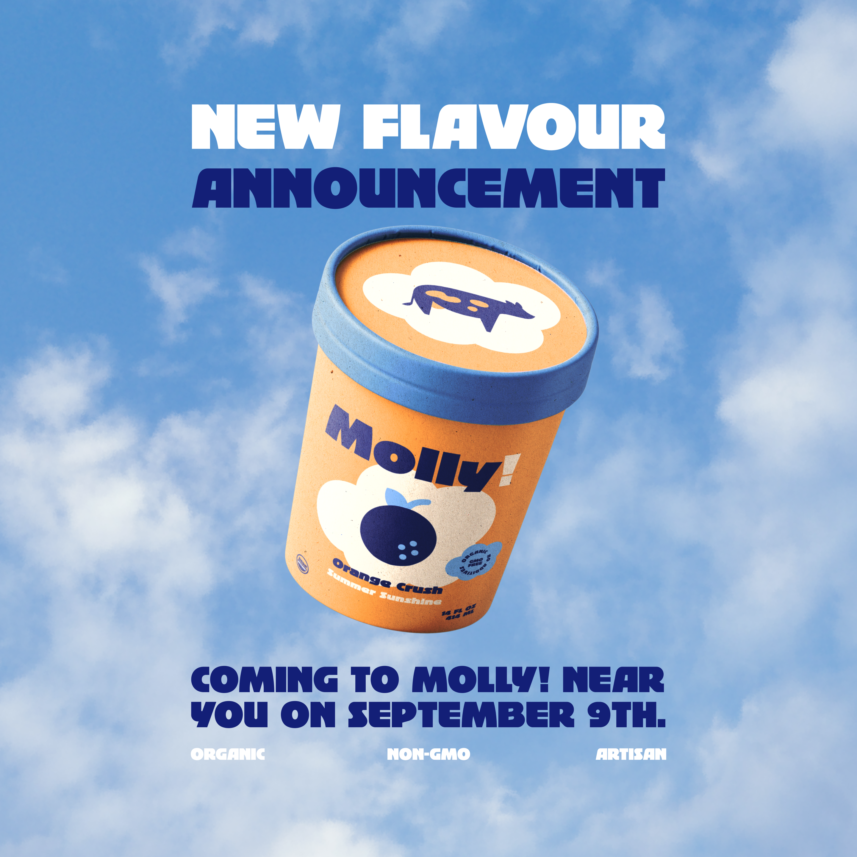
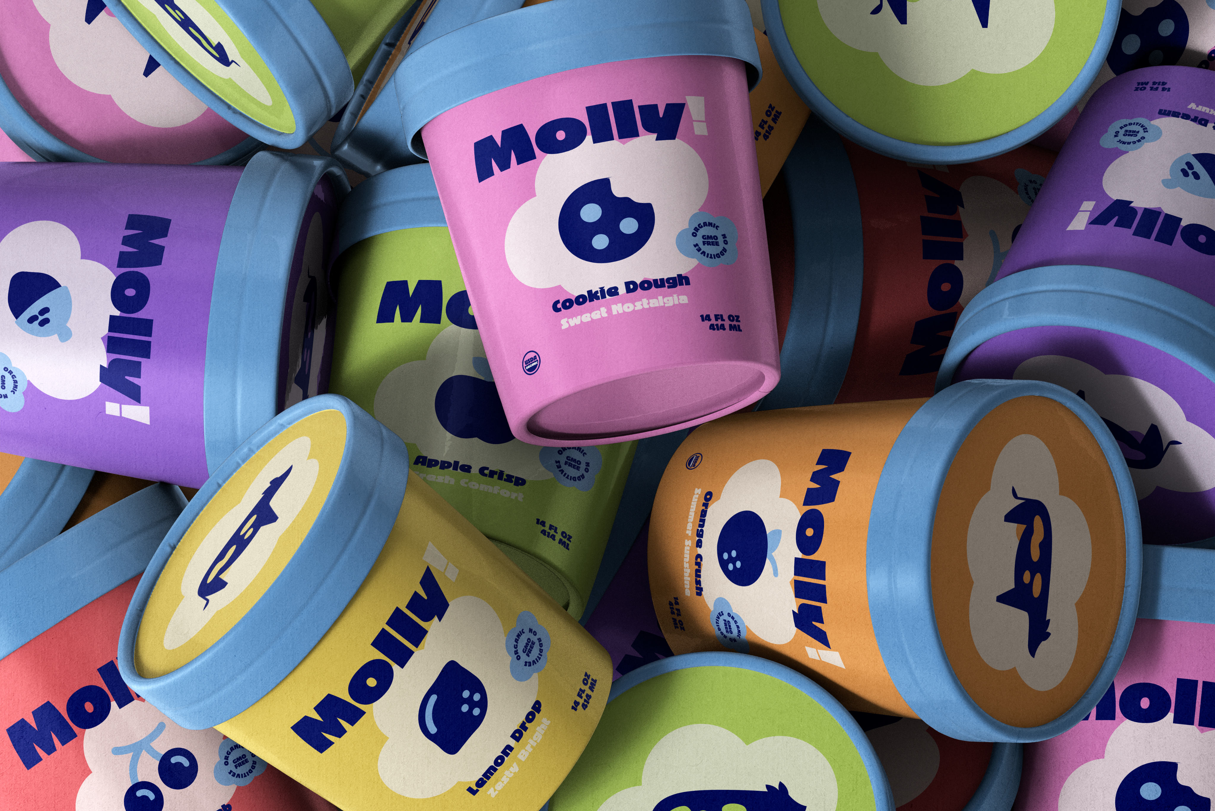
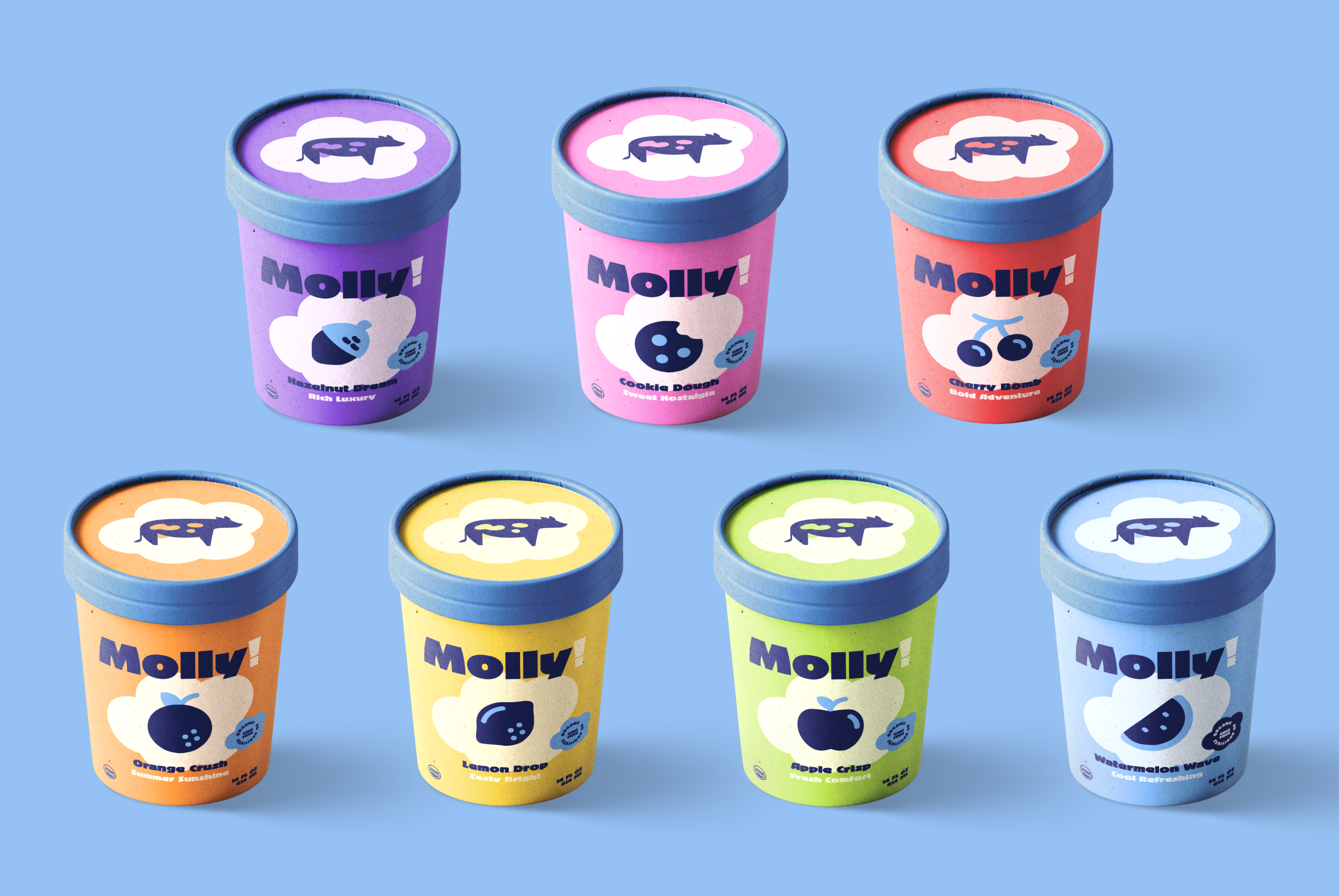
We created a modular container system where flavor-specific color bands wrap around consistent white bases. This approach reduces printing costs while maximizing visual impact when products are grouped together in retail displays.
Visual Identity
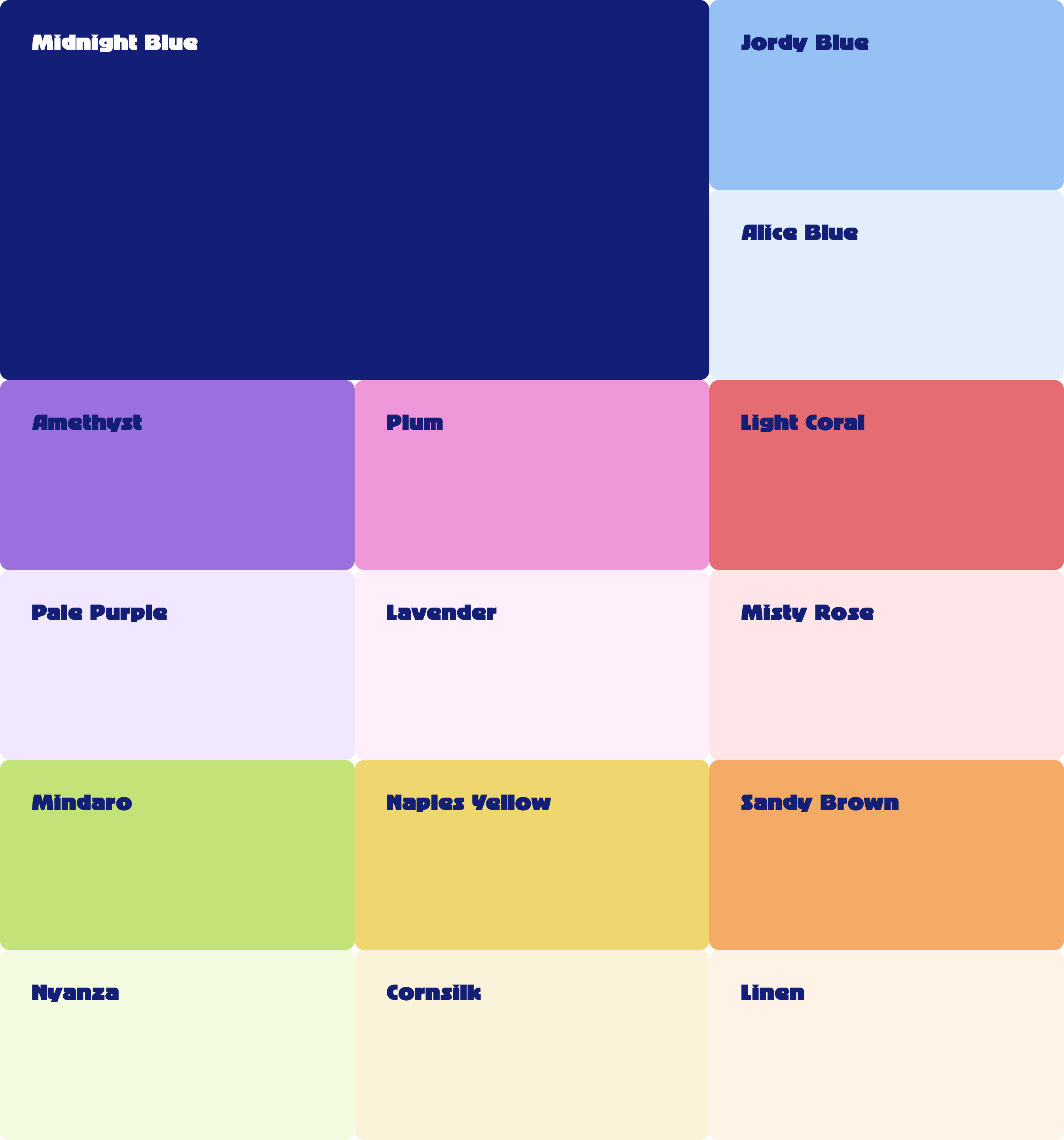
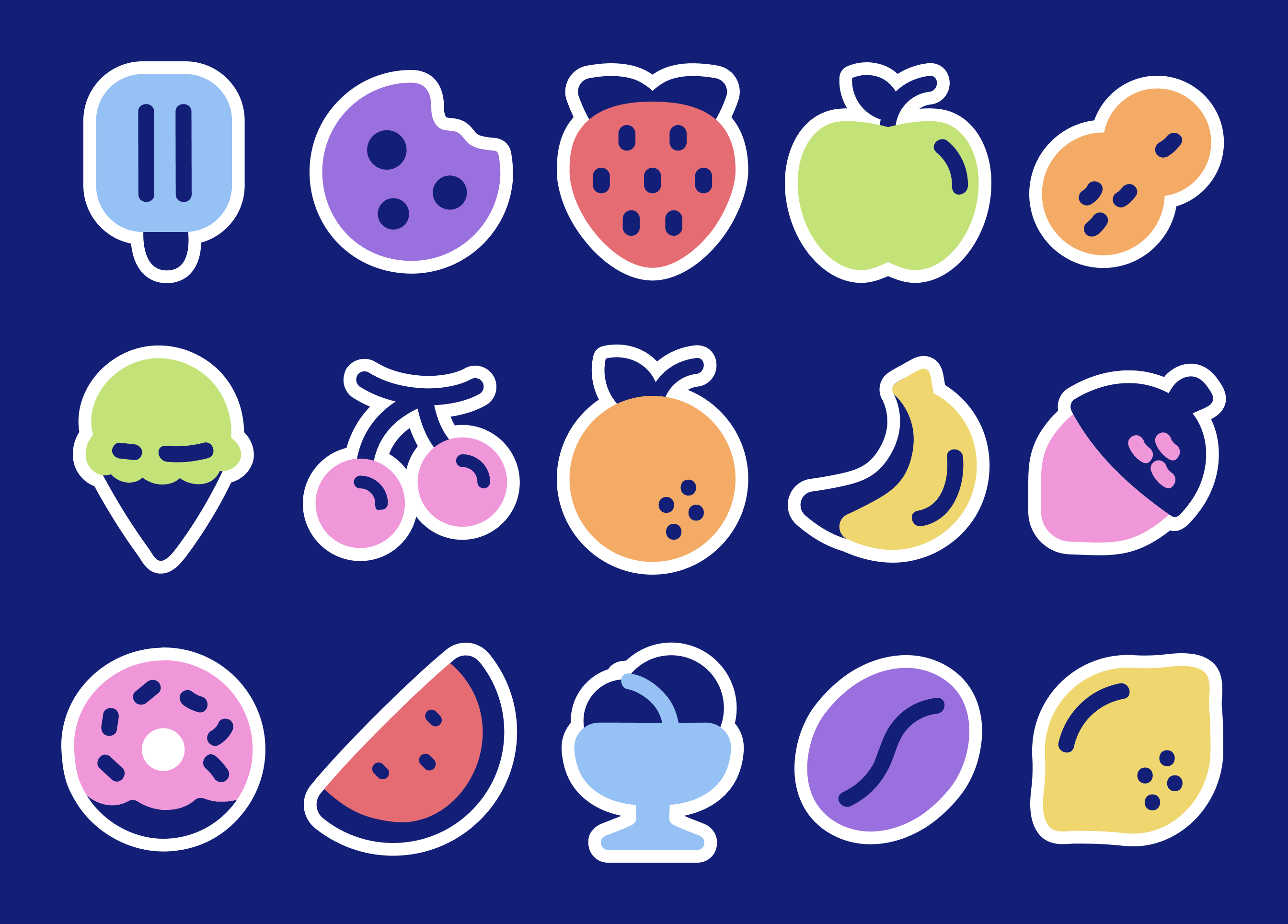
The Molly! identity system uses a geometric cow mascot with five expression variations, paired with a custom wordmark featuring hand-lettered elements that reference farm signage. Each ice cream flavor gets its own dedicated color creating an intuitive identification system that makes flavors instantly recognizable. The typography pairs a bold condensed display font for headlines with a clean sans-serif for body text, while the container design uses flavor-coded bands that create visual unity when displayed together and reduce printing costs by using consistent white bases.

Packaging Design
We created a modular container system where flavor-specific color bands wrap around consistent white bases. This approach reduces printing costs while maximizing visual impact when products are grouped together in retail displays.
See more work.
Miska
Strategy
Branding
PACKAGING
MERCH
View Case
→
Guapp
Strategy
Branding
website
App
View Case
→

Vortex
Strategy
Branding
website
marketing
View Case
→

Want to work together?
Book a free 30-minute consultation. We'll talk about your project, answer your questions, and see if we're a good fit.
BOOK A CALL

MENU
HOME
WORK
SERVICES
ABOUT
GET IN TOUCH
Ig: @TeenyStudio
Ln: @Teeny-Studio
Molly!
Molly! is an organic ice cream brand that crafts premium frozen treats using locally sourced milk from their own farm cows. They believe great ice cream starts with happy cows and ends with happy customers.
PROJECT SCOPE
Logo Design, Brand Identity, Packaging Design, Social Media Design, Business Stationery
TEAM
3 Founders, 1 Marketing Lead, 1 Copywriter, 1 Designer
INDUSTRY
Organic Food & Dairy Products
YEAR
2025
Context
Molly! was using plain white containers and generic stickers for their locally-sold ice cream. The owners wanted professional branding that matched their personality without losing the approachable, fun vibe that made their product special. They needed packaging that could scale from farmer's market stands to retail shelves.
What’s been done?
We built a complete brand system from naming to packaging, focusing on flavor differentiation and shelf presence.
01
Brand Strategy
We positioned the brand around local authenticity and joyful experiences rather than competing on health benefits. The strategy centered on the cow mascot as a trust symbol while using humor and color to differentiate from clinical dairy competitors.
02
Brand Design
The identity uses a geometric cow mascot with five expression variations for different contexts. The wordmark incorporates hand-lettered elements that reference farm signage, while maintaining scalability for small format applications.
03
Packaging Design
We created a modular container system where flavor-specific color bands wrap around consistent white bases. This approach reduces printing costs while maximizing visual impact when products are grouped together in retail displays.
Visual Identity
The Molly! identity system uses a geometric cow mascot with five expression variations, paired with a custom wordmark featuring hand-lettered elements that reference farm signage. Each ice cream flavor gets its own dedicated color creating an intuitive identification system that makes flavors instantly recognizable. The typography pairs a bold condensed display font for headlines with a clean sans-serif for body text, while the container design uses flavor-coded bands that create visual unity when displayed together and reduce printing costs by using consistent white bases.
Packaging Design
We created a modular container system where flavor-specific color bands wrap around consistent white bases. This approach reduces printing costs while maximizing visual impact when products are grouped together in retail displays.
See more work.
Miska
Strategy
Branding
PACKAGING
MERCH
View Case
→
Guapp
Strategy
Branding
website
App
View Case
→
Vortex
Strategy
Branding
website
marketing
View Case
→
Want to work together?
Book a free 30-minute consultation. We'll talk about your project, answer your questions, and see if we're a good fit.
BOOK A CALL