Miška
Miška is a Slovenian wine brand that makes wine selection approachable through playful storytelling and character-driven labels.
PROJECT SCOPE
Logo Design, Brand Identity, Packaging Design, Label Design, Business Stationery
TEAM
1 Founder, 1 Strategist, 1 Copywriter, 1 Designer
INDUSTRY
Wine & Alcoholic Beverages
YEAR
2025
Context
Miška had a strong vision without cohesive brand story to connect with customers unfamiliar with Slovenian wines. The winery needed an identity that could introduce Vipava Valley wines to new markets while maintaining authenticity. They wanted to stand out on crowded shelves without looking gimmicky or compromising the wine's credibility.
What’s been done?
We developed a complete brand ecosystem from mascot creation to menu design, building a narrative-driven identity.
01
Brand Strategy
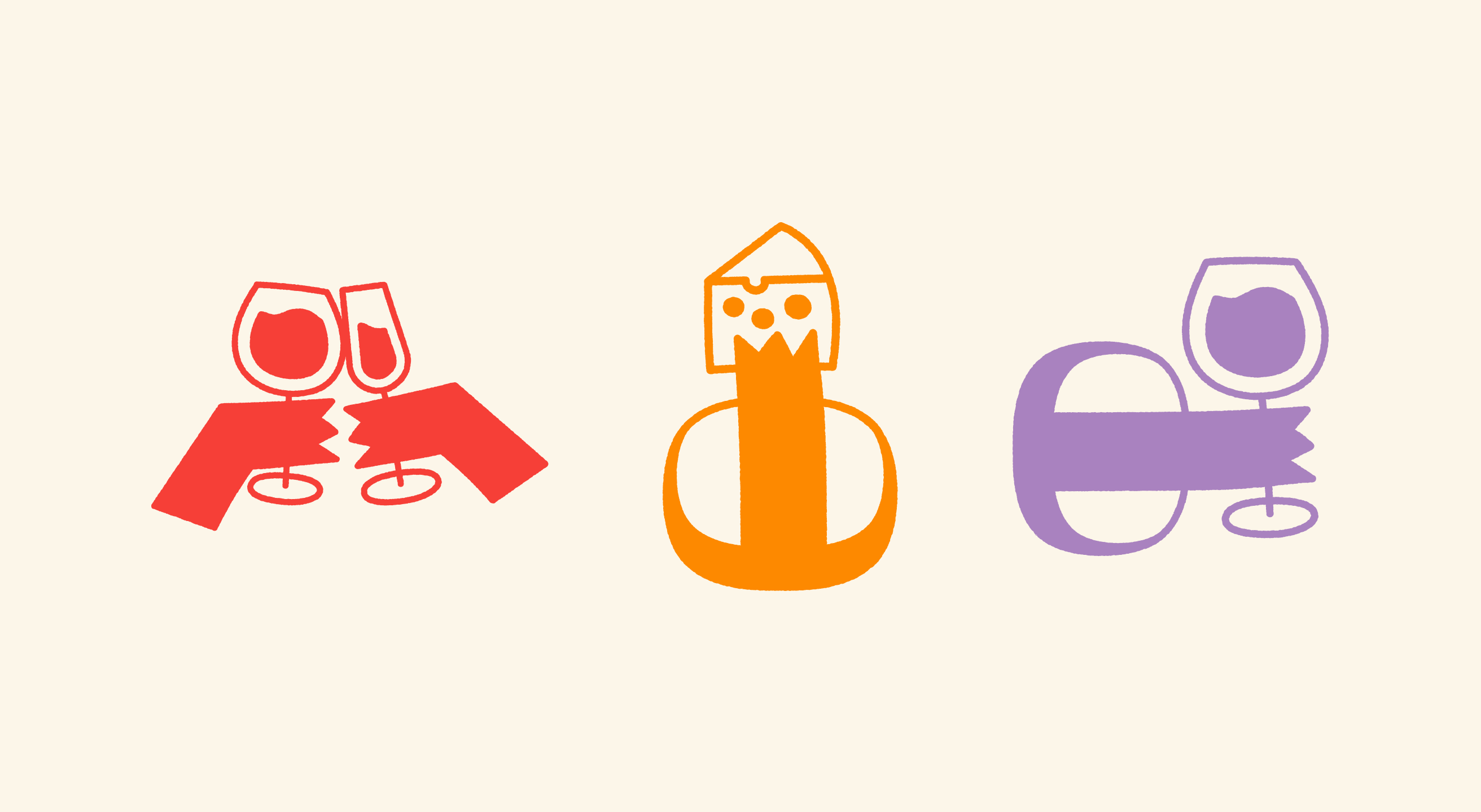
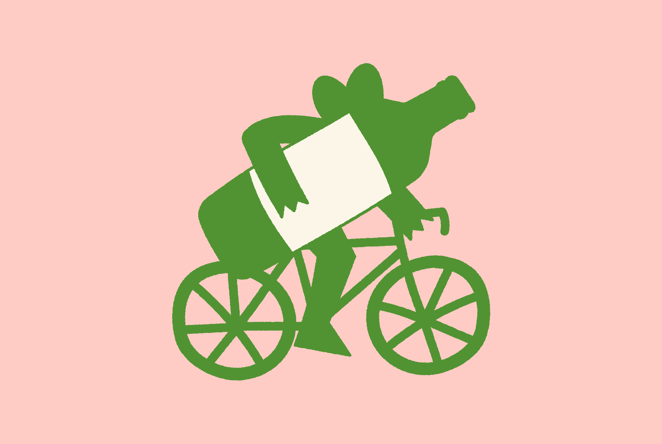
We positioned Miška around discovery and approachability rather than traditional wine sophistication. The strategy used a mouse mascot with distinct personalities to humanize each wine variety, making selection less about expertise and more about finding your match.
02
Brand Design
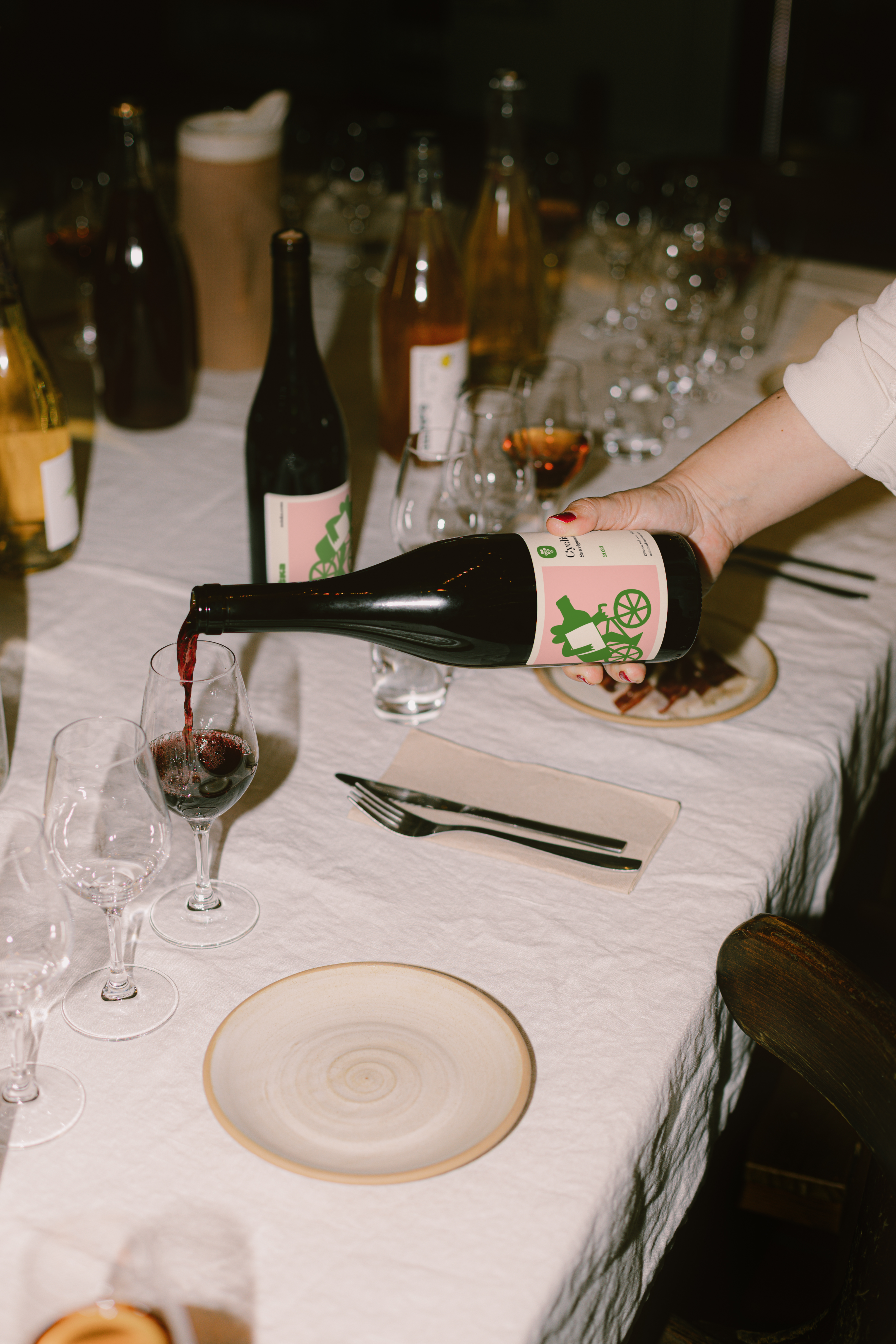
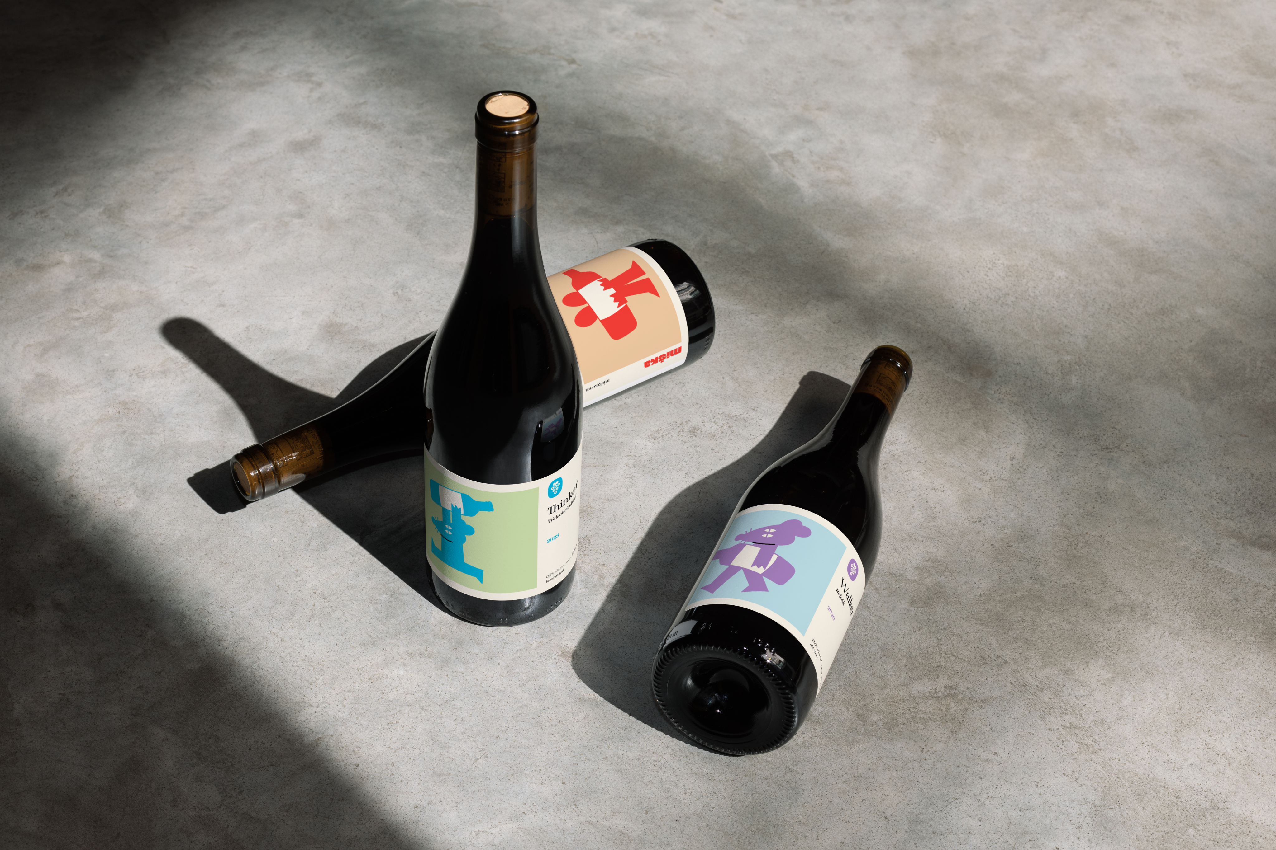
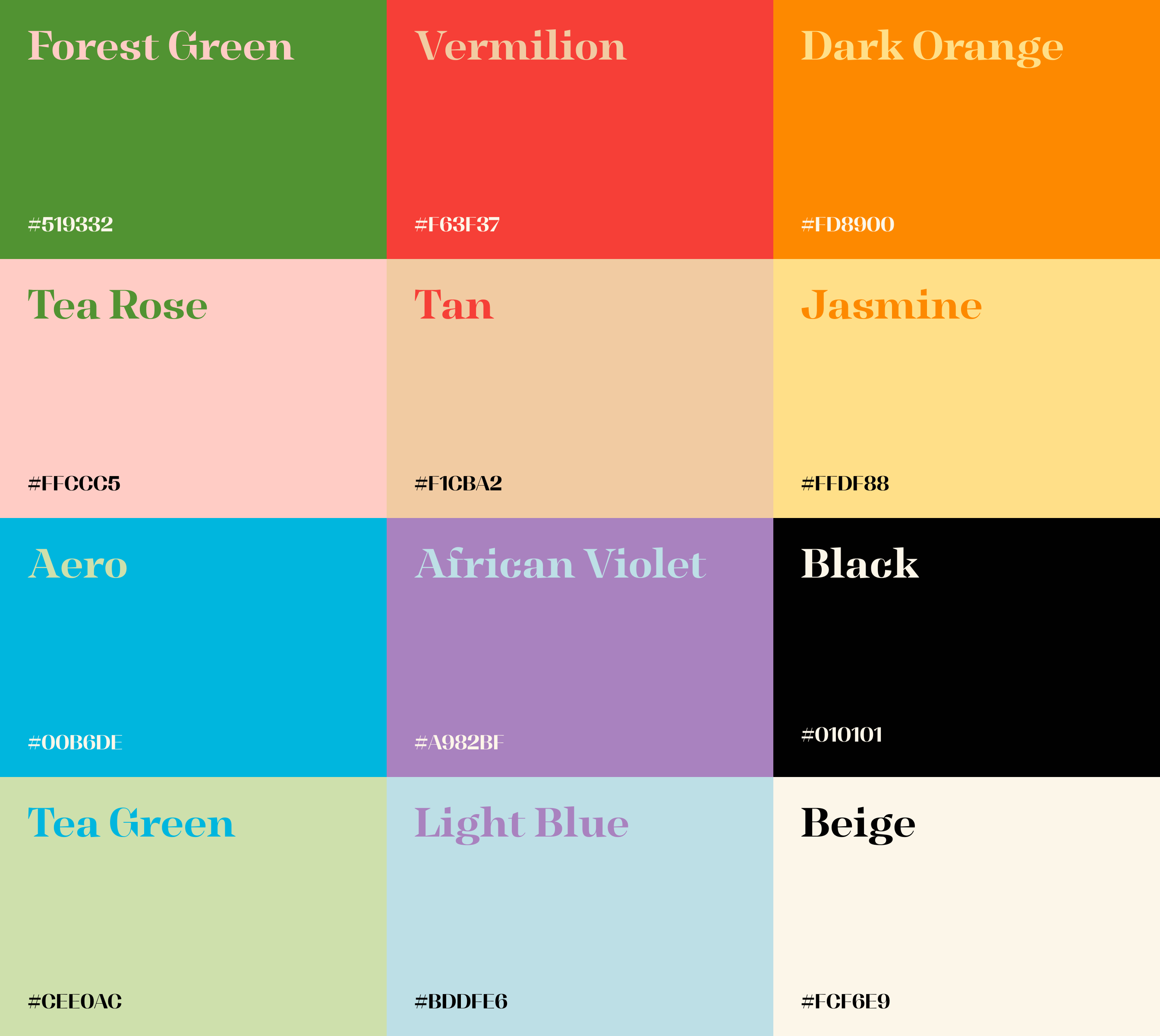
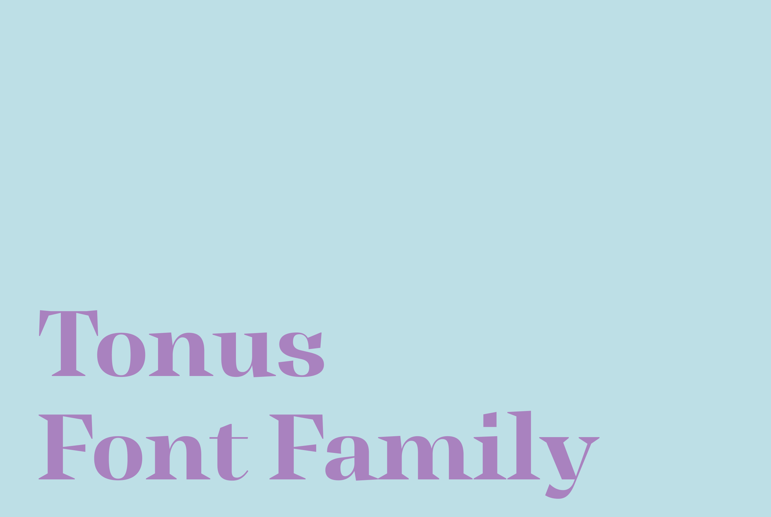
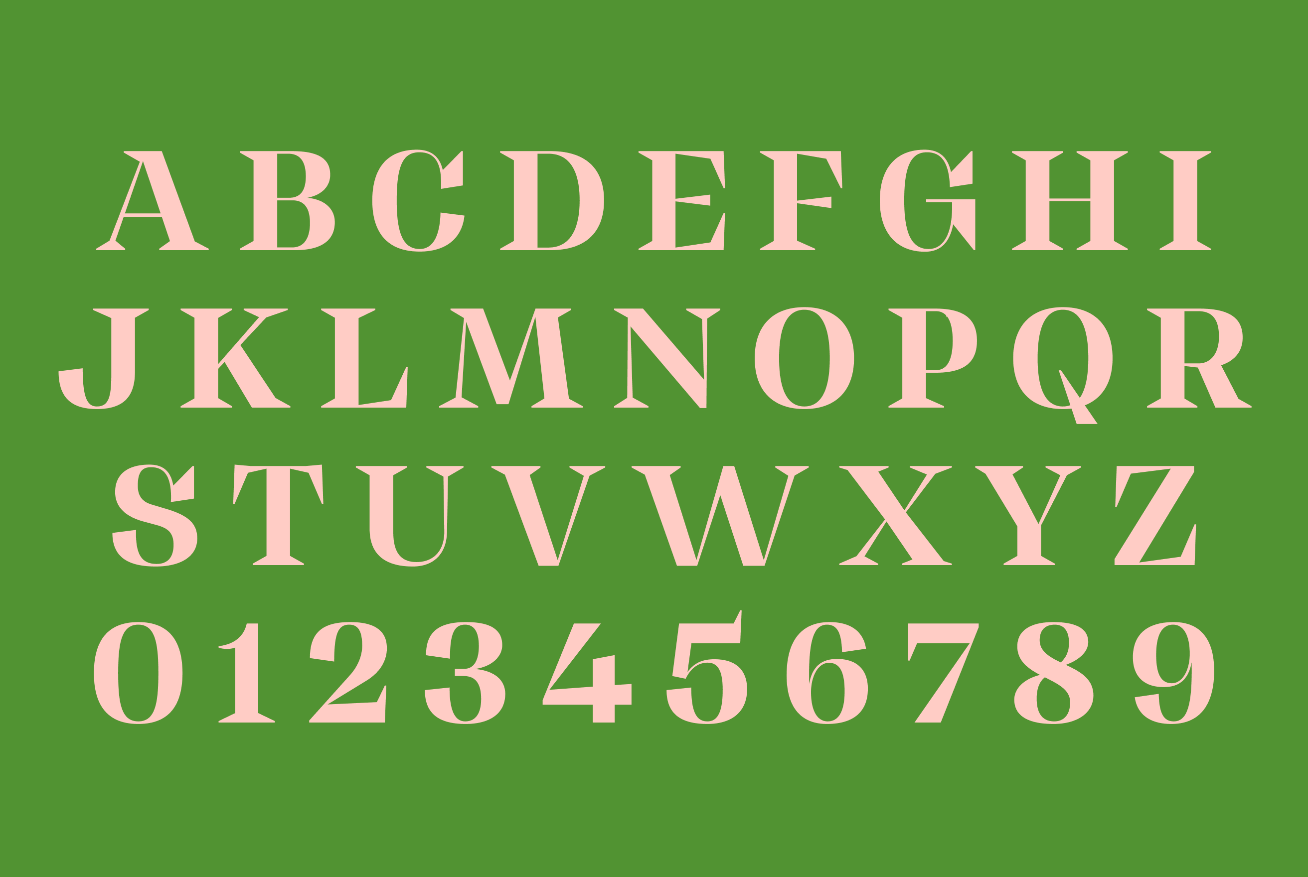
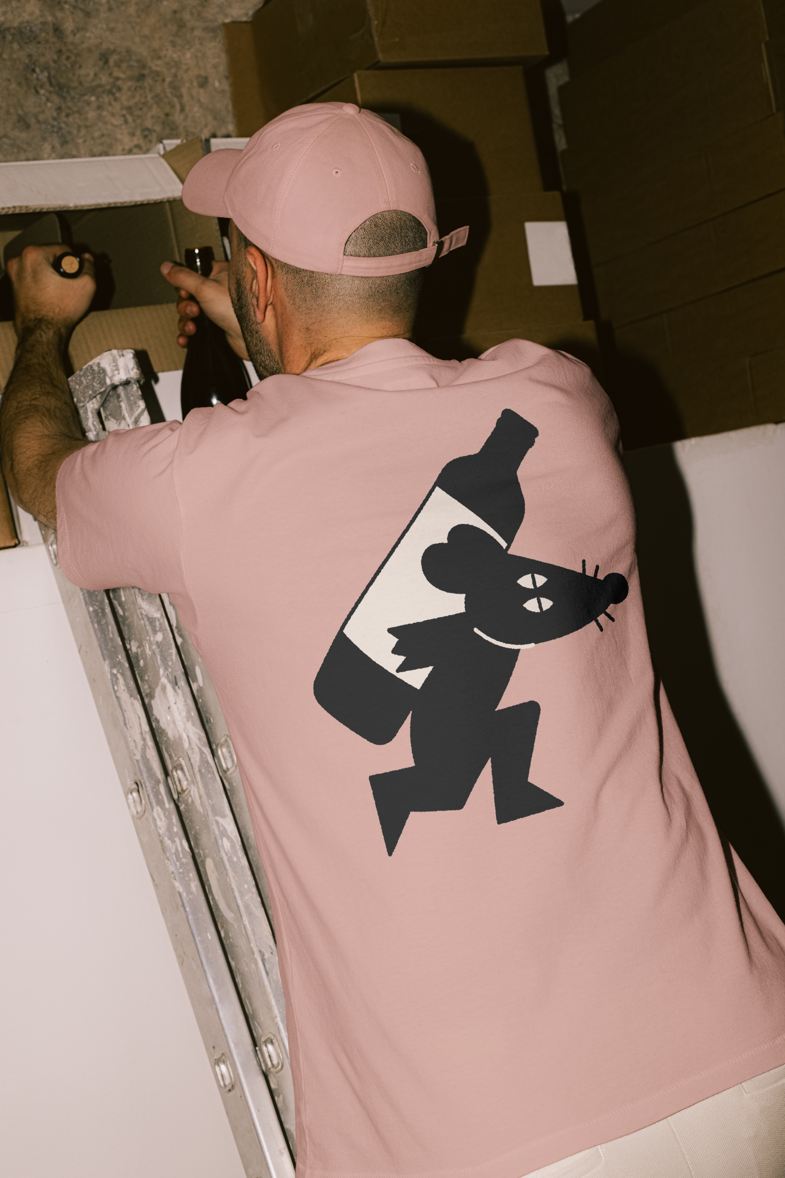
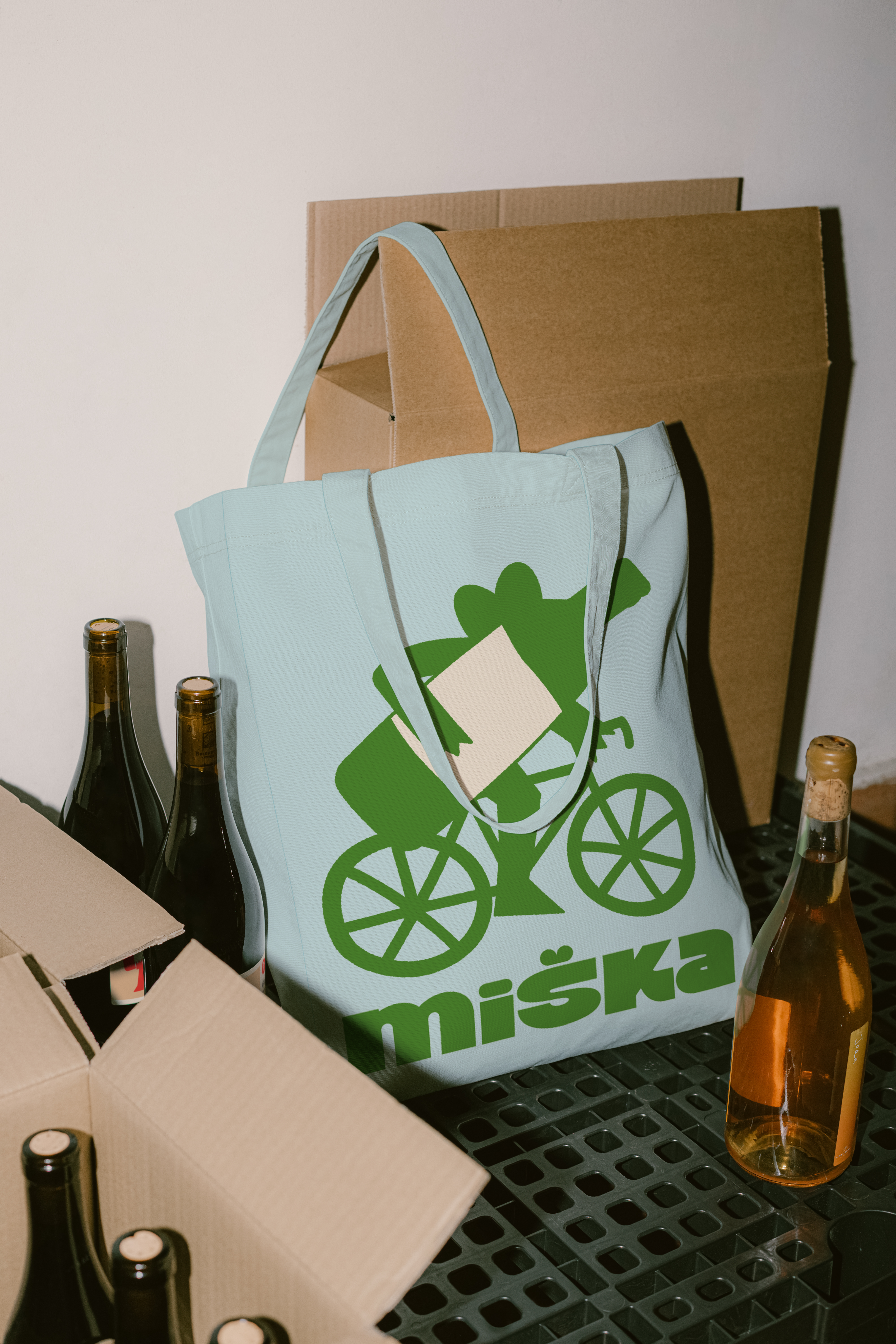
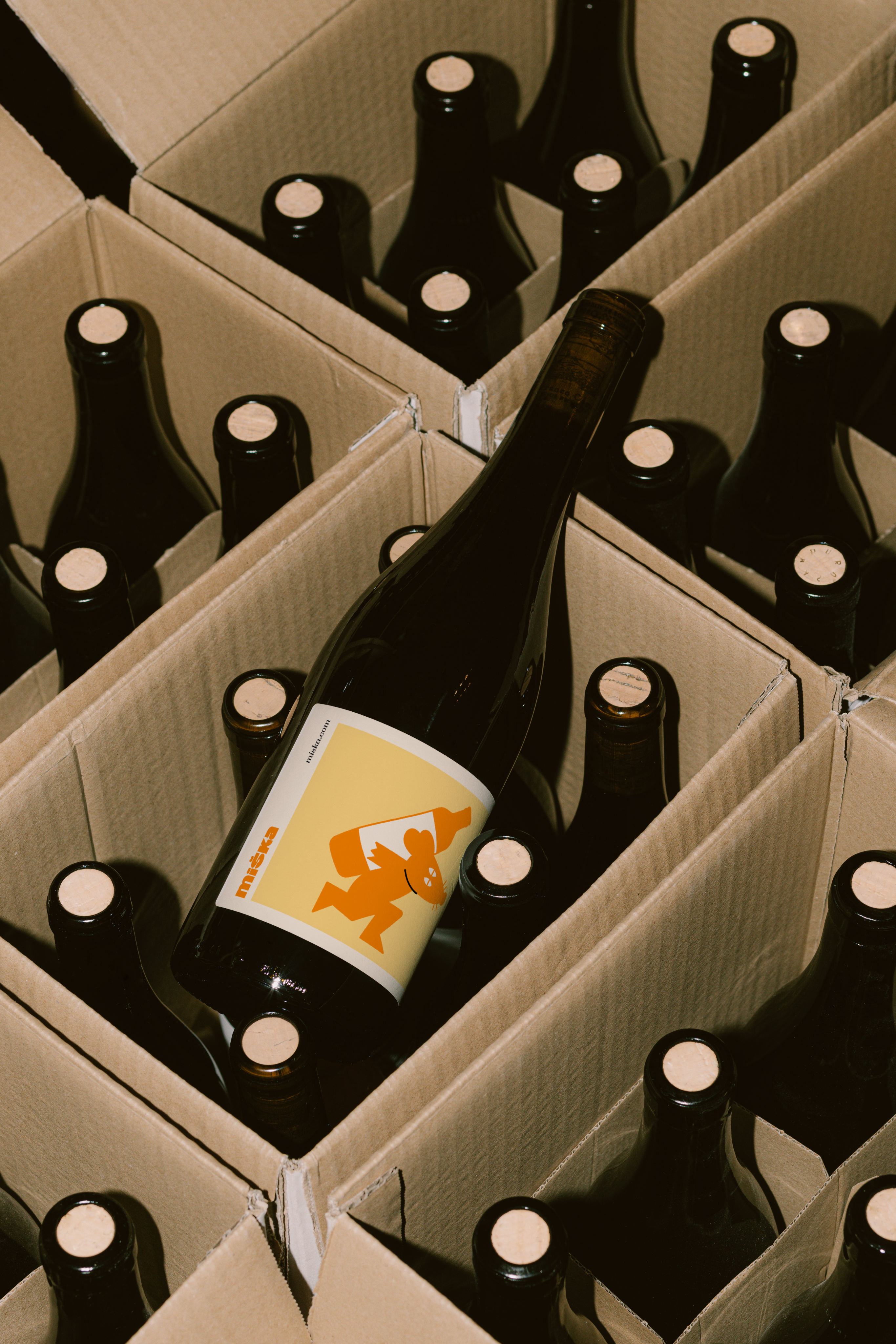
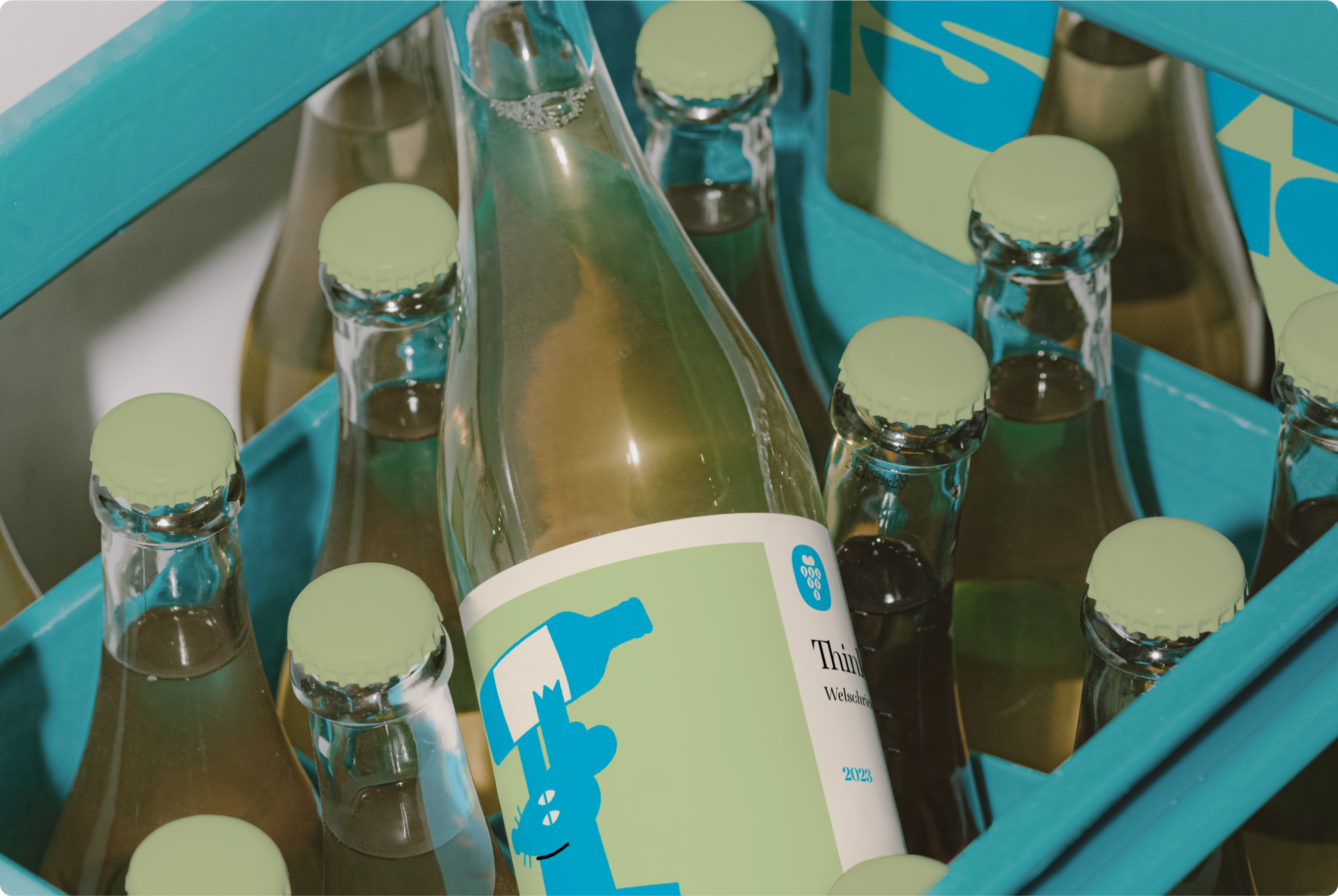
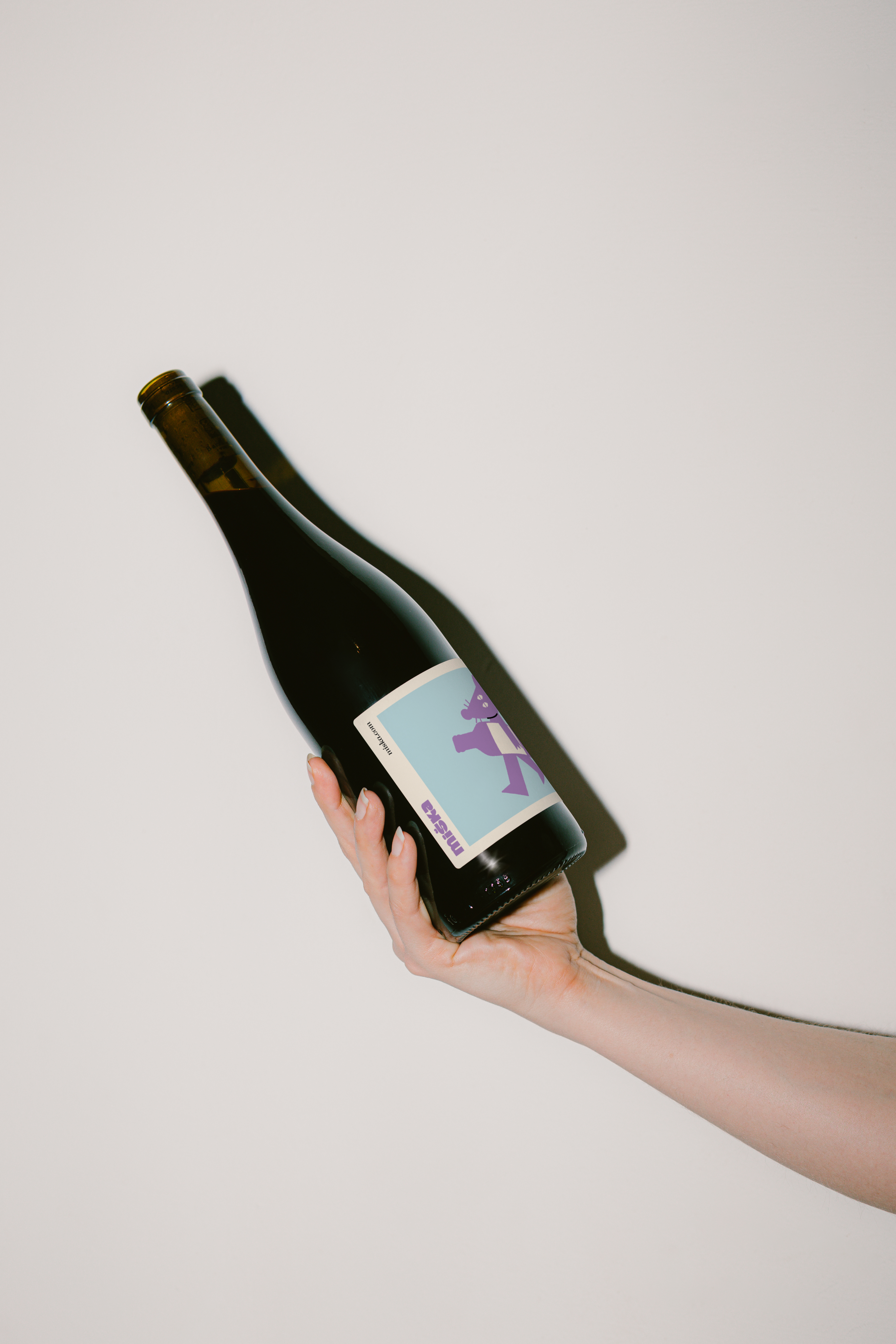
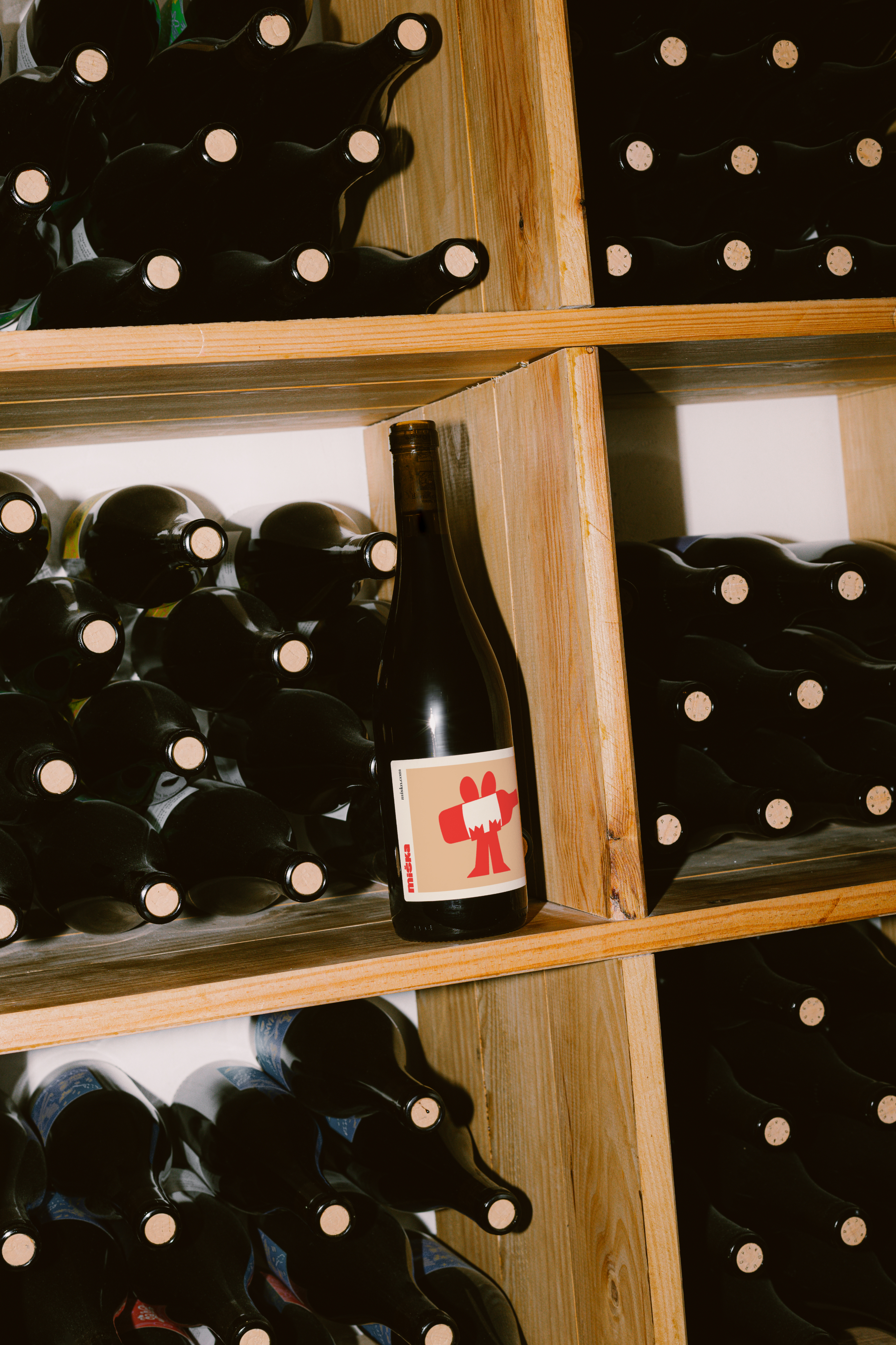
The identity features a geometric mouse mascot with five character variations (Cyclist, Guard, Dancer, Thinker, Walker) representing different wine profiles. The wordmark balances playfulness with credibility, while the color system creates instant variety recognition across the product line.
03
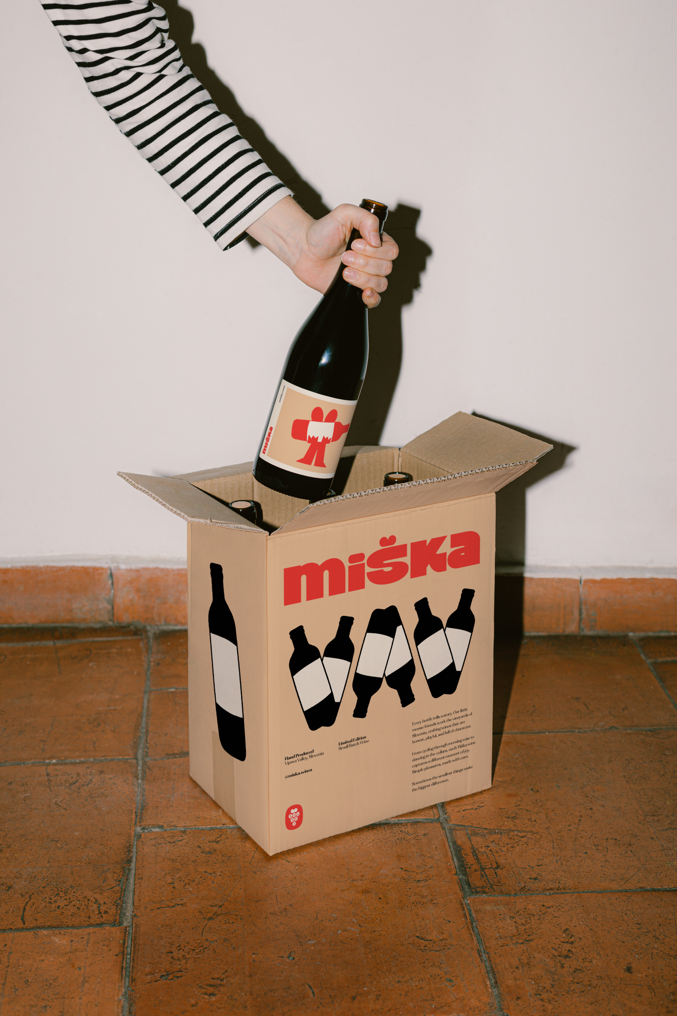
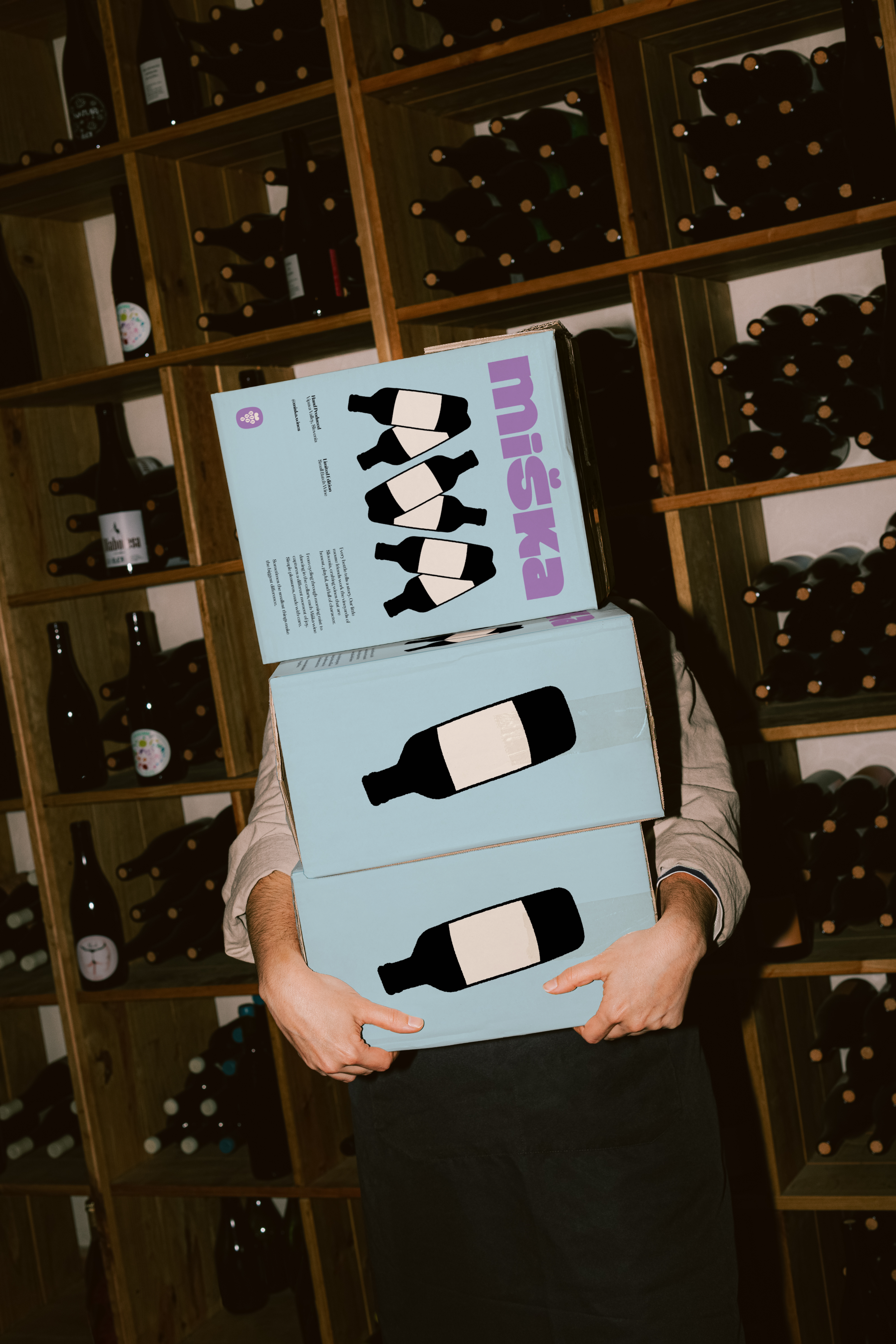
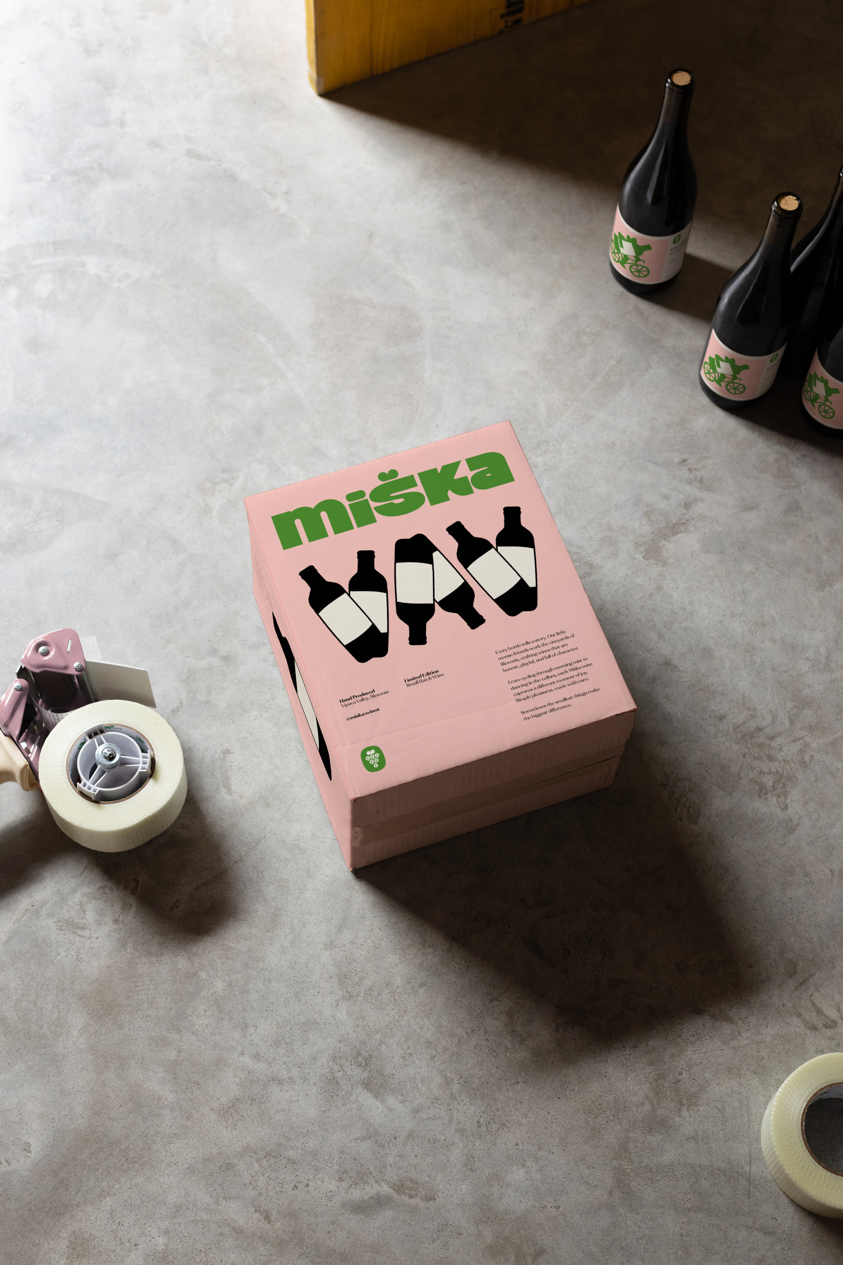
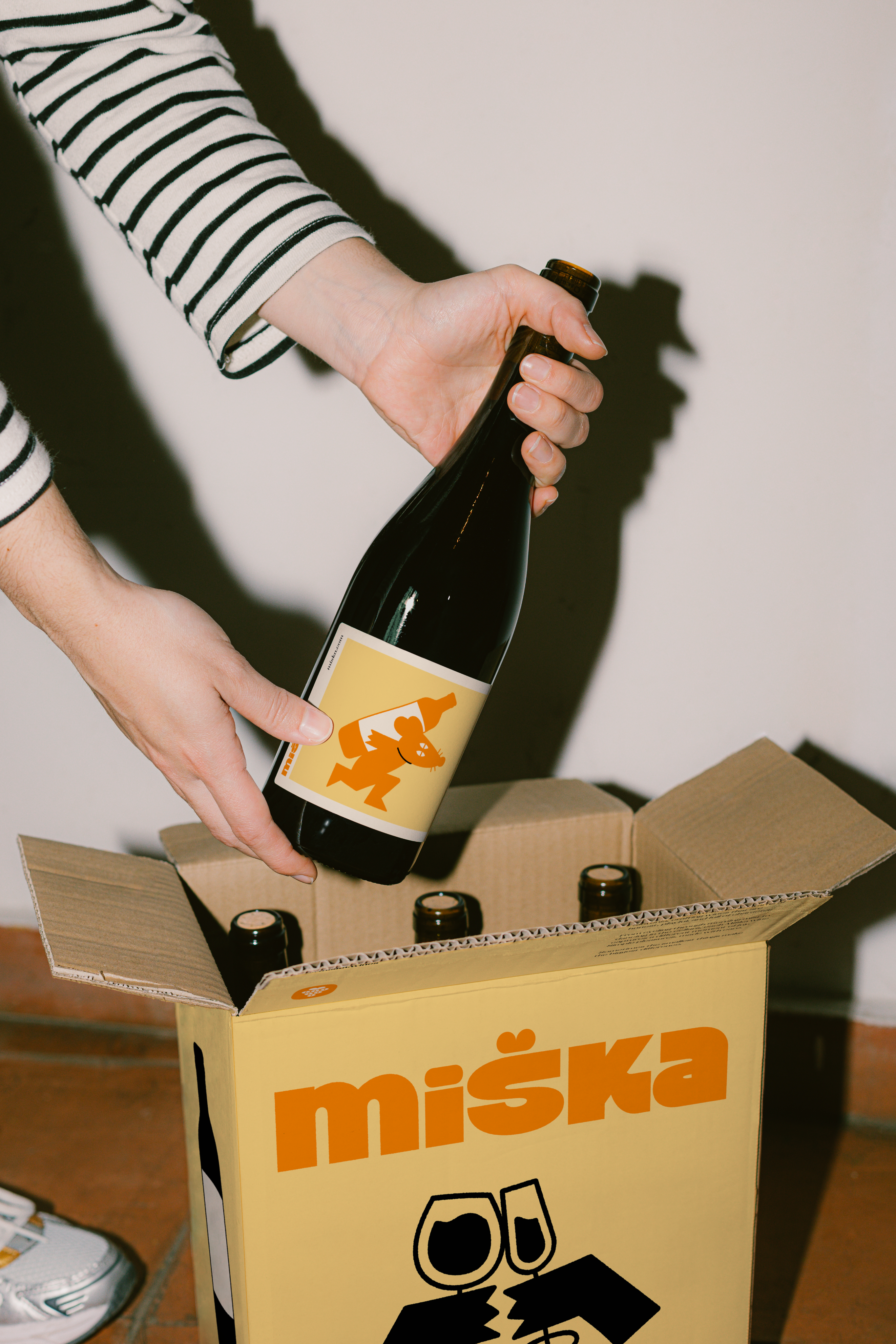
Packaging Design
We designed a color-coded box and label system where each wine personality gets its own distinctive palette. This visual hierarchy helps customers navigate selections quickly while the character illustrations add storytelling elements that encourage exploration of the full range.
Visual Identity
The Miška system uses an organic mouse mascot with five distinct personalities, each representing a different wine character and flavor profile. Color coding runs throughout the entire brand experience - from labels to menus to apparel - creating an intuitive navigation system. Typography combines a bold display font for wine names with clean, readable text for descriptions. Every touchpoint from business cards to gift boxes maintains consistent visual language while illustrations add warmth and approachability without sacrificing sophistication.


Packaging Design
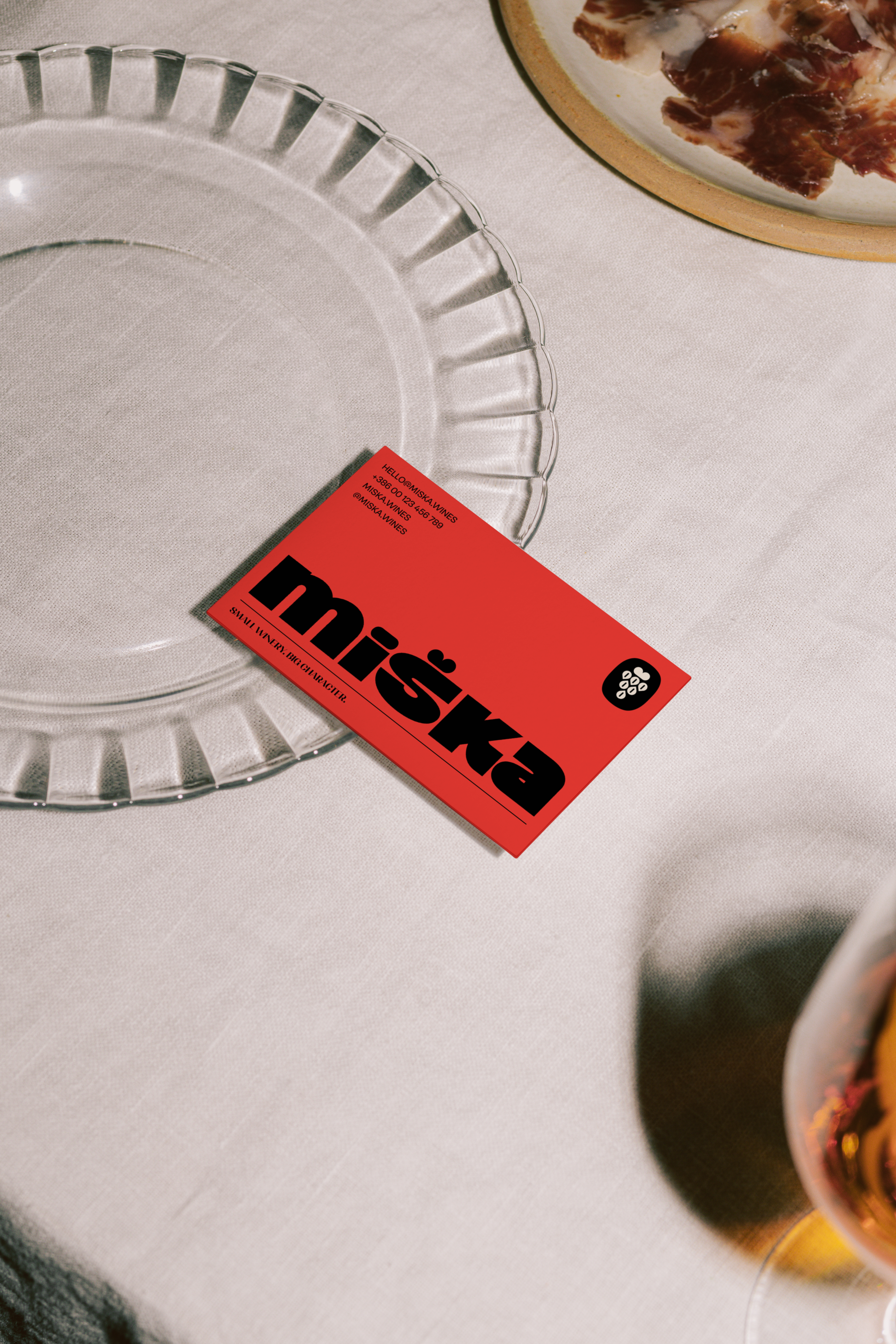
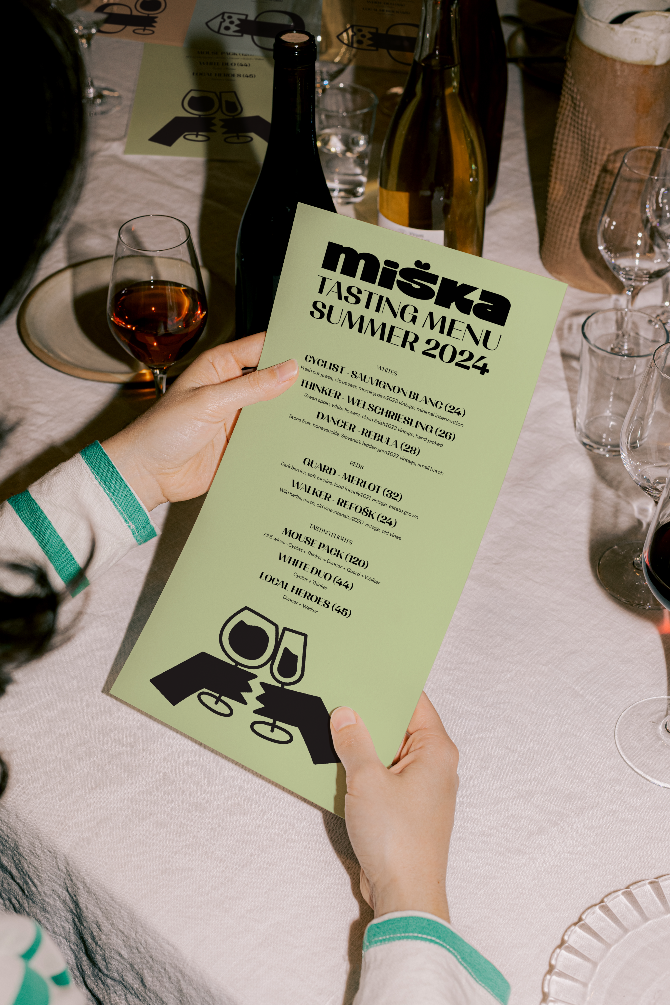
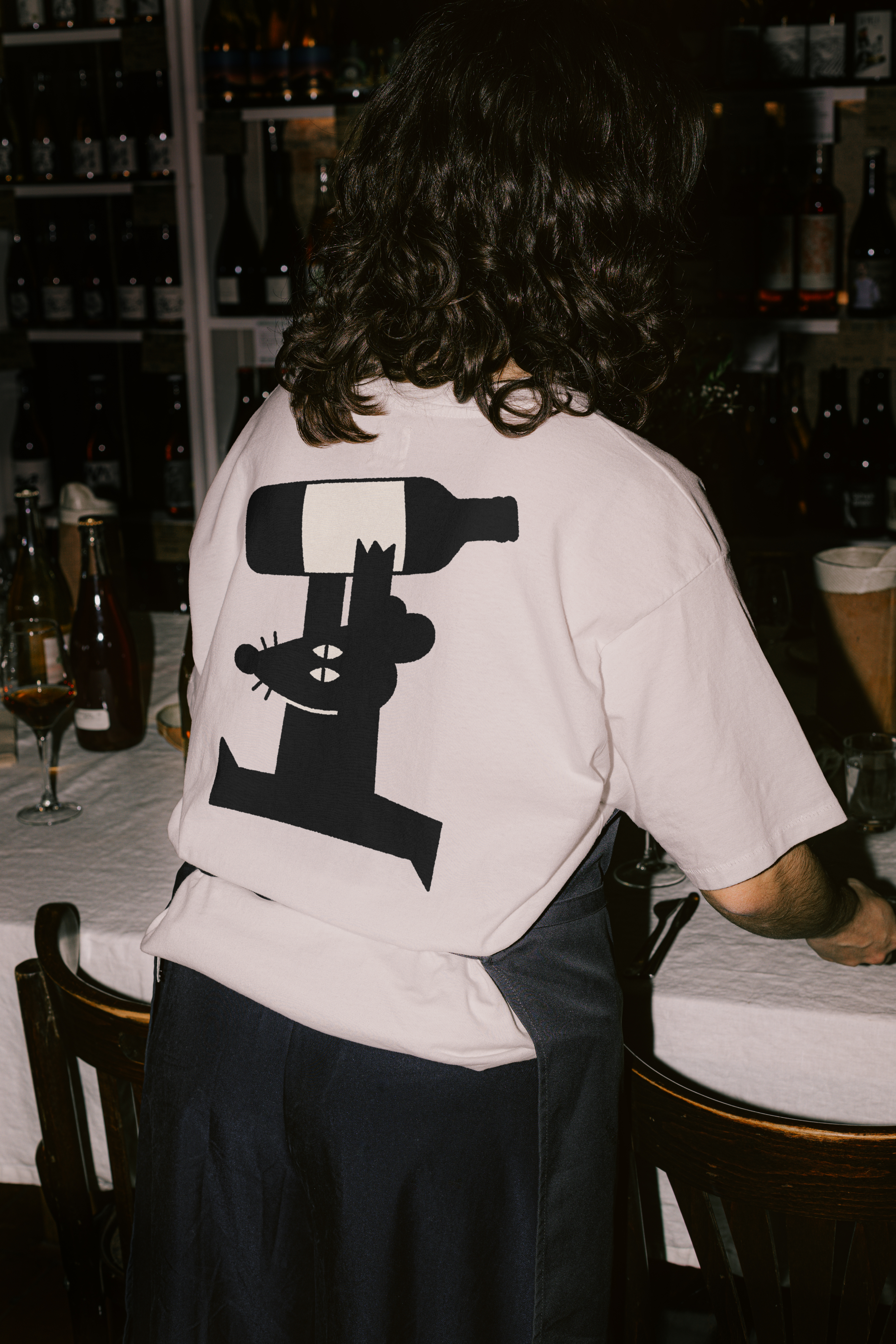
Beyond packaging, we created menus that guide tasting experiences, apparel for winery staff, business cards that people actually keep, and promotional materials for events. Each application reinforces the brand story while serving specific functional needs across the customer journey.
See more work.
Gleam
Strategy
Branding
App
Design System
View Case
→
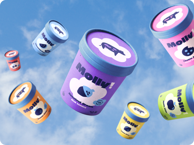
Molly
Strategy
Branding
PACKAGING
View Case
→

Vortex
Strategy
Branding
website
marketing
View Case
→


MENU
HOME
WORK
SERVICES
ABOUT
GET IN TOUCH
Ig: @TeenyStudio
Ln: @Teeny-Studio
Miška
Miška is a Slovenian wine brand that makes wine selection approachable through playful storytelling and character-driven labels.
PROJECT SCOPE
Logo Design, Brand Identity, Packaging Design, Label Design, Business Stationery
TEAM
1 Founder, 1 Strategist, 1 Copywriter, 1 Designer
INDUSTRY
Wine & Alcoholic Beverages
YEAR
2025
Context
Miška had a strong vision without cohesive brand story to connect with customers unfamiliar with Slovenian wines. The winery needed an identity that could introduce Vipava Valley wines to new markets while maintaining authenticity. They wanted to stand out on crowded shelves without looking gimmicky or compromising the wine's credibility.
What’s been done?
We developed a complete brand ecosystem from mascot creation to menu design, building a narrative-driven identity.
01
Brand Strategy
We positioned Miška around discovery and approachability rather than traditional wine sophistication. The strategy used a mouse mascot with distinct personalities to humanize each wine variety, making selection less about expertise and more about finding your match.
02
Brand Design
The identity features a geometric mouse mascot with five character variations (Cyclist, Guard, Dancer, Thinker, Walker) representing different wine profiles. The wordmark balances playfulness with credibility, while the color system creates instant variety recognition across the product line.
03
Packaging Design
We designed a color-coded box and label system where each wine personality gets its own distinctive palette. This visual hierarchy helps customers navigate selections quickly while the character illustrations add storytelling elements that encourage exploration of the full range.
Visual Identity
The Miška system uses an organic mouse mascot with five distinct personalities, each representing a different wine character and flavor profile. Color coding runs throughout the entire brand experience - from labels to menus to apparel - creating an intuitive navigation system. Typography combines a bold display font for wine names with clean, readable text for descriptions. Every touchpoint from business cards to gift boxes maintains consistent visual language while illustrations add warmth and approachability without sacrificing sophistication.
Packaging Design
Beyond packaging, we created menus that guide tasting experiences, apparel for winery staff, business cards that people actually keep, and promotional materials for events. Each application reinforces the brand story while serving specific functional needs across the customer journey.
See more work.
Gleam
Strategy
Branding
App
Design System
View Case
→
Molly
Strategy
Branding
PACKAGING
View Case
→
Vortex
Strategy
Branding
website
marketing
View Case
→

Want to work together?
Book a free 30-minute consultation. We'll talk about your project, answer your questions, and see if we're a good fit.
BOOK A CALL
Miška
Miška is a Slovenian wine brand that makes wine selection approachable through playful storytelling and character-driven labels.
PROJECT SCOPE
Logo Design, Brand Identity, Packaging Design, Label Design, Business Stationery
TEAM
1 Founder, 1 Strategist, 1 Copywriter, 1 Designer
INDUSTRY
Wine & Alcoholic Beverages
YEAR
2025
Context
Miška had a strong vision without cohesive brand story to connect with customers unfamiliar with Slovenian wines. The winery needed an identity that could introduce Vipava Valley wines to new markets while maintaining authenticity. They wanted to stand out on crowded shelves without looking gimmicky or compromising the wine's credibility.
What’s been done?
We developed a complete brand ecosystem from mascot creation to menu design, building a narrative-driven identity.
01
Brand Strategy
We positioned Miška around discovery and approachability rather than traditional wine sophistication. The strategy used a mouse mascot with distinct personalities to humanize each wine variety, making selection less about expertise and more about finding your match.
02
Brand Design
The identity features a geometric mouse mascot with five character variations (Cyclist, Guard, Dancer, Thinker, Walker) representing different wine profiles. The wordmark balances playfulness with credibility, while the color system creates instant variety recognition across the product line.
03
Packaging Design
We designed a color-coded box and label system where each wine personality gets its own distinctive palette. This visual hierarchy helps customers navigate selections quickly while the character illustrations add storytelling elements that encourage exploration of the full range.
Visual Identity
The Miška system uses an organic mouse mascot with five distinct personalities, each representing a different wine character and flavor profile. Color coding runs throughout the entire brand experience - from labels to menus to apparel - creating an intuitive navigation system. Typography combines a bold display font for wine names with clean, readable text for descriptions. Every touchpoint from business cards to gift boxes maintains consistent visual language while illustrations add warmth and approachability without sacrificing sophistication.
Packaging Design
Beyond packaging, we created menus that guide tasting experiences, apparel for winery staff, business cards that people actually keep, and promotional materials for events. Each application reinforces the brand story while serving specific functional needs across the customer journey.
See more work.
Gleam
Strategy
Branding
App
Design System
View Case
→
Molly
Strategy
Branding
PACKAGING
View Case
→
Vortex
Strategy
Branding
website
marketing
View Case
→
Want to work together?
Book a free 30-minute consultation. We'll talk about your project, answer your questions, and see if we're a good fit.
BOOK A CALL