Guapp
Guapp is a mobile banking app built to make everyday finance simple, inclusive, and accessible for everyone through intuitive design and 24/7 multilingual support.
PROJECT SCOPE
Brand Strategy, Workshops, Visual Identity, Website Design, Mobile App Design, User Testing
TEAM
1 Co-Founder, 1 Project Manager, 1 Tech Lead, 1 Marketing Lead, 1 Strategist, 1 Business Analyst, 1 Designer, 4 Developers
INDUSTRY
Fintech Platform in Mobile Banking
YEAR
2025
Context
Guapp came to us with a strong product idea but no brand, no design direction, and an app still in early definition. We joined at the very beginning to create the brand strategy and identity. As the partnership grew, we took on the full design scope, shaping the product, creating the design system, and delivering a consistent, scalable experience across all digital and marketing touchpoints.
What’s been done?
To build Guapp from zero to launch, we defined the brand, designed the full product experience, and created a scalable design system for the app.
01
Brand Strategy
We led two structured workshops. The first focused on defining visual tone, audience perception, and personality traits. The second introduced visual directions, shaped by the first session. Through co-creation, we aligned on a brand foundation that felt both distinctive and credible in the fintech space.
02
Brand Design
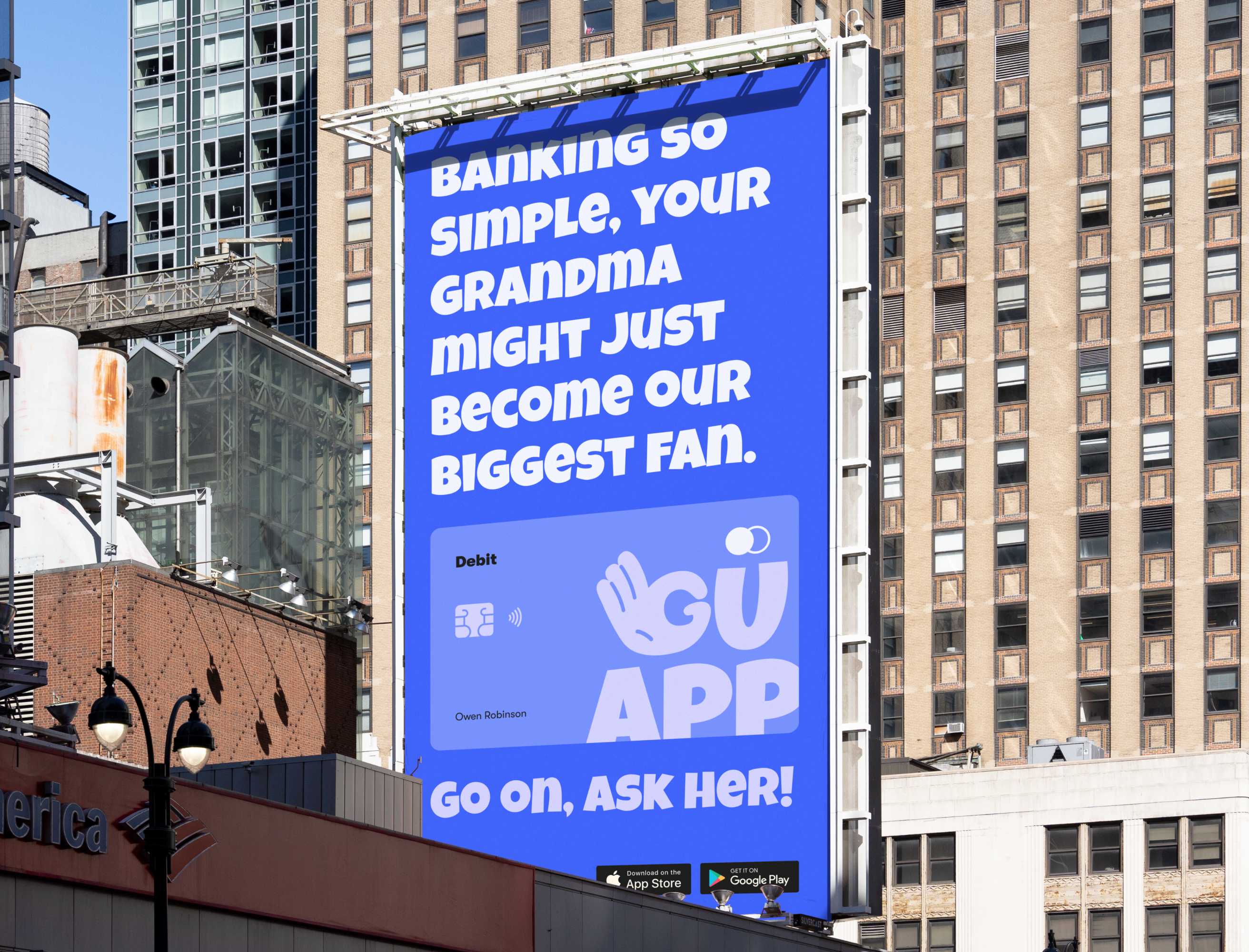
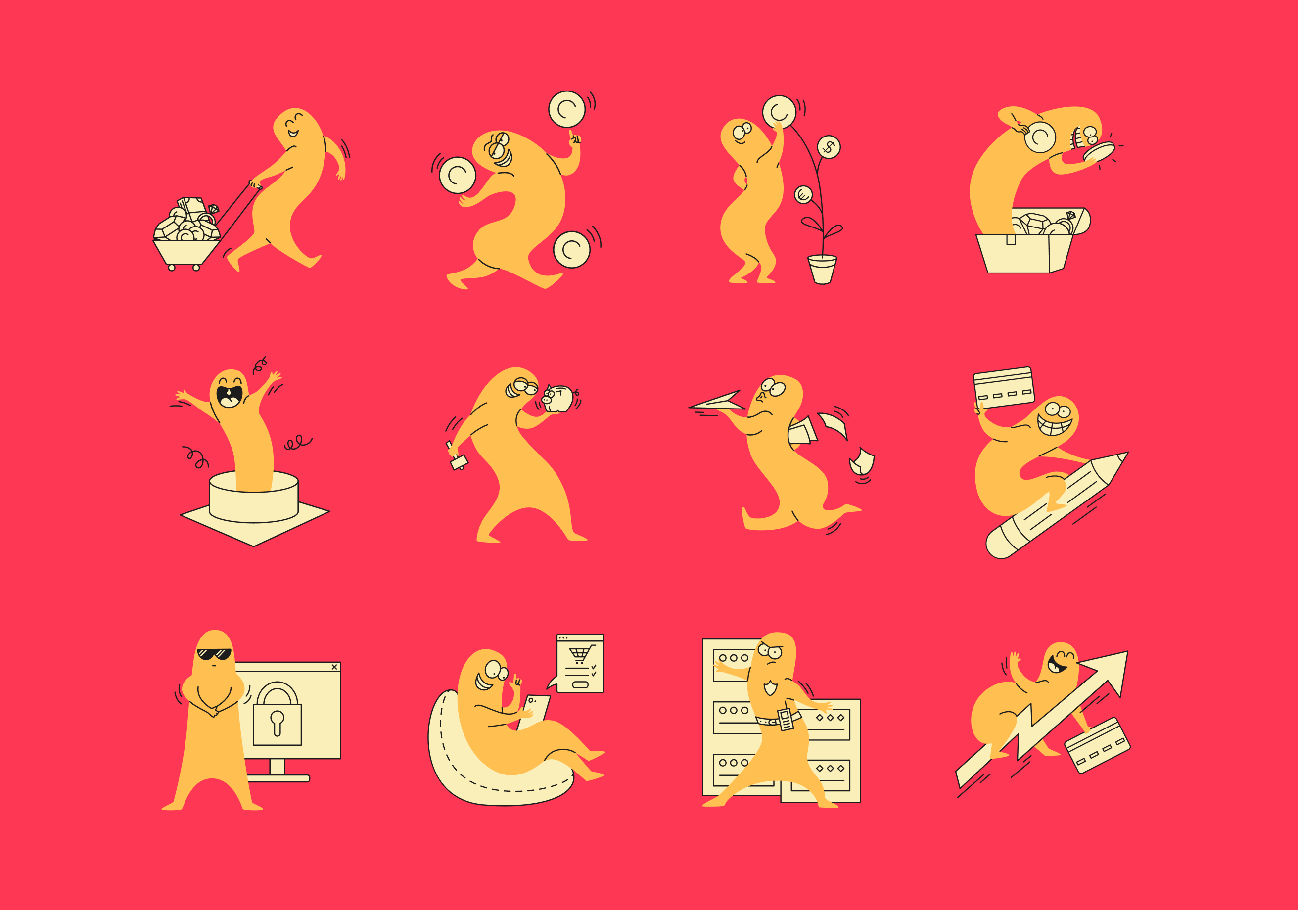
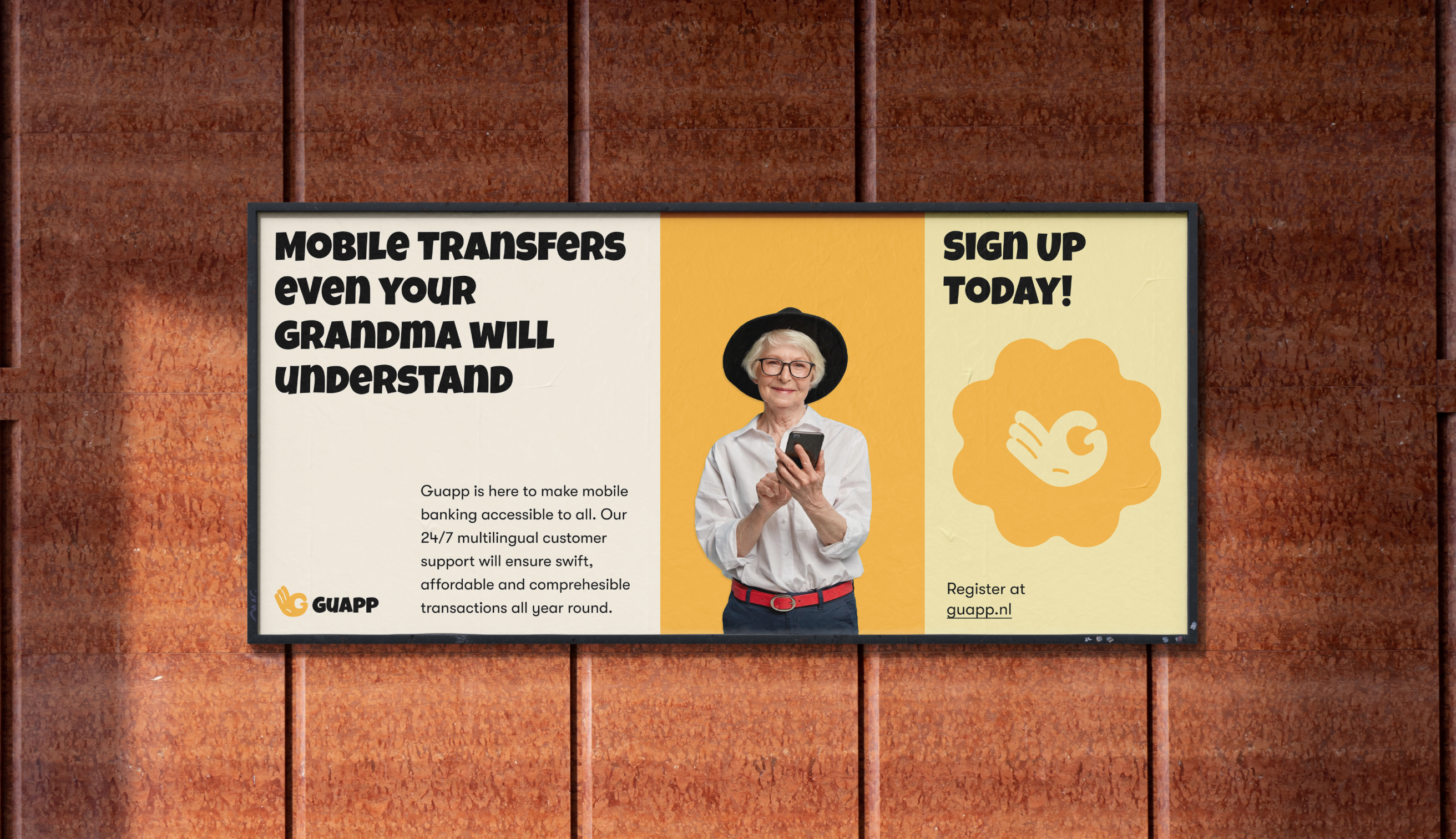
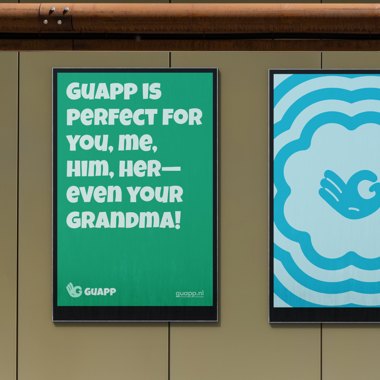
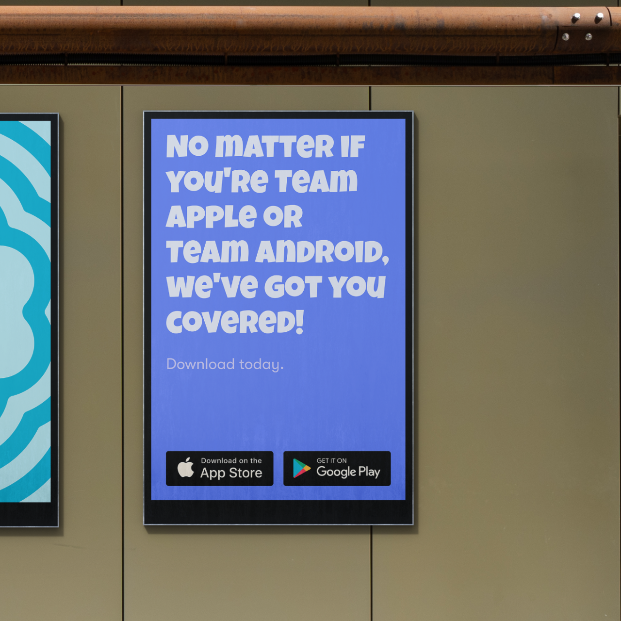
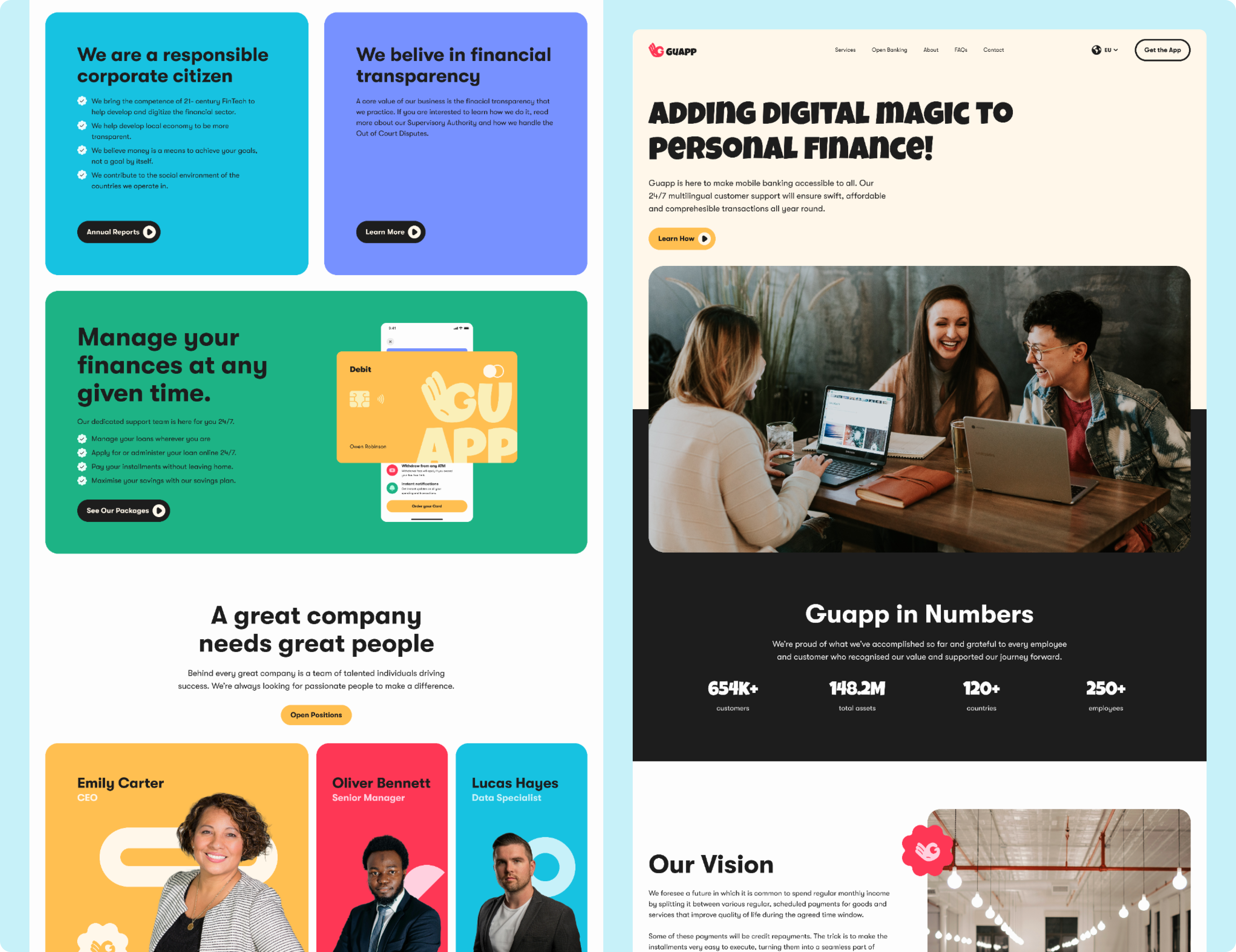
We developed a dual identity system. One bold and expressive for marketing, digital presence and merch. One cleaner and more minimal for the in-app experience. This approach kept our brand true to itself, communication engaging, while ensuring clarity and ease of use in the product.
03
Product Design
We designed the entire app from concept to high-fidelity screens. The MVP was tested early with 20 target users using interactive wireframes. Final designs were validated through usability testing, resulting in a clean, confident experience fit for a multilingual financial platform.
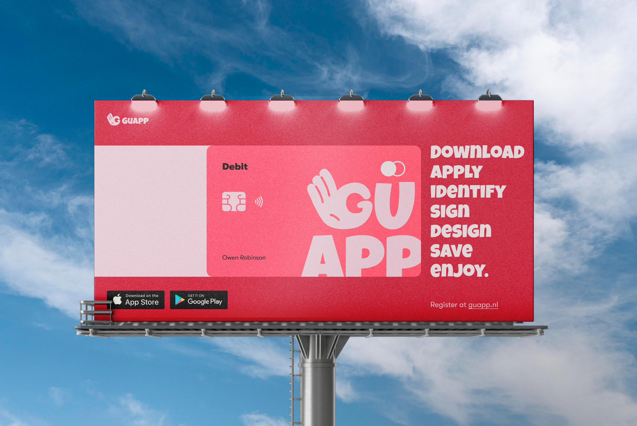
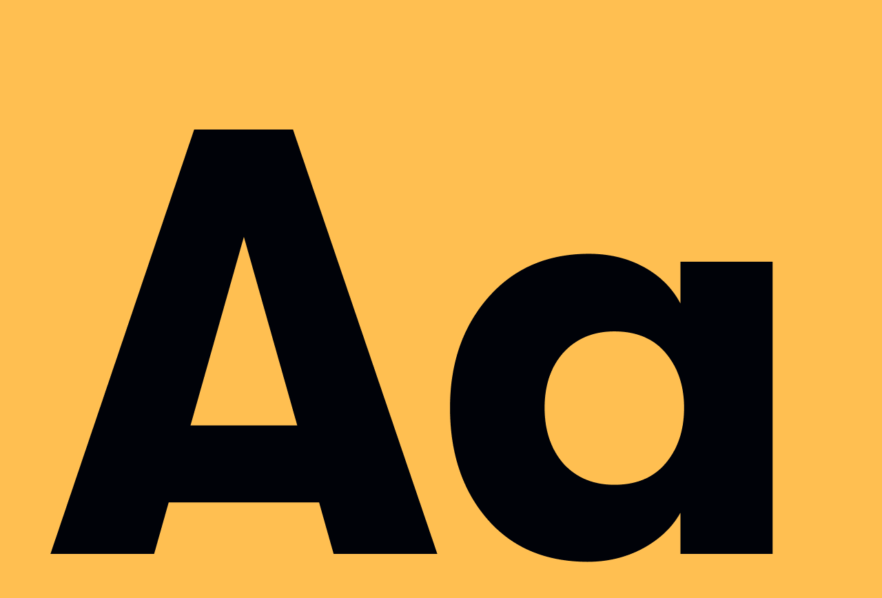
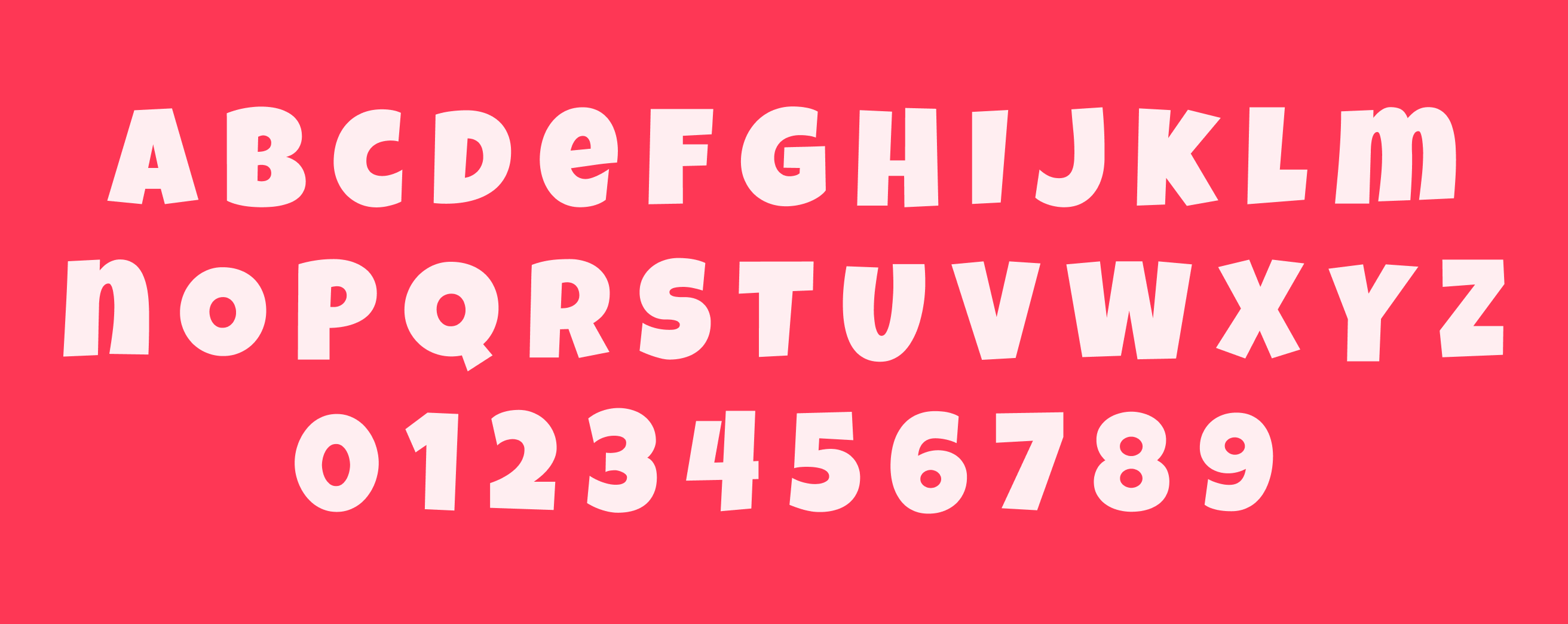
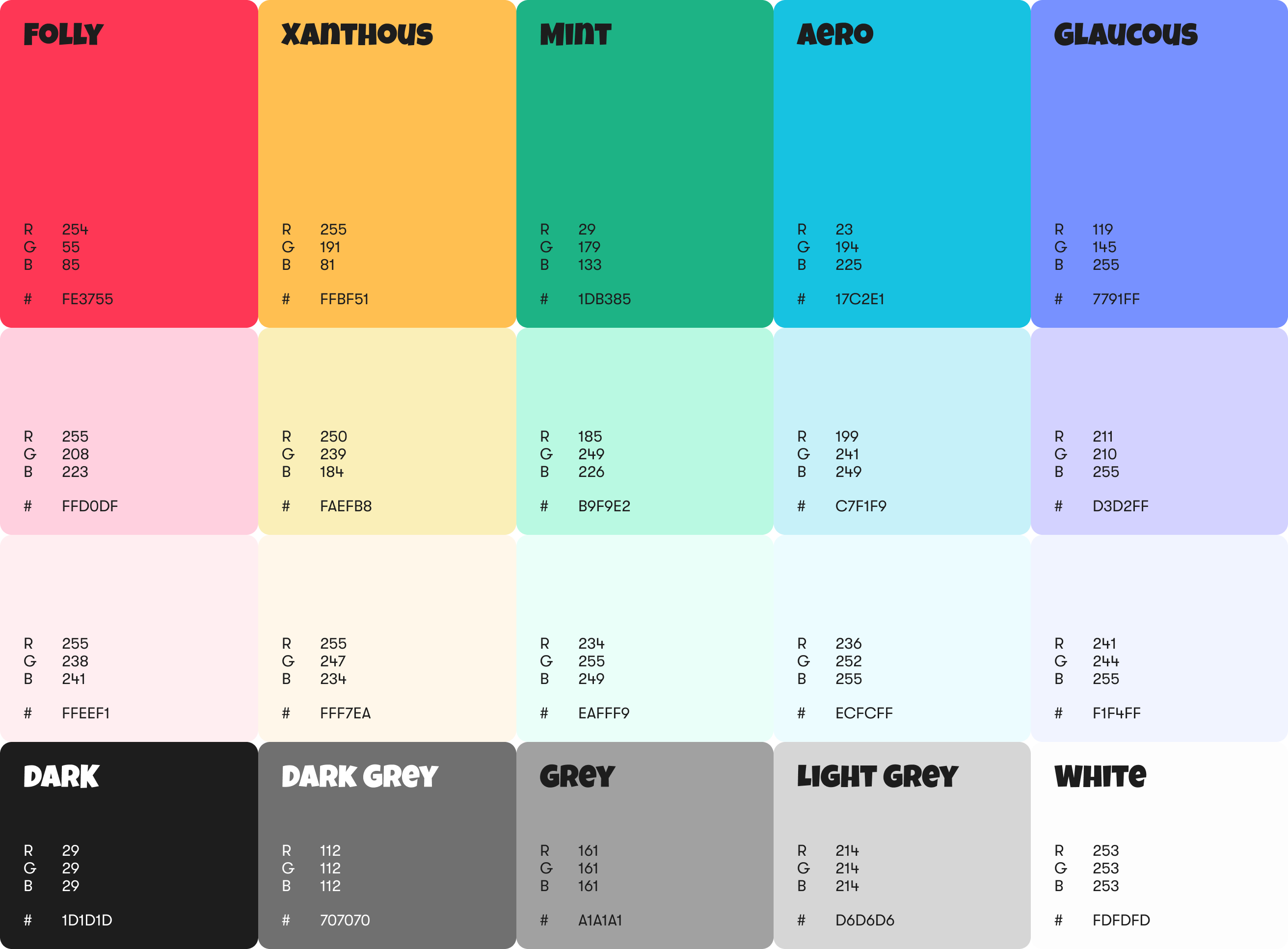
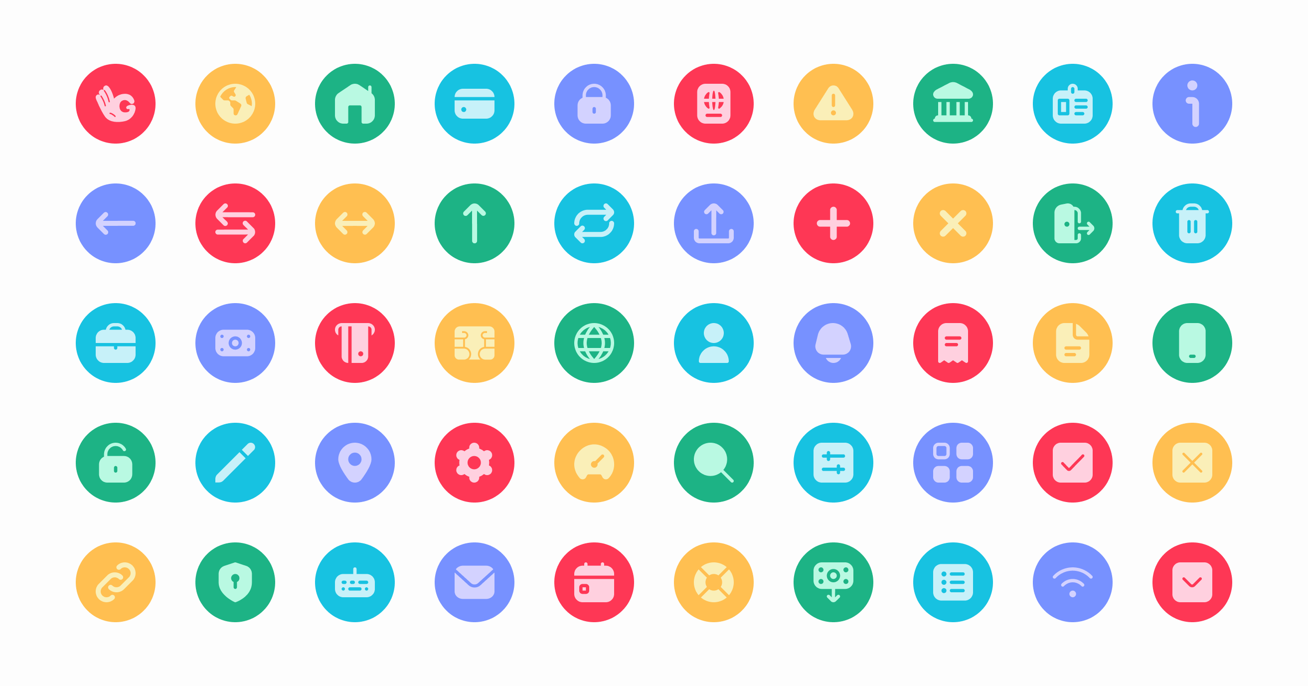
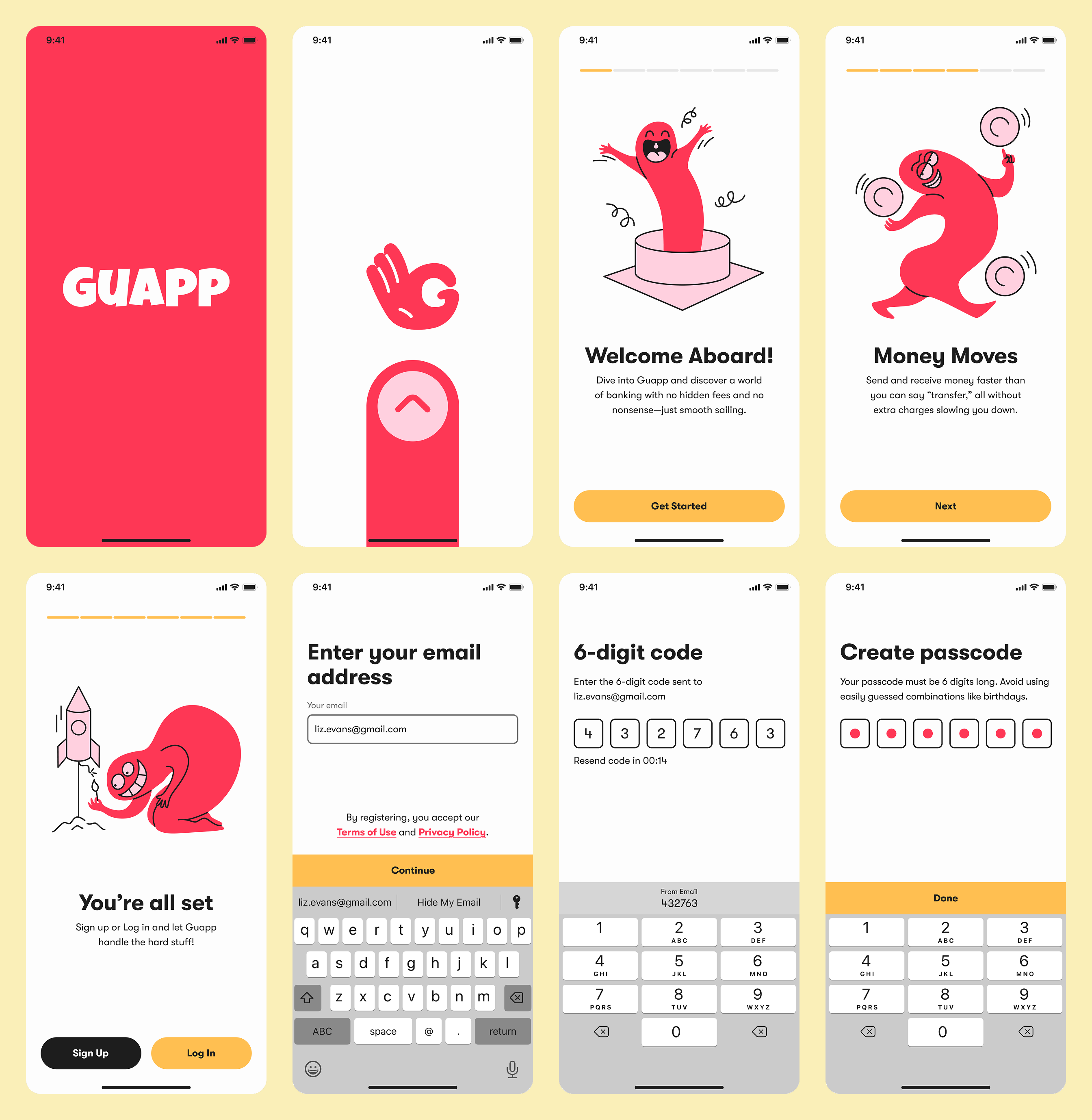
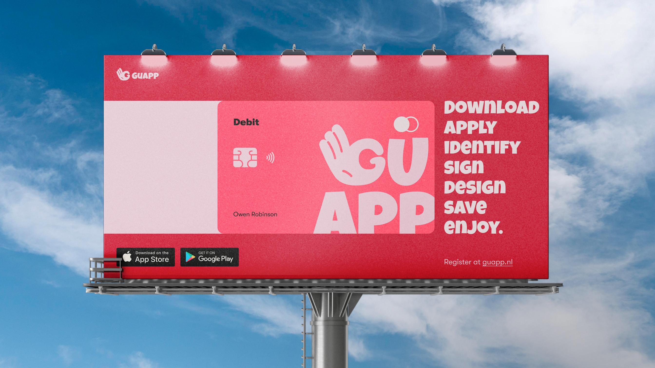
Visual Identity
The Guapp logo system is flexible, built in five responsive layouts to work across any use case. The mark features a hidden “G” within a hand “OK” gesture, striking a balance between friendliness and trust. The colour palette is bold and vibrant, while the type system uses a playful display font for marketing and a clean, rounded geometric typeface for the product interface and body content.


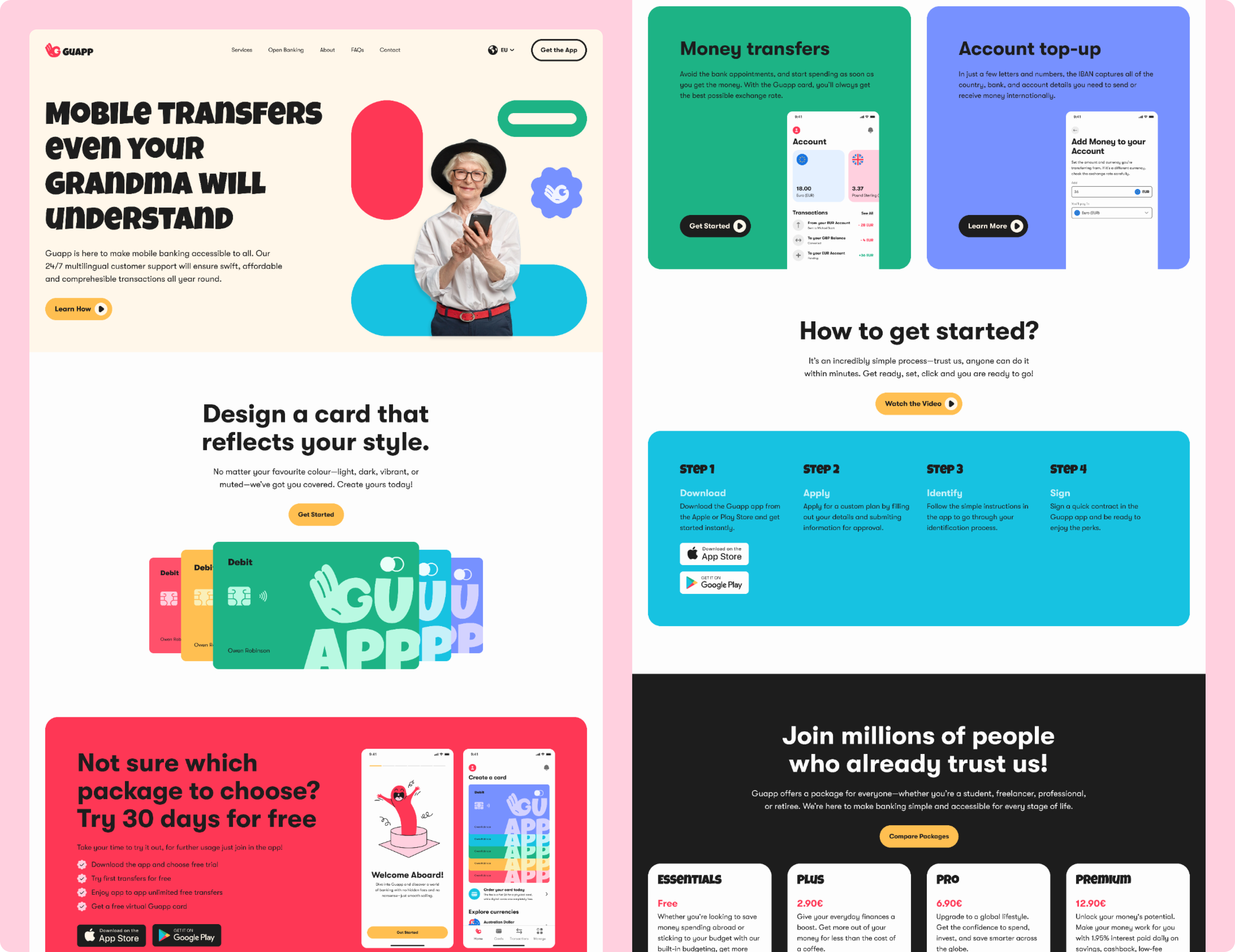
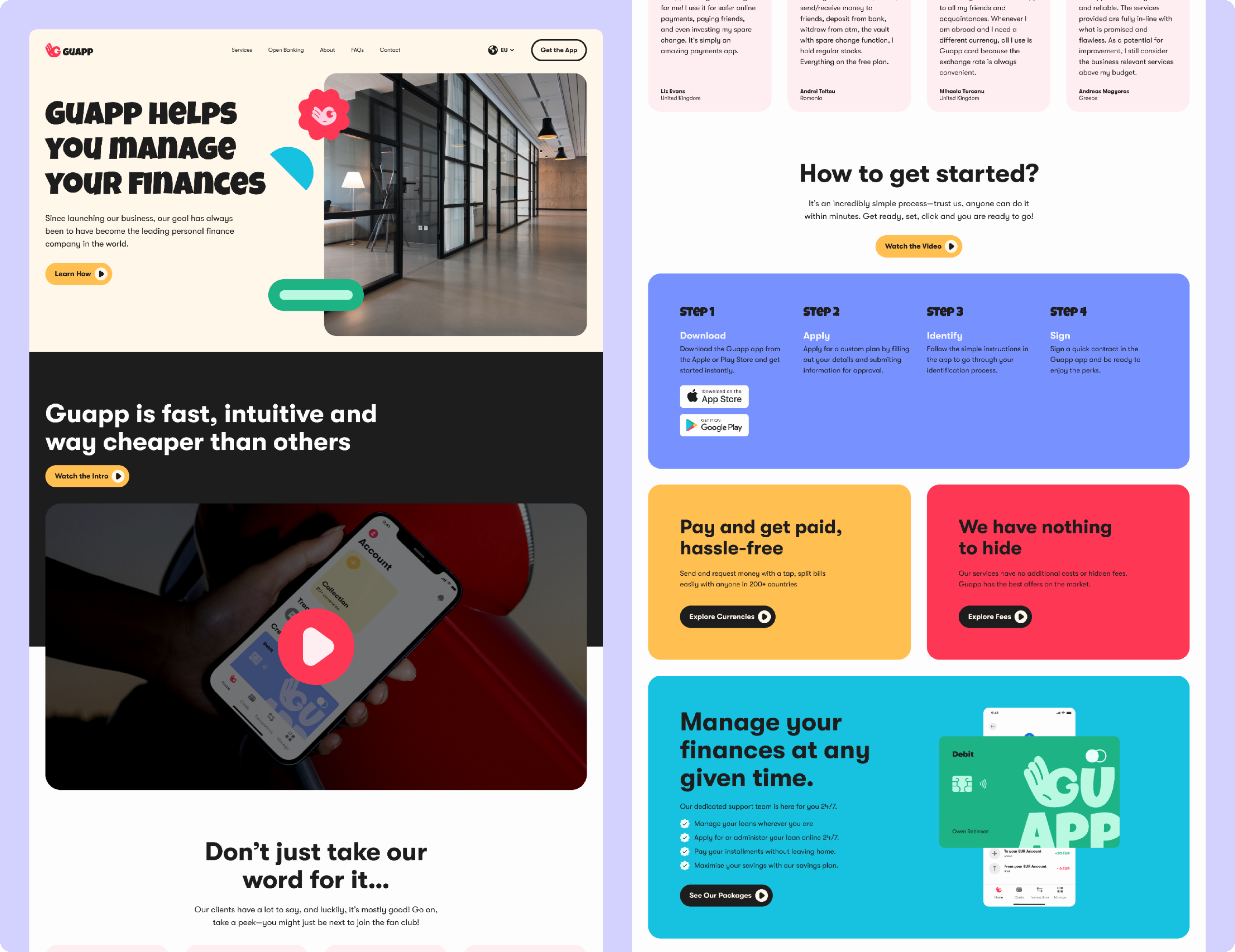
Website Redesign
The website was designed with speed and clarity in mind. We stripped back unnecessary content and focused on clear, direct messaging. A softer version of the brand identity was applied to ensure visual consistency while maintaining ease of navigation and user focus.
Designing a Product from the Ground Up
The product lacked content, structure, and a cohesive user experience. We began from scratch by defining essential features, developing a consistent design system, and ensuring the brand was aligned across the app and website. Our approach was guided by thorough research, user feedback, and a strong emphasis on making the experience intuitive and accessible.
There were a few bumps in the road:
01
Lack of user trust in a new financial product
With no brand presence or reputation, Guapp had to quickly earn user confidence. Trust is critical when users are asked to share sensitive financial data on a new platform.
02
Unclear structure in early wireframe concepts
Initial app flows were either too complex or lacked logical progression. Without clear structure, users struggled to complete basic tasks like setting up an account or navigating between features.
03
Misalignment between product, brand, and design
Guapp’s early product decisions and technical roadmap lacked a unified design perspective. Without clear design ownership, there was a risk of inconsistencies across app and marketing.
Here’s how we smoothed things out:
01
Designed a transparent and reassuring user journey
We restructured onboarding to reduce friction, using direct language, clear progress indicators, and contextual guidance. Every screen was tested with early users. 87% reported feeling confident, safe, and informed completing onboarding and connecting their account.
02
Balanced simplicity with professionalism
We audited competing apps and interviewed users to identify common pain points. Based on these insights, we redesigned flows to be intuitive and predictable without dumbing things down. 90% of users in usability testing described the app as clear, modern, and easy to use.
03
Unified product and brand through a design-led process
We joined weekly product planning sessions and worked directly with engineering to shape feature requirements. A shared design system aligned visual and interaction patterns across app and marketing. This avoided fragmentation and reduced development rework across teams.
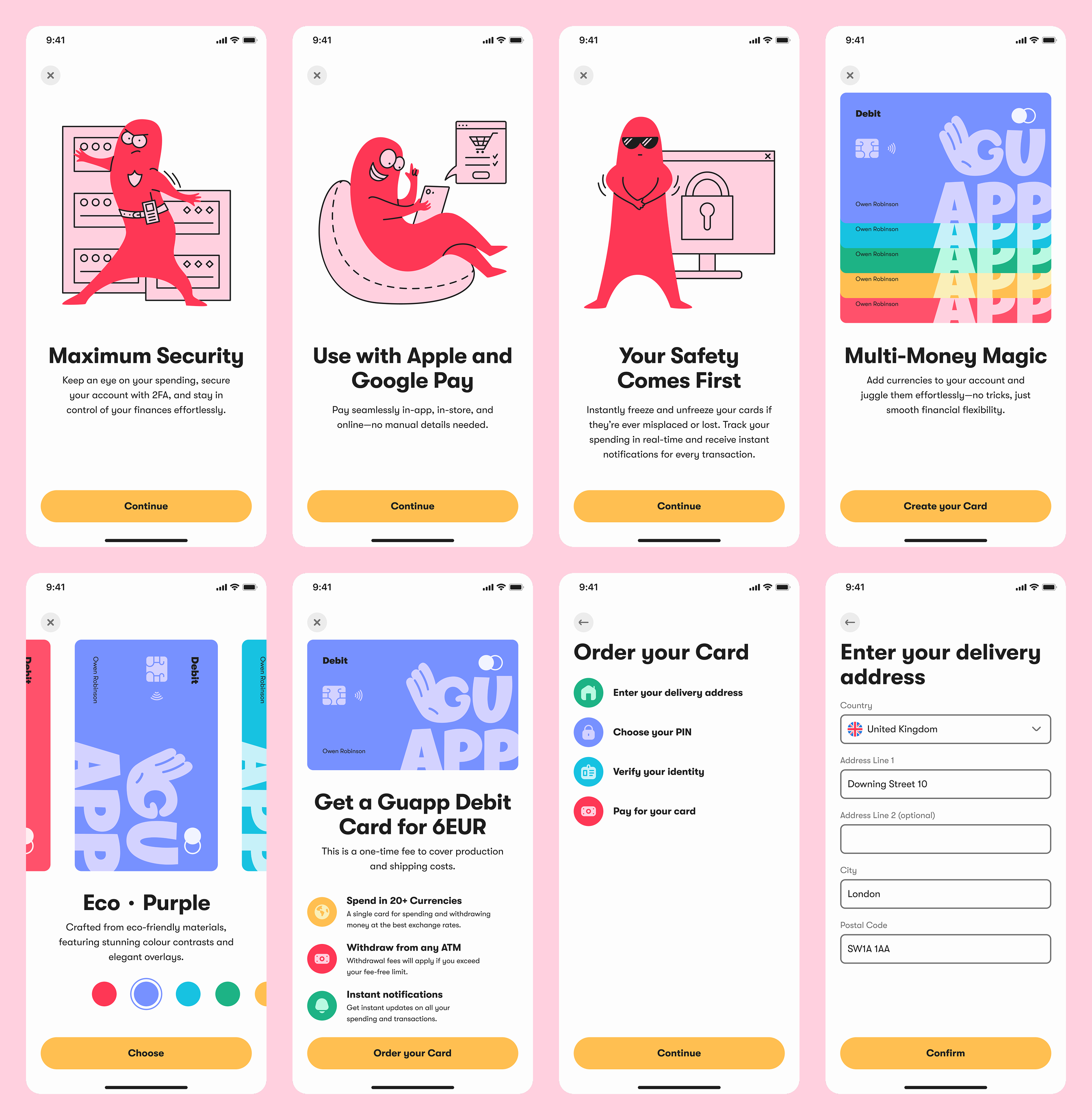
Onboarding & Sign Up
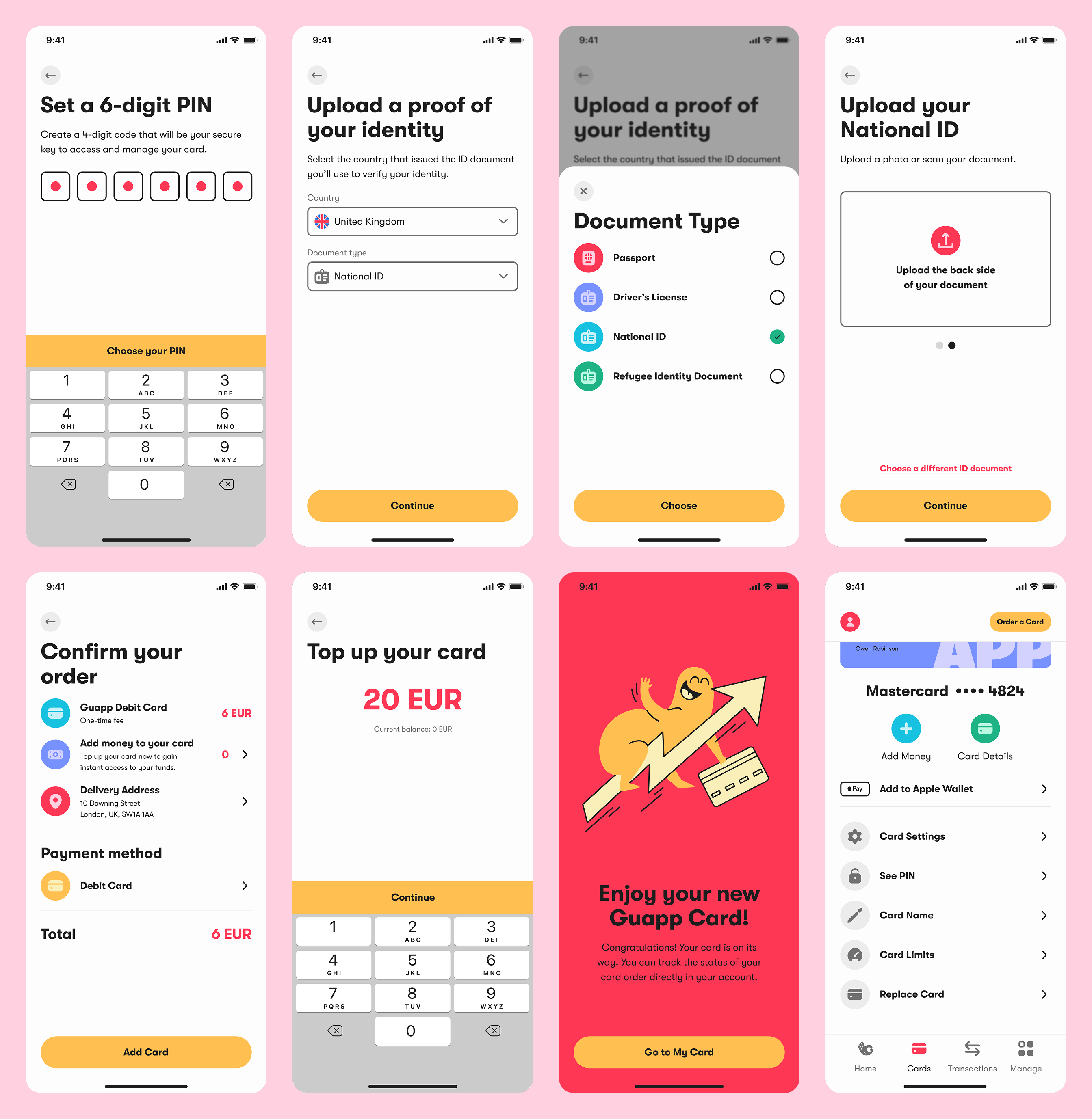
We designed a clear, step-by-step onboarding flow focused on ease and trust. Input fields are minimal, instructions are always visible, and every interaction builds confidence. The journey was mapped to reduce friction, avoid drop-off, and ensure users know exactly what to expect.
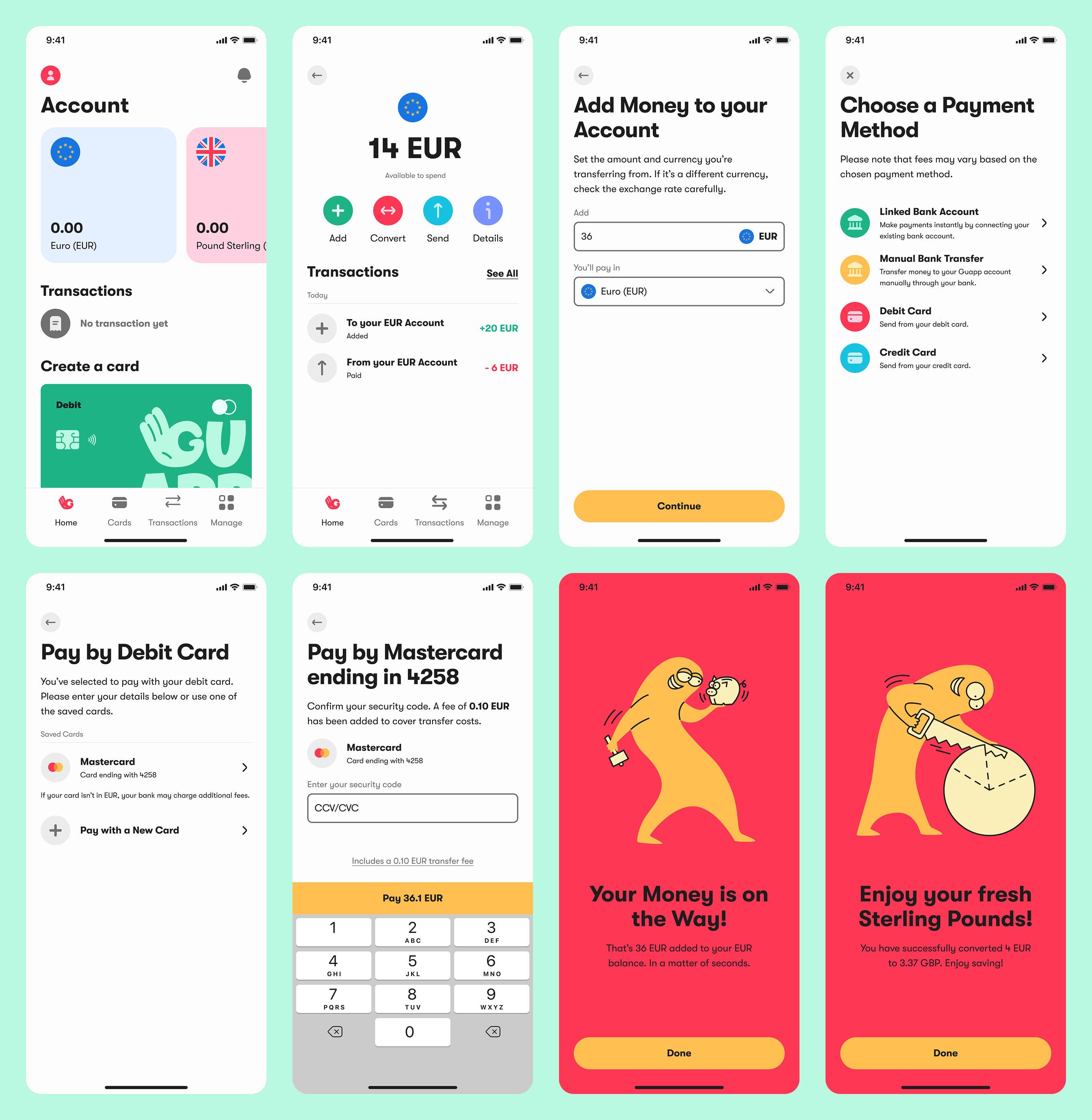
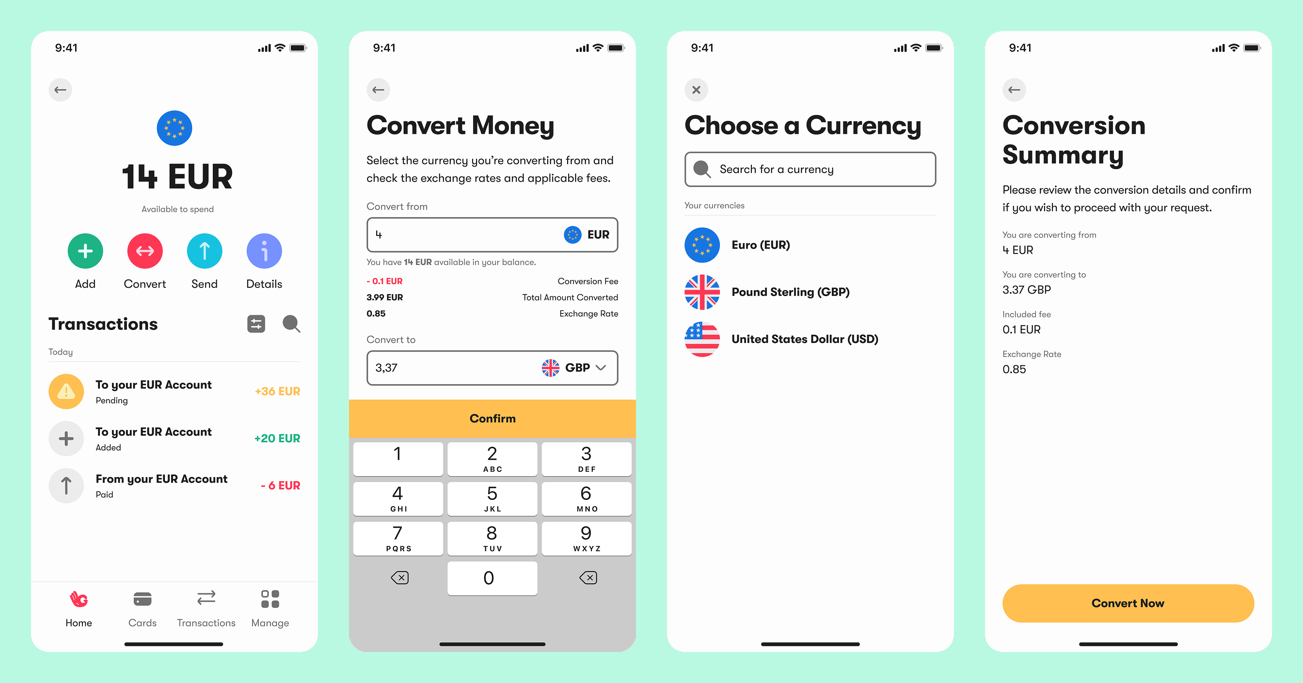
Home & Accounts
This screen gives users a complete view of their finances. We structured it like a dashboard, balancing clarity and flexibility. Accounts, cards, transactions, and alerts are all accessible within seconds. Every element was prioritised to support daily use and fast decision-making.
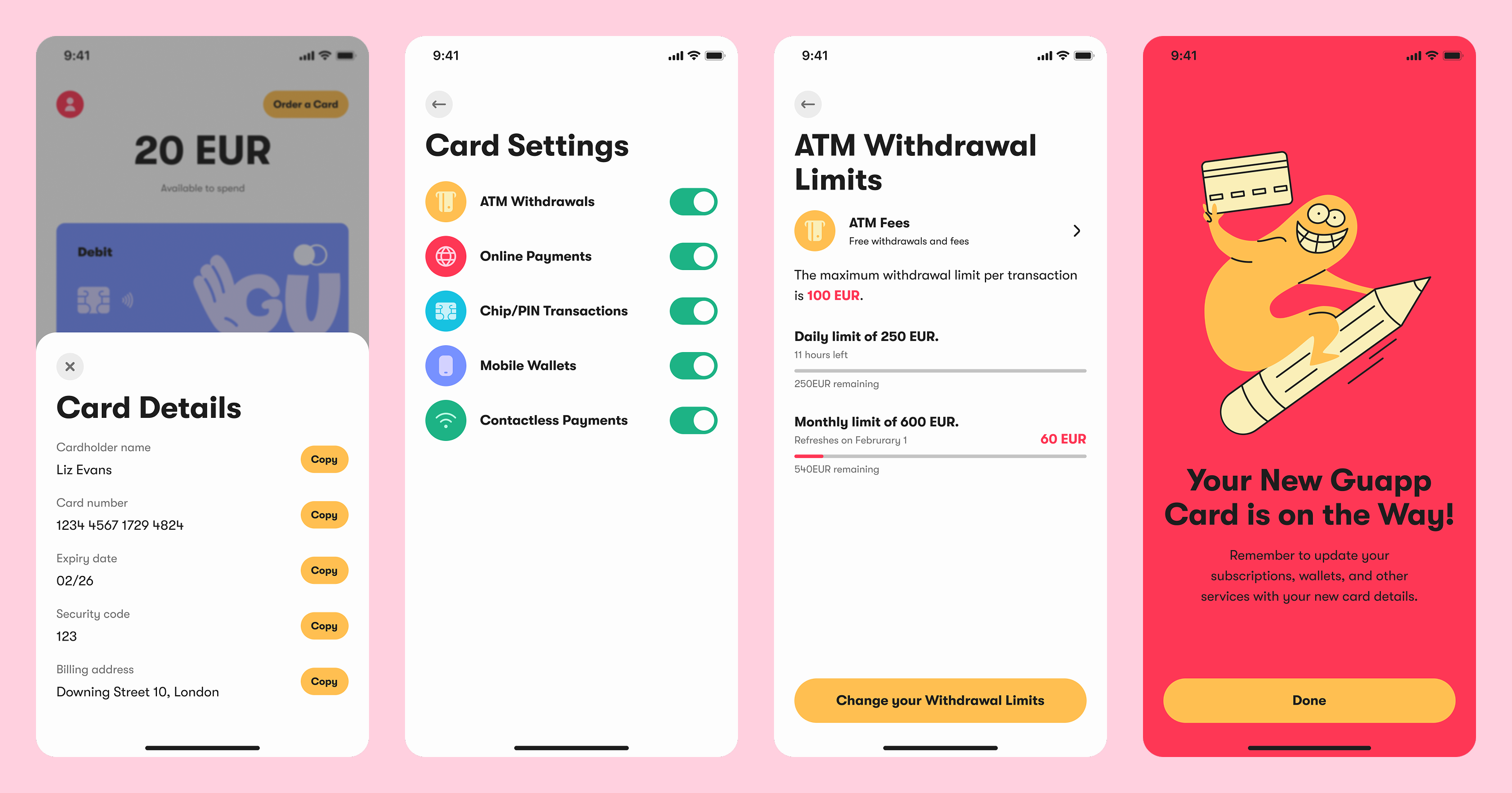
Cards
We designed every flow around control and clarity. Users can order, manage, and update their cards without digging through menus. Actions like renaming, setting limits, or freezing a card are surfaced in a clear, predictable layout that reduces cognitive load.
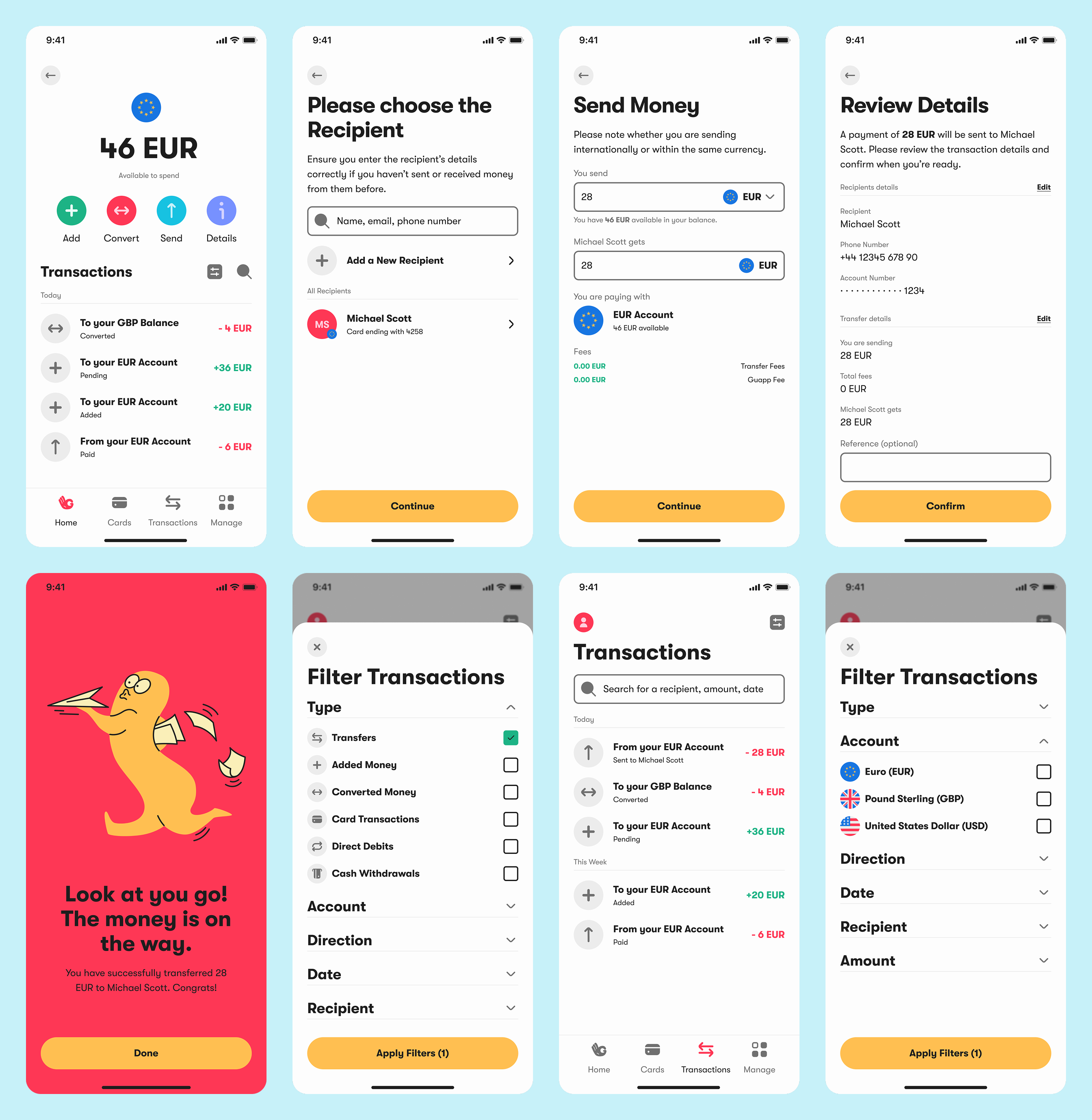
Transactions
We mapped out and simplified every key action: sending, receiving, converting, and scheduling money. The experience is built to support frequent use with minimal steps. Smart defaults and confirmation layers help users feel in control without slowing them down.
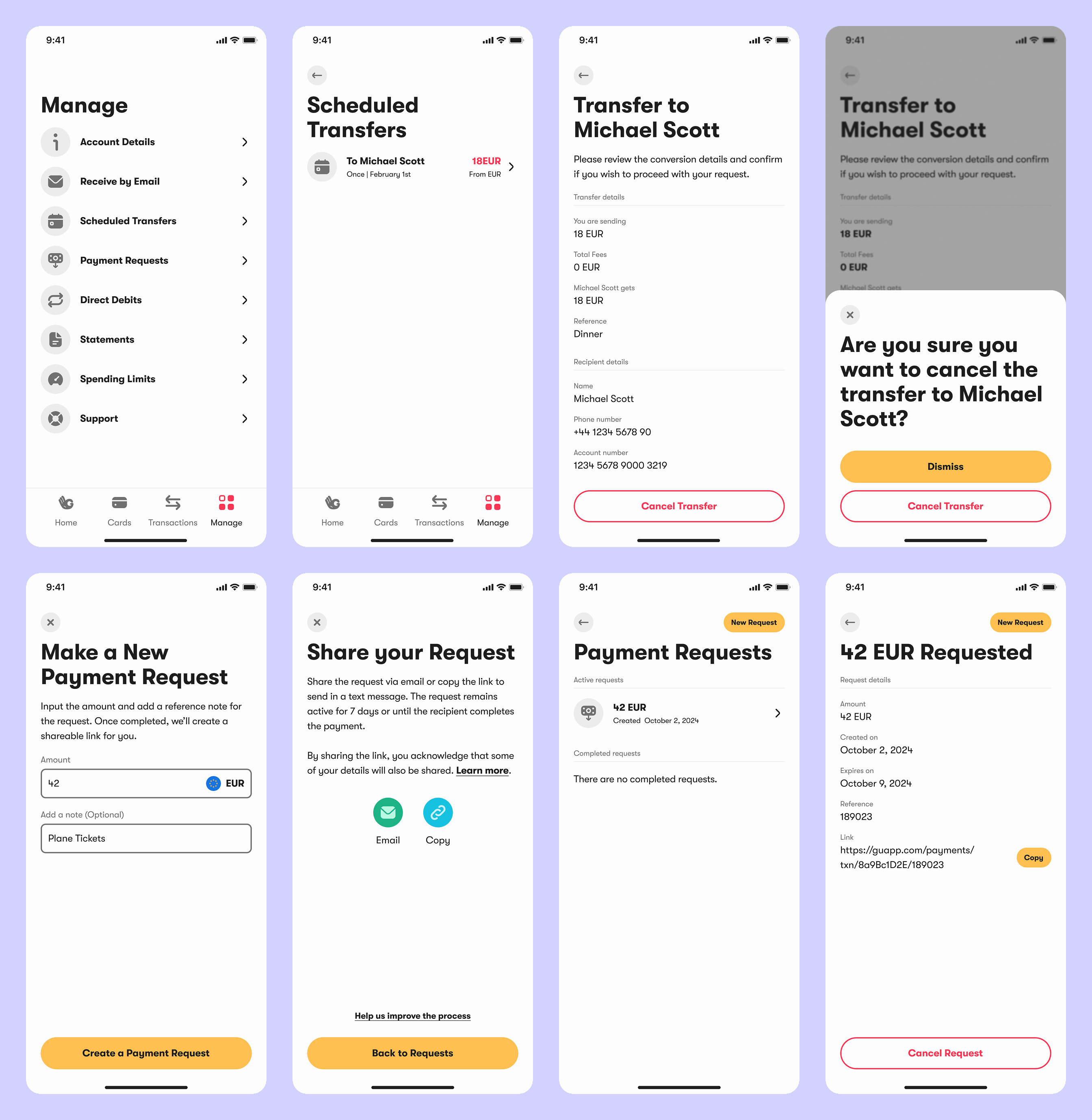
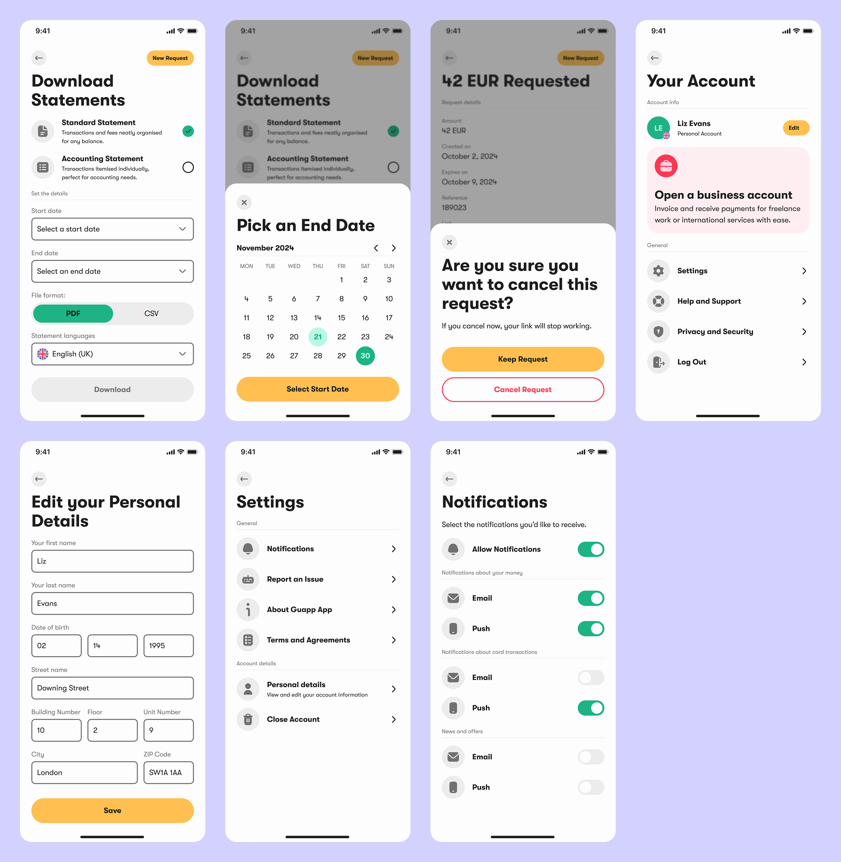
Profile & Settings
We grouped settings into clear categories and followed consistent patterns, so users never feel lost. From managing accounts to setting up payment rules or accessing support, everything is designed to be intuitive and self-service ready.
Impact
The new brand and product experience helped Guapp launch with clarity, trust, and strong early traction.
01
90% User Satisfaction Rate
In comprehensive user testing, 9 out of 10 participants rated the app as both visually trustworthy and intuitive to navigate. Testers specifically highlighted the clean interface, logical flow between sections, and transparent security features as standout elements.
02
38% Churn Reduction
Our streamlined sign-up process dramatically cut drop-off rates compared to the previous flow. By reducing unnecessary steps and providing clear guidance, we created a frictionless path to activation that significantly improved conversion metrics.
03
€12M in 90 Days
Within just three months of launch, Guapp successfully onboarded over 18,000 new users who collectively moved more than €12 million through the platform. This strong user adoption directly supports the projected 24% revenue increase by year-end, exceeding initial growth targets.
See more work.

Bidde
Strategy
Branding
website
marketing
View Case
→
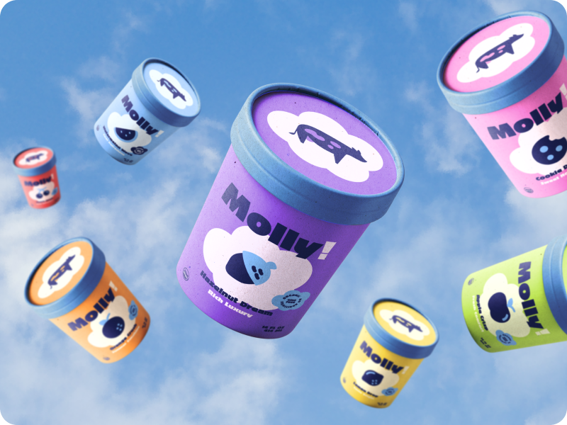
Molly
Strategy
Branding
PACKAGING
View Case
→
Miska
Strategy
Branding
PACKAGING
MERCH
View Case
→


MENU
HOME
WORK
SERVICES
ABOUT
GET IN TOUCH
Ig: @TeenyStudio
Ln: @Teeny-Studio
Guapp
Guapp is a mobile banking app built to make everyday finance simple, inclusive, and accessible for everyone through intuitive design and 24/7 multilingual support.
PROJECT SCOPE
Brand Strategy, Workshops, Visual Identity, Website Design, Mobile App Design, User Testing
TEAM
1 Co-Founder, 1 Project Manager, 1 Tech Lead, 1 Marketing Lead, 1 Strategist, 1 Business Analyst, 1 Designer, 4 Developers
INDUSTRY
Fintech Platform in Mobile Banking
YEAR
2025
Context
Guapp came to us with a strong product idea but no brand, no design direction, and an app still in early definition. We joined at the very beginning to create the brand strategy and identity. As the partnership grew, we took on the full design scope, shaping the product, creating the design system, and delivering a consistent, scalable experience across all digital and marketing touchpoints.
What’s been done?
To build Guapp from zero to launch, we defined the brand, designed the full product experience, and created a scalable design system for the app.
01
Brand Strategy
We led two structured workshops. The first focused on defining visual tone, audience perception, and personality traits. The second introduced visual directions, shaped by the first session. Through co-creation, we aligned on a brand foundation that felt both distinctive and credible in the fintech space.
02
Brand Design
We developed a dual identity system. One bold and expressive for marketing, digital presence and merch. One cleaner and more minimal for the in-app experience. This approach kept our brand true to itself, communication engaging, while ensuring clarity and ease of use in the product.
03
Product Design
We designed the entire app from concept to high-fidelity screens. The MVP was tested early with 20 target users using interactive wireframes. Final designs were validated through usability testing, resulting in a clean, confident experience fit for a multilingual financial platform.
Visual Identity
The Guapp logo system is flexible, built in five responsive layouts to work across any use case. The mark features a hidden “G” within a hand “OK” gesture, striking a balance between friendliness and trust. The colour palette is bold and vibrant, while the type system uses a playful display font for marketing and a clean, rounded geometric typeface for the product interface and body content.
Website Redesign
The website was designed with speed and clarity in mind. We stripped back unnecessary content and focused on clear, direct messaging. A softer version of the brand identity was applied to ensure visual consistency while maintaining ease of navigation and user focus.
Designing a Product from the Ground Up
The product lacked content, structure, and a cohesive user experience. We began from scratch by defining essential features, developing a consistent design system, and ensuring the brand was aligned across the app and website. Our approach was guided by thorough research, user feedback, and a strong emphasis on making the experience intuitive and accessible.
There were a few bumps in the road:
01
Lack of user trust in a new financial product
With no brand presence or reputation, Guapp had to quickly earn user confidence. Trust is critical when users are asked to share sensitive financial data on a new platform.
02
Unclear structure in early wireframe concepts
Initial app flows were either too complex or lacked logical progression. Without clear structure, users struggled to complete basic tasks like setting up an account or navigating between features.
03
Misalignment between product, brand, and design
Guapp’s early product decisions and technical roadmap lacked a unified design perspective. Without clear design ownership, there was a risk of inconsistencies across app and marketing.
Here’s how we smoothed things out:
01
Designed a transparent and reassuring user journey
We restructured onboarding to reduce friction, using direct language, clear progress indicators, and contextual guidance. Every screen was tested with early users. 87% reported feeling confident, safe, and informed completing onboarding and connecting their account.
02
Balanced simplicity with professionalism
We audited competing apps and interviewed users to identify common pain points. Based on these insights, we redesigned flows to be intuitive and predictable without dumbing things down. 90% of users in usability testing described the app as clear, modern, and easy to use.
03
Unified product and brand through a design-led process
We joined weekly product planning sessions and worked directly with engineering to shape feature requirements. A shared design system aligned visual and interaction patterns across app and marketing. This avoided fragmentation and reduced development rework across teams.
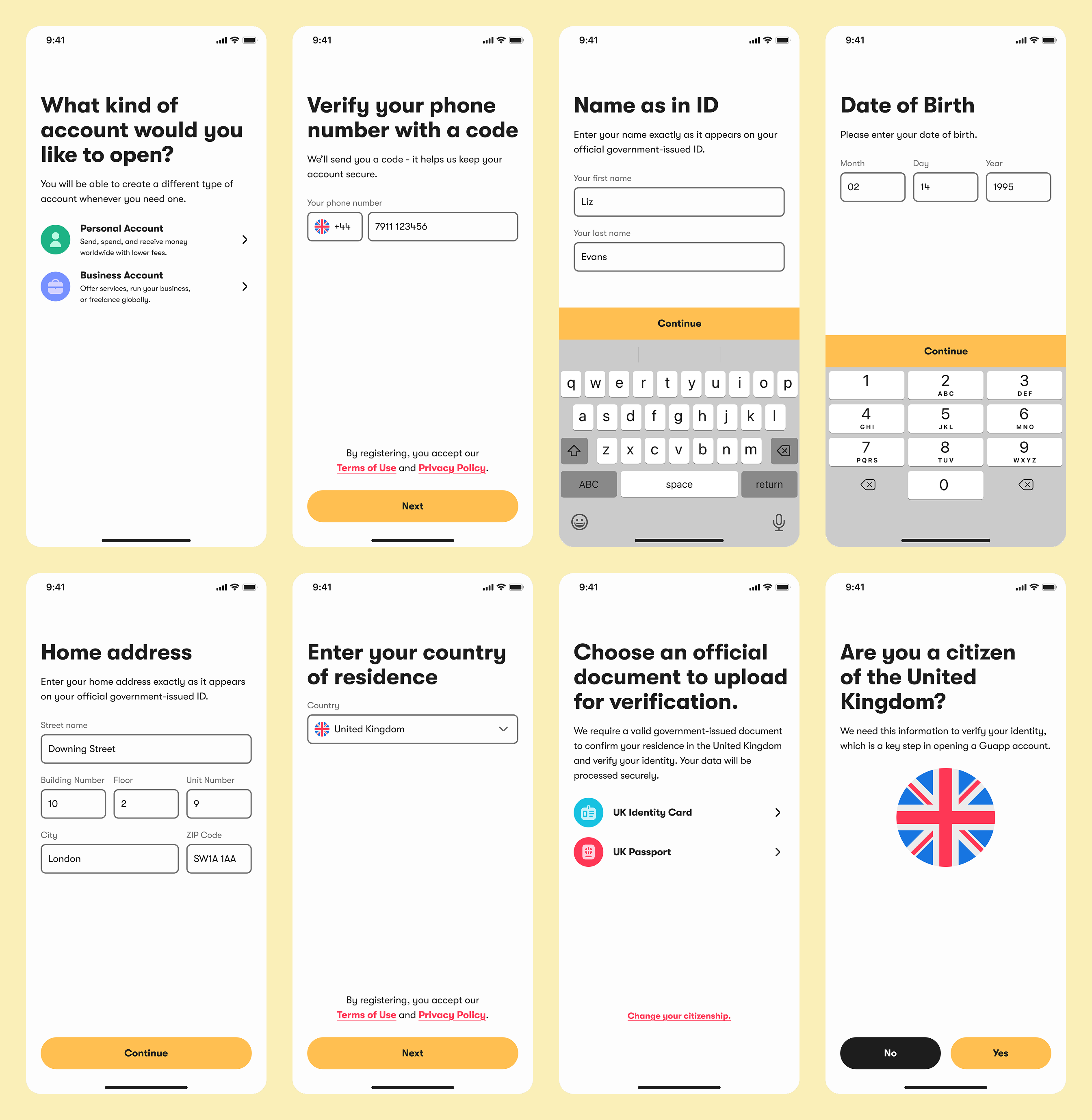
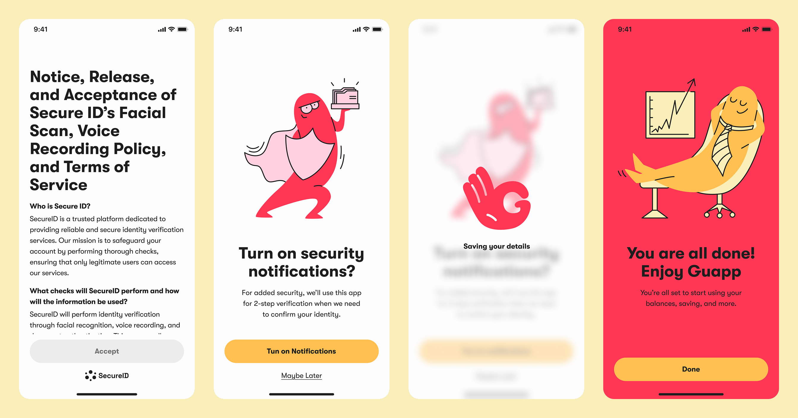
Onboarding & Sign Up
We designed a clear, step-by-step onboarding flow focused on ease and trust. Input fields are minimal, instructions are always visible, and every interaction builds confidence. The journey was mapped to reduce friction, avoid drop-off, and ensure users know exactly what to expect.
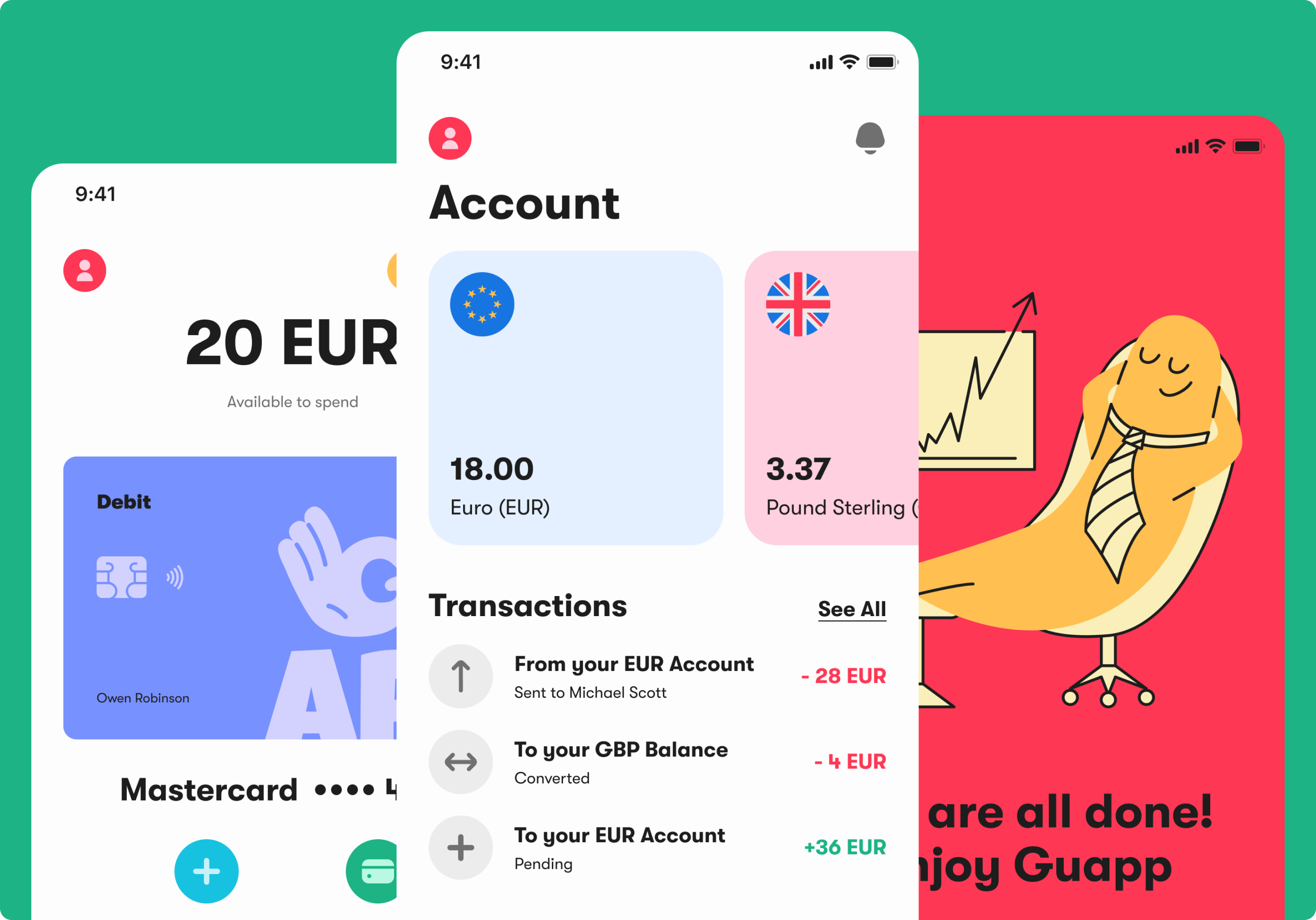
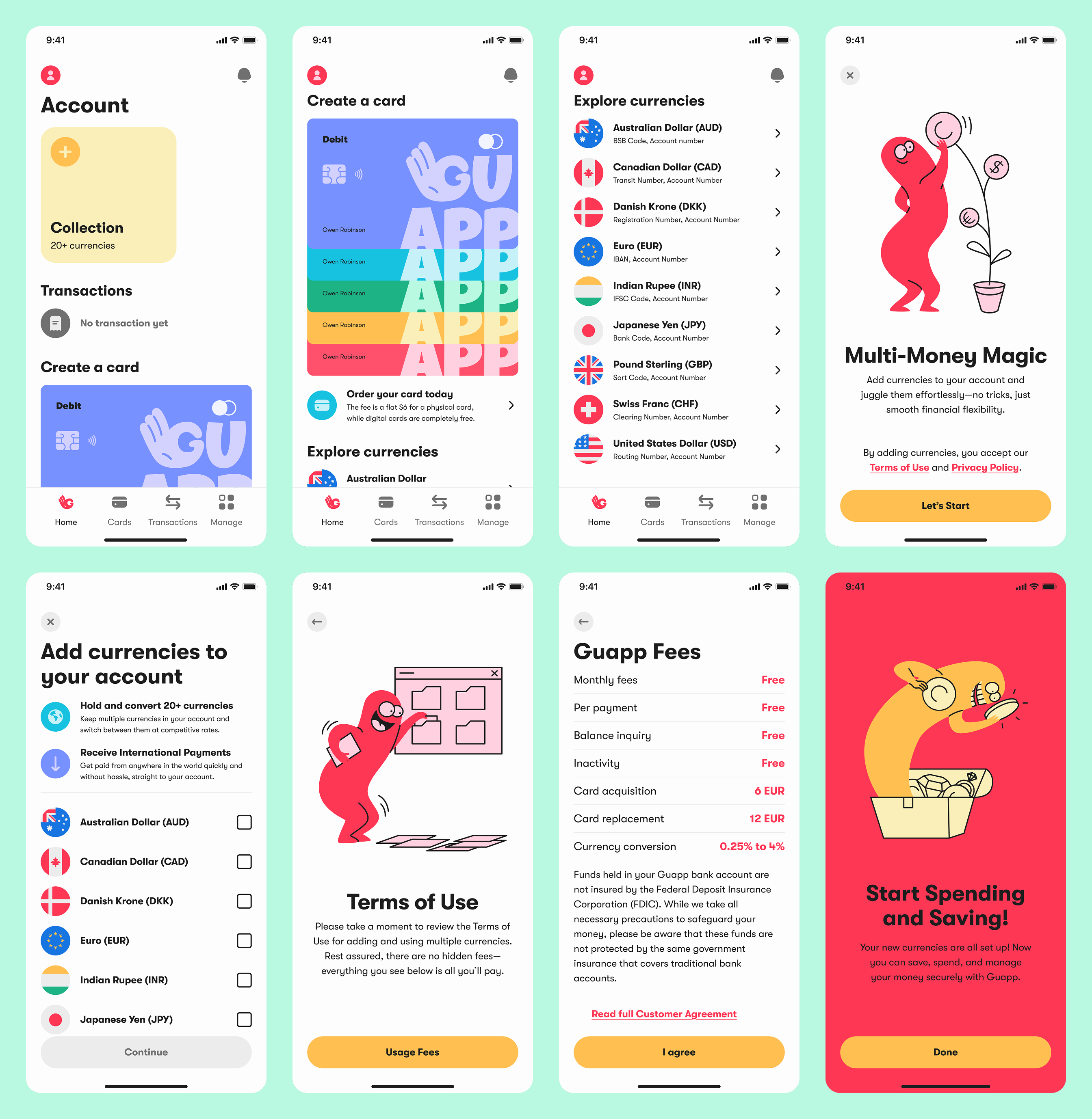
Home & Accounts
This screen gives users a complete view of their finances. We structured it like a dashboard, balancing clarity and flexibility. Accounts, cards, transactions, and alerts are all accessible within seconds. Every element was prioritised to support daily use and fast decision-making.
Cards
We designed every flow around control and clarity. Users can order, manage, and update their cards without digging through menus. Actions like renaming, setting limits, or freezing a card are surfaced in a clear, predictable layout that reduces cognitive load.
Transactions
We mapped out and simplified every key action: sending, receiving, converting, and scheduling money. The experience is built to support frequent use with minimal steps. Smart defaults and confirmation layers help users feel in control without slowing them down.
Profile & Settings
We grouped settings into clear categories and followed consistent patterns, so users never feel lost. From managing accounts to setting up payment rules or accessing support, everything is designed to be intuitive and self-service ready.
Impact
The new brand and product experience helped Guapp launch with clarity, trust, and strong early traction.
01
90% User Satisfaction Rate
In comprehensive user testing, 9 out of 10 participants rated the app as both visually trustworthy and intuitive to navigate. Testers specifically highlighted the clean interface, logical flow between sections, and transparent security features as standout elements.
02
38% Churn Reduction
Our streamlined sign-up process dramatically cut drop-off rates compared to the previous flow. By reducing unnecessary steps and providing clear guidance, we created a frictionless path to activation that significantly improved conversion metrics.
03
€12M in 90 Days
Within just three months of launch, Guapp successfully onboarded over 18,000 new users who collectively moved more than €12 million through the platform. This strong user adoption directly supports the projected 24% revenue increase by year-end, exceeding initial growth targets.
See more work.
Bidde
Strategy
Branding
website
marketing
View Case
→
Molly
Strategy
Branding
PACKAGING
View Case
→
Miska
Strategy
Branding
PACKAGING
MERCH
View Case
→

Want to work together?
Book a free 30-minute consultation. We'll talk about your project, answer your questions, and see if we're a good fit.
BOOK A CALL
Guapp
Guapp is a mobile banking app built to make everyday finance simple, inclusive, and accessible for everyone through intuitive design and 24/7 multilingual support.
PROJECT SCOPE
Brand Strategy, Workshops, Visual Identity, Website Design, Mobile App Design, User Testing
TEAM
1 Co-Founder, 1 Project Manager, 1 Tech Lead, 1 Marketing Lead, 1 Strategist, 1 Business Analyst, 1 Designer, 4 Developers
INDUSTRY
Fintech Platform in Mobile Banking
YEAR
2025
Context
Guapp came to us with a strong product idea but no brand, no design direction, and an app still in early definition. We joined at the very beginning to create the brand strategy and identity. As the partnership grew, we took on the full design scope, shaping the product, creating the design system, and delivering a consistent, scalable experience across all digital and marketing touchpoints.
What’s been done?
To build Guapp from zero to launch, we defined the brand, designed the full product experience, and created a scalable design system for the app.
01
Brand Strategy
We led two structured workshops. The first focused on defining visual tone, audience perception, and personality traits. The second introduced visual directions, shaped by the first session. Through co-creation, we aligned on a brand foundation that felt both distinctive and credible in the fintech space.
02
Brand Design
We developed a dual identity system. One bold and expressive for marketing, digital presence and merch. One cleaner and more minimal for the in-app experience. This approach kept our brand true to itself, communication engaging, while ensuring clarity and ease of use in the product.
03
Product Design
We designed the entire app from concept to high-fidelity screens. The MVP was tested early with 20 target users using interactive wireframes. Final designs were validated through usability testing, resulting in a clean, confident experience fit for a multilingual financial platform.
Visual Identity
The Guapp logo system is flexible, built in five responsive layouts to work across any use case. The mark features a hidden “G” within a hand “OK” gesture, striking a balance between friendliness and trust. The colour palette is bold and vibrant, while the type system uses a playful display font for marketing and a clean, rounded geometric typeface for the product interface and body content.
Website Redesign
The website was designed with speed and clarity in mind. We stripped back unnecessary content and focused on clear, direct messaging. A softer version of the brand identity was applied to ensure visual consistency while maintaining ease of navigation and user focus.
Designing a Product from the Ground Up
The product lacked content, structure, and a cohesive user experience. We began from scratch by defining essential features, developing a consistent design system, and ensuring the brand was aligned across the app and website. Our approach was guided by thorough research, user feedback, and a strong emphasis on making the experience intuitive and accessible.
There were a few bumps in the road:
01
Lack of user trust in a new financial product
With no brand presence or reputation, Guapp had to quickly earn user confidence. Trust is critical when users are asked to share sensitive financial data on a new platform.
02
Unclear structure in early wireframe concepts
Initial app flows were either too complex or lacked logical progression. Without clear structure, users struggled to complete basic tasks like setting up an account or navigating between features.
03
Misalignment between product, brand, and design
Guapp’s early product decisions and technical roadmap lacked a unified design perspective. Without clear design ownership, there was a risk of inconsistencies across app and marketing.
Here’s how we smoothed things out:
01
Designed a transparent and reassuring user journey
We restructured onboarding to reduce friction, using direct language, clear progress indicators, and contextual guidance. Every screen was tested with early users. 87% reported feeling confident, safe, and informed completing onboarding and connecting their account.
02
Balanced simplicity with professionalism
We audited competing apps and interviewed users to identify common pain points. Based on these insights, we redesigned flows to be intuitive and predictable without dumbing things down. 90% of users in usability testing described the app as clear, modern, and easy to use.
03
Unified product and brand through a design-led process
We joined weekly product planning sessions and worked directly with engineering to shape feature requirements. A shared design system aligned visual and interaction patterns across app and marketing. This avoided fragmentation and reduced development rework across teams.
Onboarding & Sign Up
We designed a clear, step-by-step onboarding flow focused on ease and trust. Input fields are minimal, instructions are always visible, and every interaction builds confidence. The journey was mapped to reduce friction, avoid drop-off, and ensure users know exactly what to expect.
Home & Accounts
This screen gives users a complete view of their finances. We structured it like a dashboard, balancing clarity and flexibility. Accounts, cards, transactions, and alerts are all accessible within seconds. Every element was prioritised to support daily use and fast decision-making.
Cards
We designed every flow around control and clarity. Users can order, manage, and update their cards without digging through menus. Actions like renaming, setting limits, or freezing a card are surfaced in a clear, predictable layout that reduces cognitive load.
Transactions
We mapped out and simplified every key action: sending, receiving, converting, and scheduling money. The experience is built to support frequent use with minimal steps. Smart defaults and confirmation layers help users feel in control without slowing them down.
Profile & Settings
We grouped settings into clear categories and followed consistent patterns, so users never feel lost. From managing accounts to setting up payment rules or accessing support, everything is designed to be intuitive and self-service ready.
Impact
The new brand and product experience helped Guapp launch with clarity, trust, and strong early traction.
01
90% User Satisfaction Rate
In comprehensive user testing, 9 out of 10 participants rated the app as both visually trustworthy and intuitive to navigate. Testers specifically highlighted the clean interface, logical flow between sections, and transparent security features as standout elements.
02
38% Churn Reduction
Our streamlined sign-up process dramatically cut drop-off rates compared to the previous flow. By reducing unnecessary steps and providing clear guidance, we created a frictionless path to activation that significantly improved conversion metrics.
03
€12M in 90 Days
Within just three months of launch, Guapp successfully onboarded over 18,000 new users who collectively moved more than €12 million through the platform. This adoption directly supports the projected 24% revenue increase by year-end, exceeding initial growth targets.
See more work.
Bidde
Strategy
Branding
website
marketing
View Case
→
Molly
Strategy
Branding
PACKAGING
View Case
→
Miska
Strategy
Branding
PACKAGING
MERCH
View Case
→

Want to work together?
Book a free 30-minute consultation. We'll talk about your project, answer your questions, and see if we're a good fit.
BOOK A CALL