
Gleam turns local sustainable actions into real-world rewards. It lets people join or create eco-friendly challenges, earn points, and redeem them through businesses that support the cause.
PROJECT SCOPE
Brand Strategy, Naming, Visual Identity, Art Direction, App Design, UX Research, Design System
TEAM
Founder, Product Manager, Tech Lead, Marketing Lead, Strategy Lead, Designer, 2 Developers
INDUSTRY
Sustainability App in Tech Industry
YEAR
2025
Gleam had an MVP in place, but it struggled to attract users and failed to engage potential sponsors. They brought us in to rethink the full experience. We led the rebrand, product design, and strategy to reshape the platform from the ground up.
We led a full transformation of the app, covering discovery, naming, strategy, brand identity, and product design. Every decision was based on direct user feedback and real-world testing.
01
We interviewed over 40 people from NGOs, green communities, and early testers. Most said the app felt cold, corporate, and untrustworthy. Based on that, we refined the brand tone, clarified the value for both users and partners, and rebuilt the offer to make it feel human and action-driven.
02
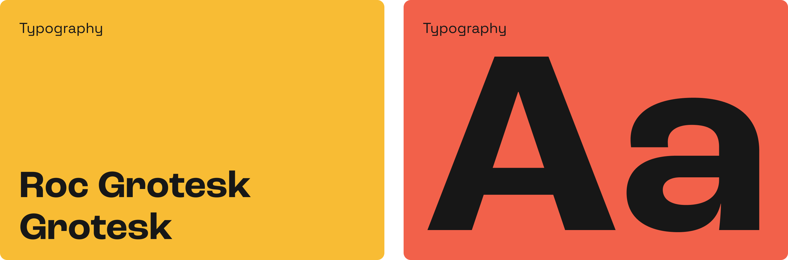
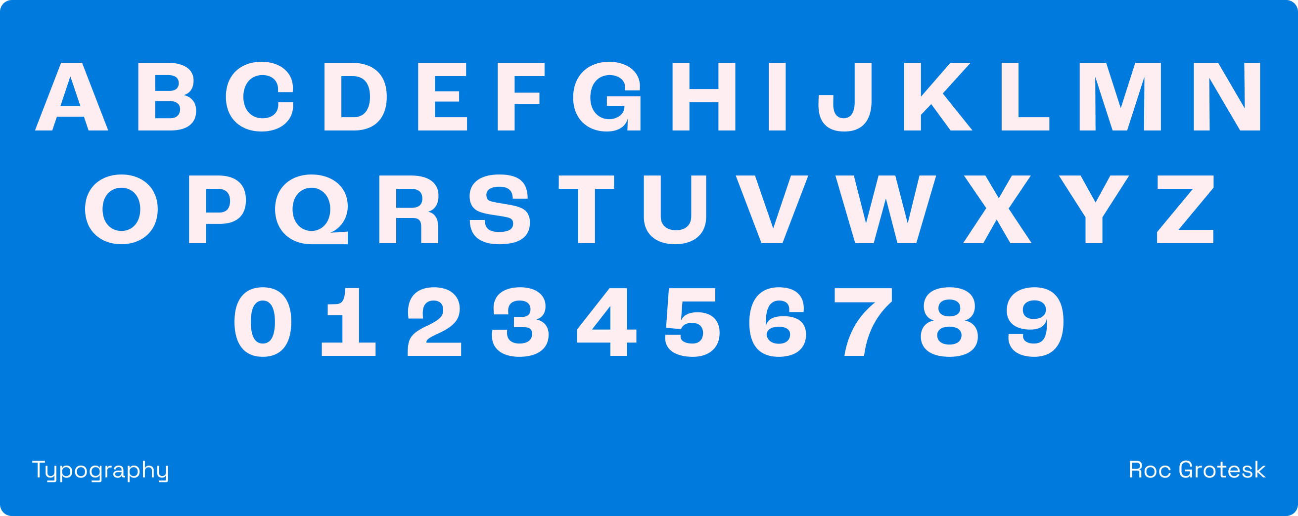
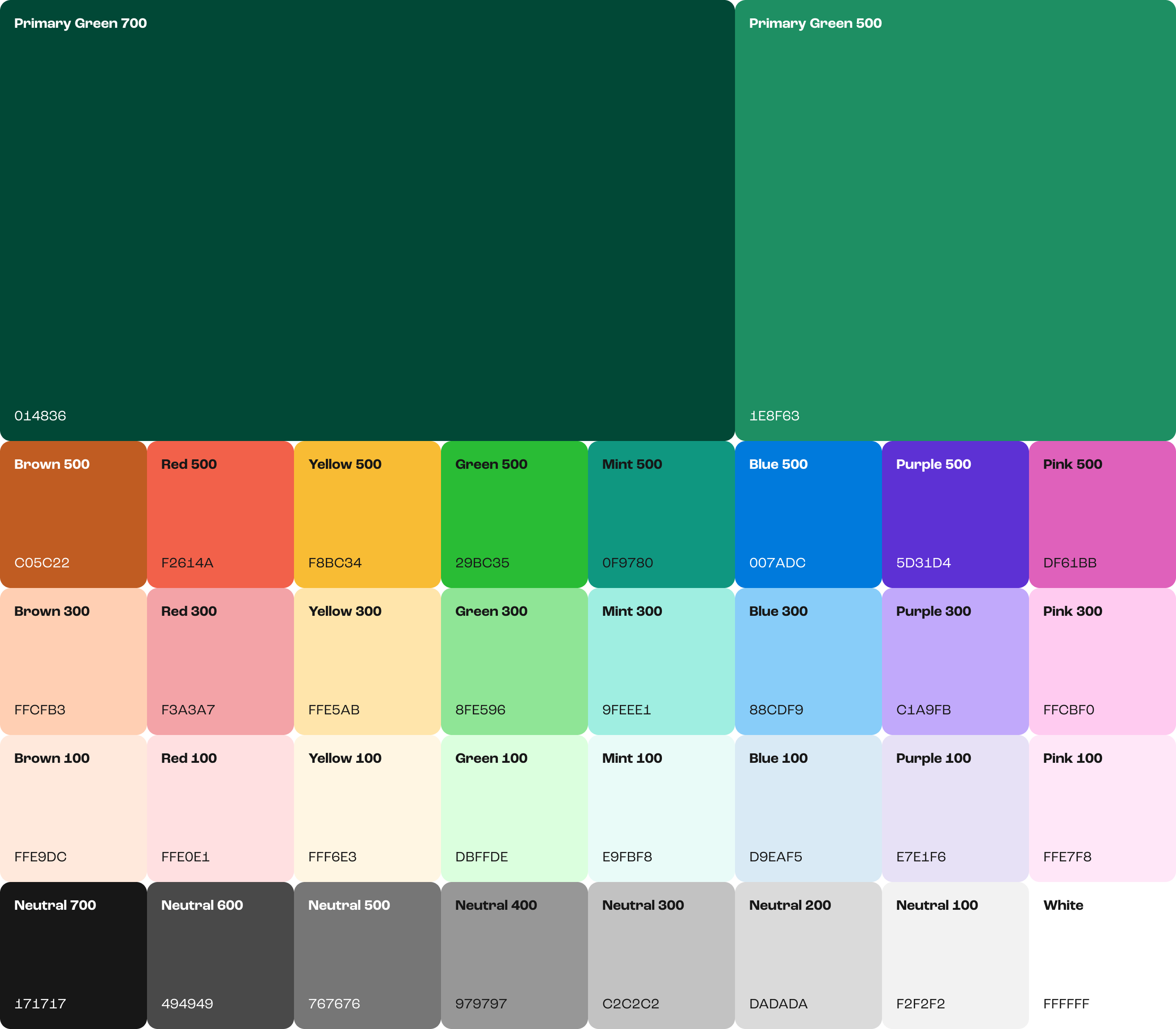
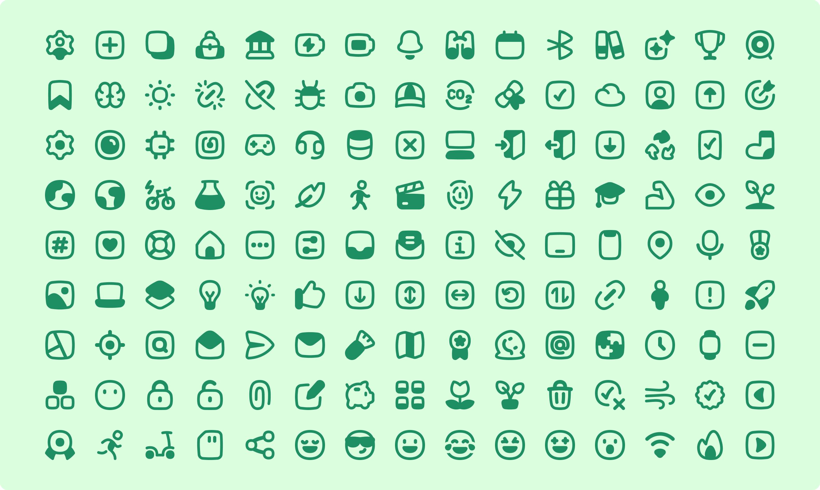
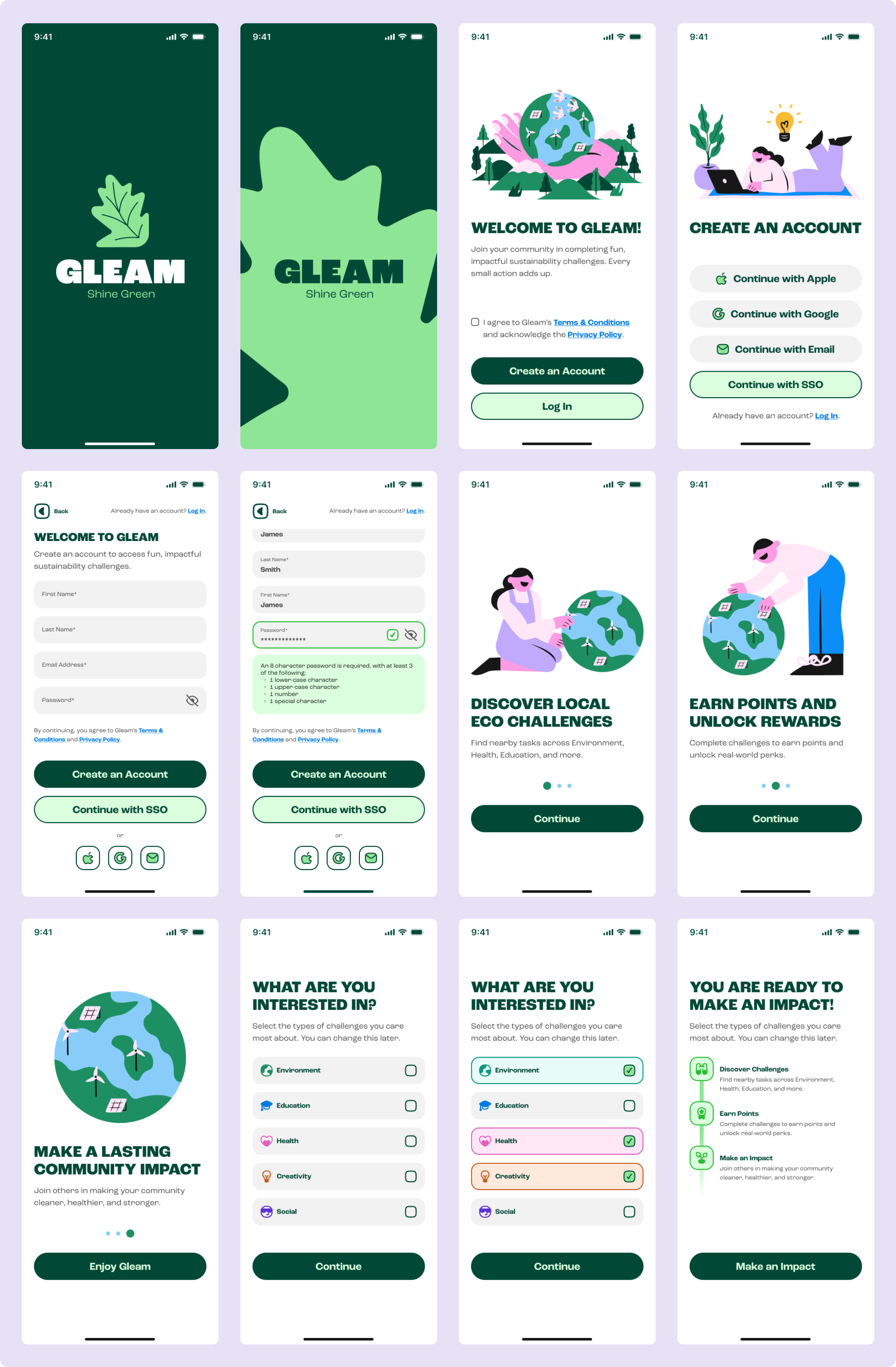
We renamed the app and created a bold, youthful brand with strong typography, vibrant colors, playful illustrations, and a simple yet inviting icon set. The goal was to make Gleam stand out in digital spaces, connect with a younger audience, and feel shareable and honest.
03
We simplified the entire app. Onboarding now clearly explains the value and helps users get started quickly. Key flows for joining, creating, and completing challenges were refined to minimize steps and confusion. The rewards system is easy to access and use, keeping users motivated.

The initial MVP offered a basic framework but lacked clear user engagement and business value. Wireframes and early app screens showed a cluttered experience with confusing flows. Feedback revealed that users found the app cold and uninviting, while potential sponsors were unclear about the reward system. These issues made it difficult to attract and retain both users and partners.

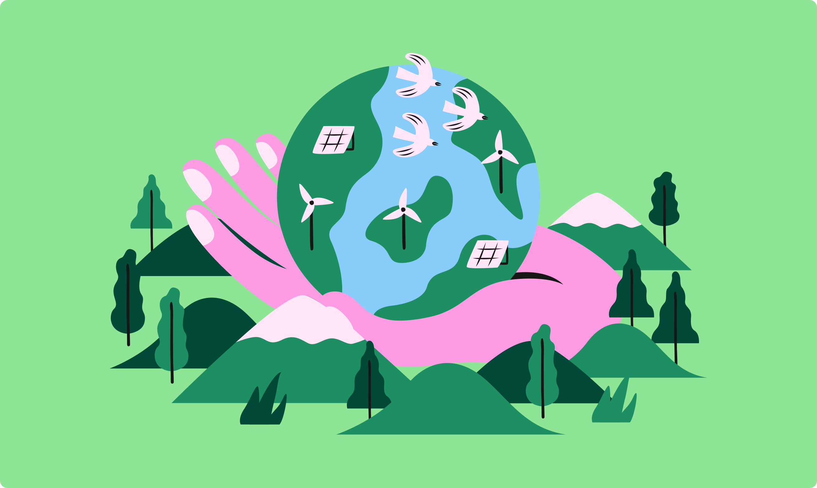
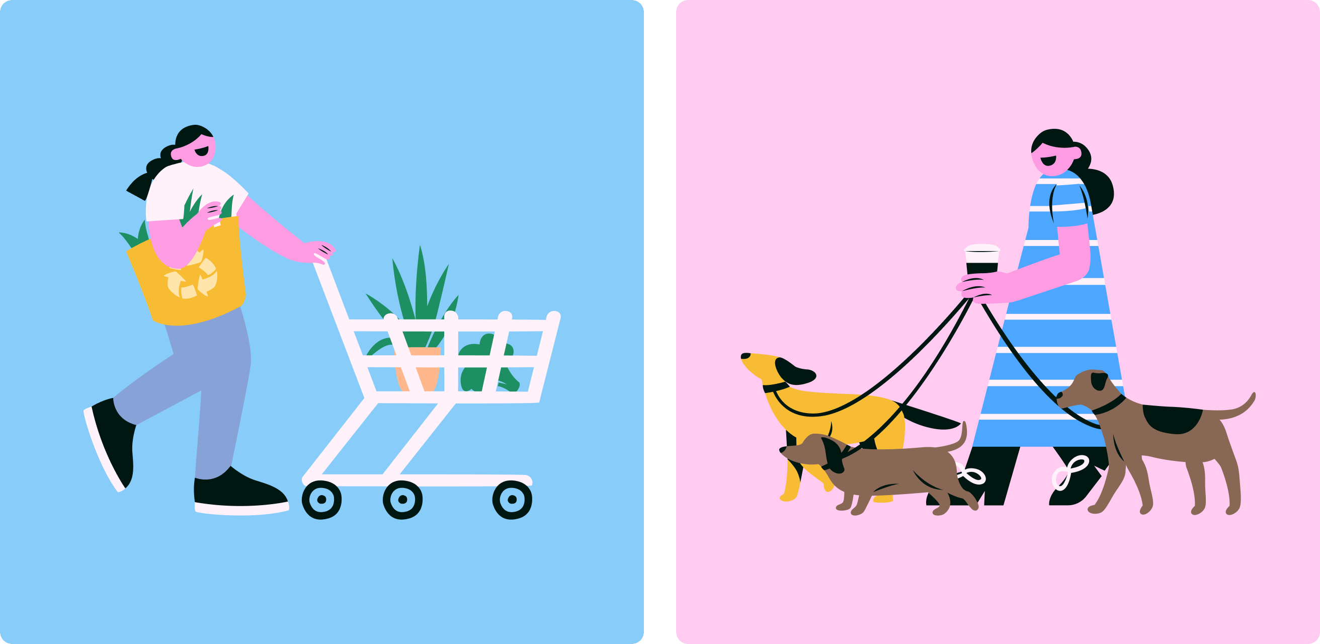
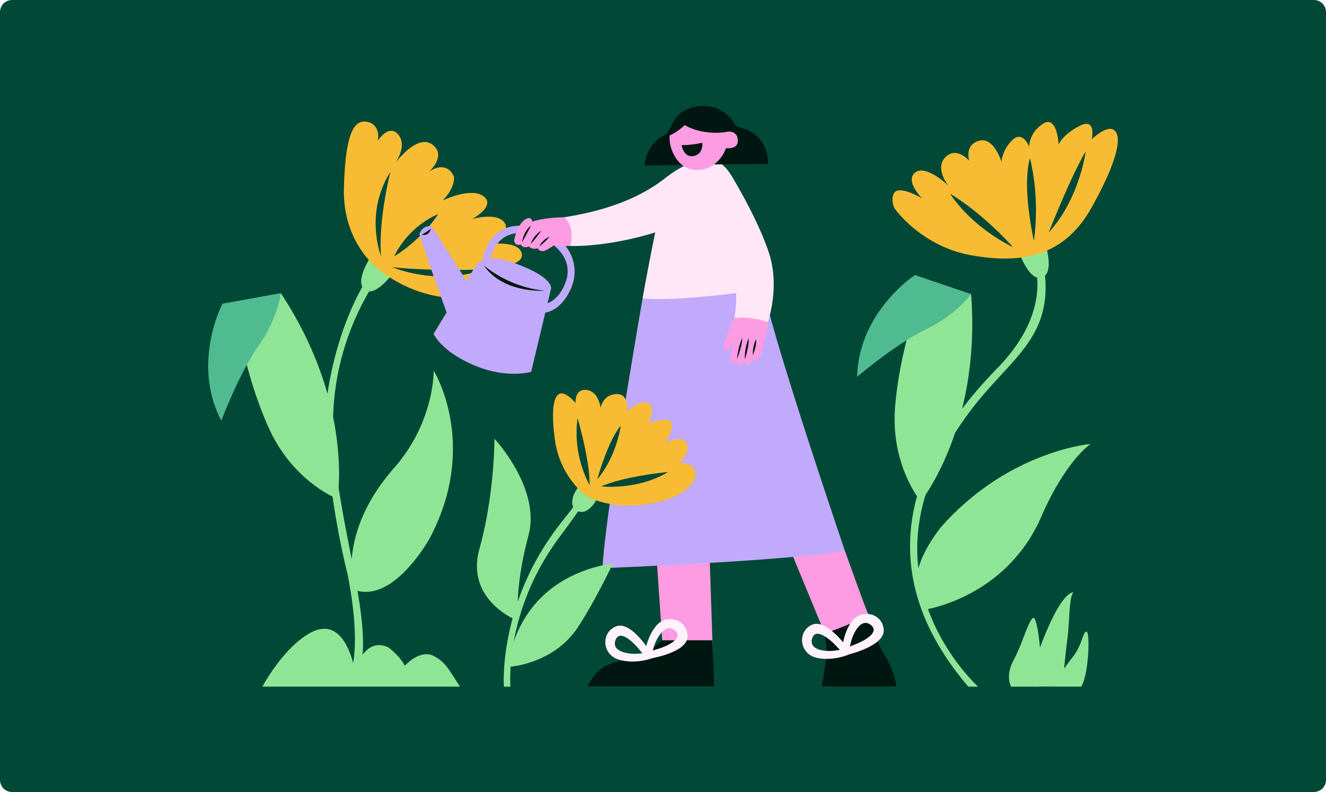
We developed a bold visual identity that connects with eco-conscious users. This includes distinctive branding, a vibrant color palette, and expressive illustrations that create an approachable experience across all digital platforms.
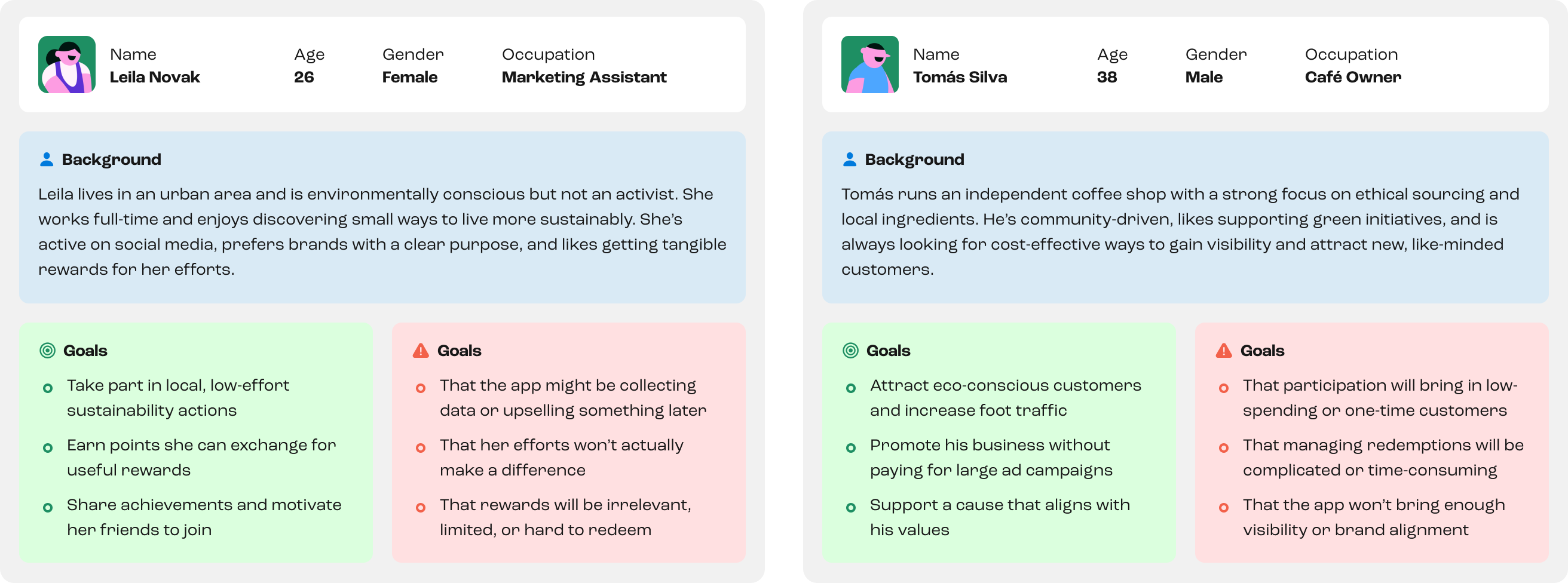
To create a product that truly works, we interviewed 40 people including app users and small business owners. We focused on understanding their motivations around sustainability and rewards. These insights shaped two clear personas that guided every major design decision and kept the team focused on what matters most.t
We started with a full UX/UI audit of the existing MVP. This was followed by workshops to explore user behaviors, business needs, and product challenges. These sessions aligned stakeholders, clarified user journeys, and uncovered key usability issues, setting the foundation for targeted design improvements.
01
Users described the MVP as impersonal and unclear. Many assumed there was a paywall or hidden agenda, which killed trust early on. The app failed to communicate its purpose and offered no emotional connection or real incentive to stay.
02
Businesses didn't understand how the app would benefit them. The reward system was vague, the flow was confusing, and there was no structure in place to support partnerships. Without clear value, companies were reluctant to participate.
03
Key flows like joining a challenge, tracking progress, or redeeming points felt disconnected. The navigation was clunky and users often got lost or overwhelmed. It took too many steps to take action, and the overall experience lacked focus.
01
We renamed the product and created a visual identity that feels human, bold, and optimistic. Every screen was redesigned to be transparent, friendly, and clear in its purpose. The result is a brand that invites participation and feels like a movement, not a transaction.
02
We worked with the team to clarify how points are earned and redeemed, making the reward system central to the app experience. The new flow gives businesses visibility within the app while making it easy for users to understand the value of their sustainable actions.
03
We rebuilt the app around real user needs, reducing steps and confusion throughout. Navigation is simple, challenges are easy to join, and rewards can be redeemed in just a few taps. Every screen keeps things clear and focused, helping users stay engaged without getting lost.
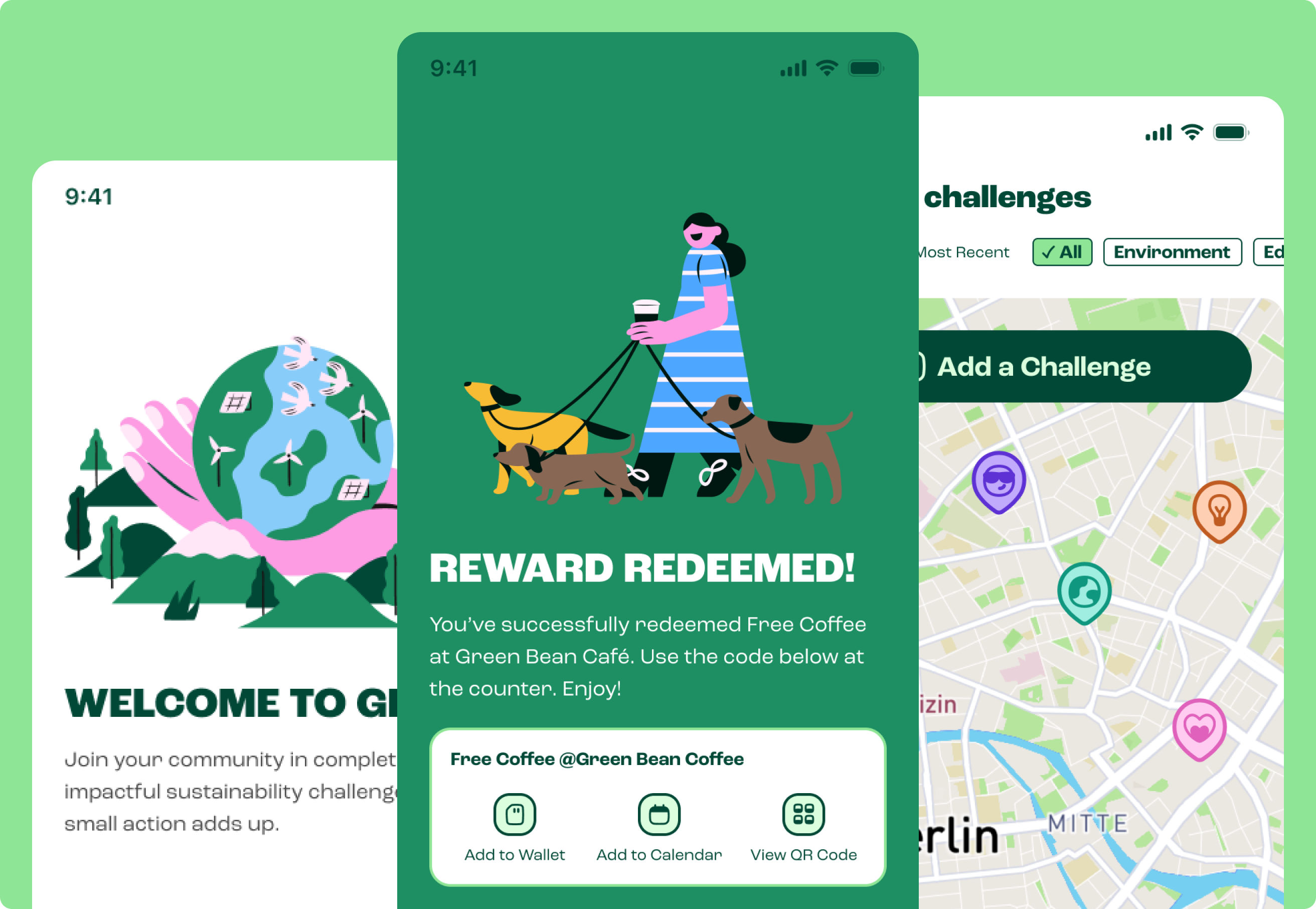
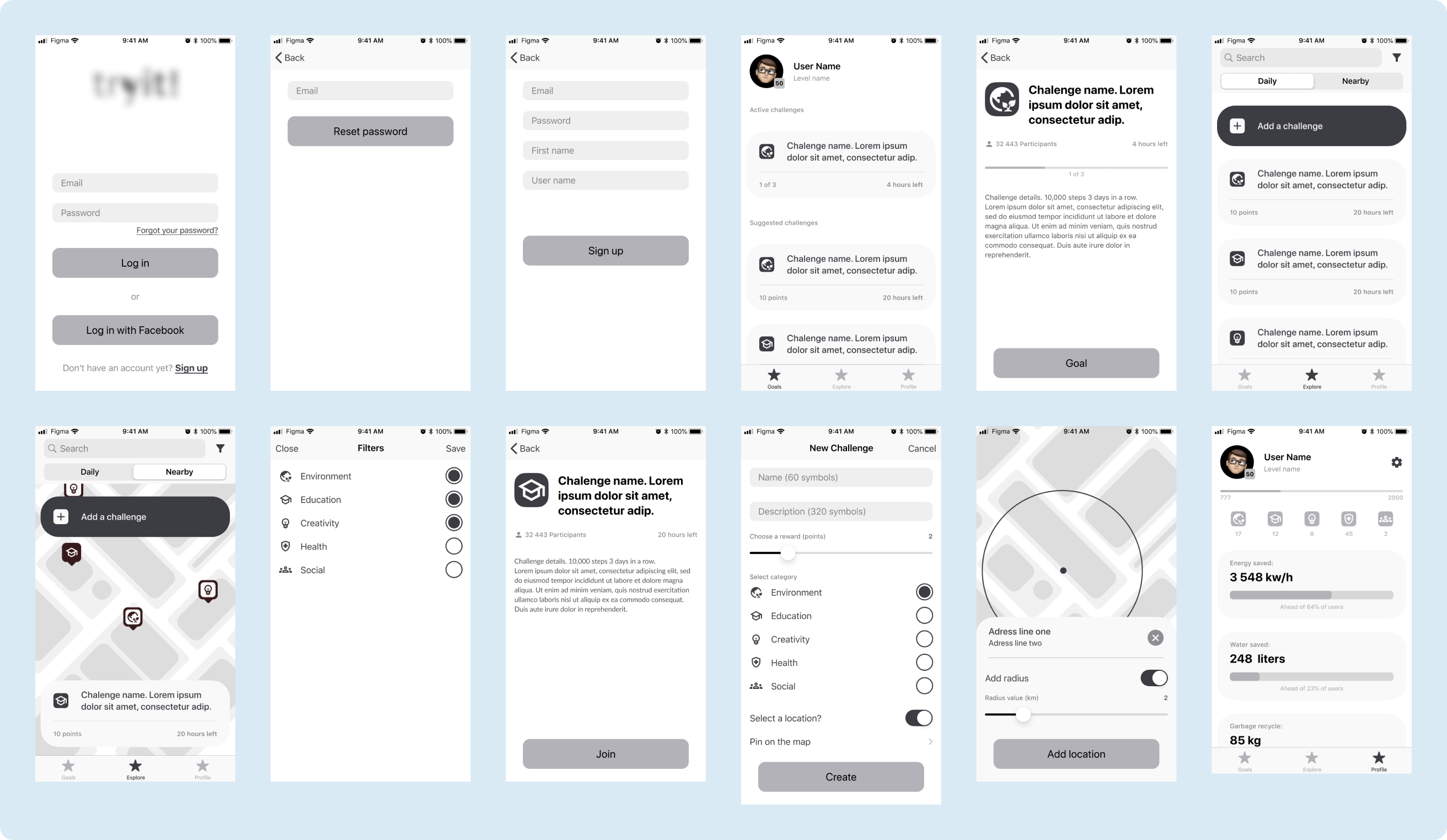
We simplified and personalized the onboarding process to welcome new users and clearly communicate the app's purpose and benefits. The sign-up flow was redesigned to reduce friction and encourage completion, helping users start engaging with challenges immediately.
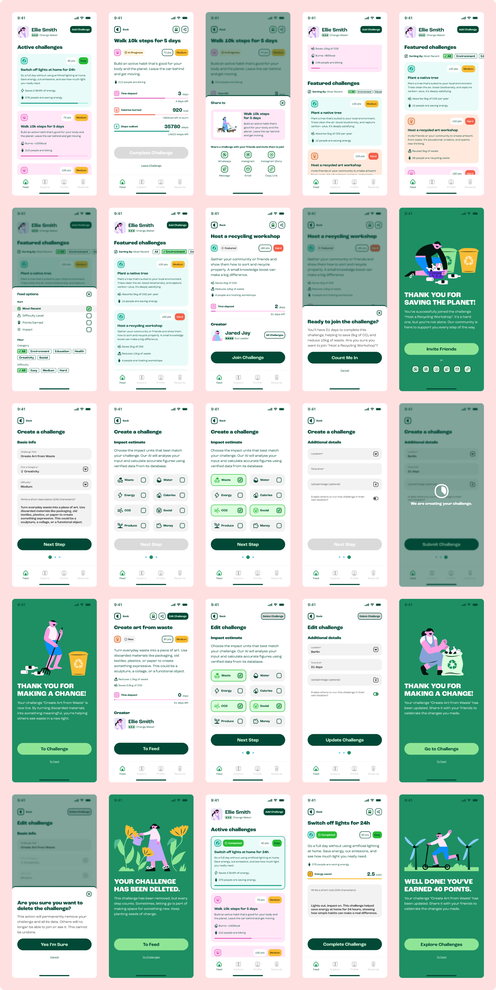
The home feed was restructured to prioritize active challenges, featured local opportunities, and quick access to creating new challenges. Clear categorization and concise challenge cards make exploration intuitive, while keeping users focused on participation.
The explore section was streamlined to surface relevant challenges without overwhelming the user. Filters and categories help users find new opportunities efficiently, while design elements keep navigation straightforward and engaging.
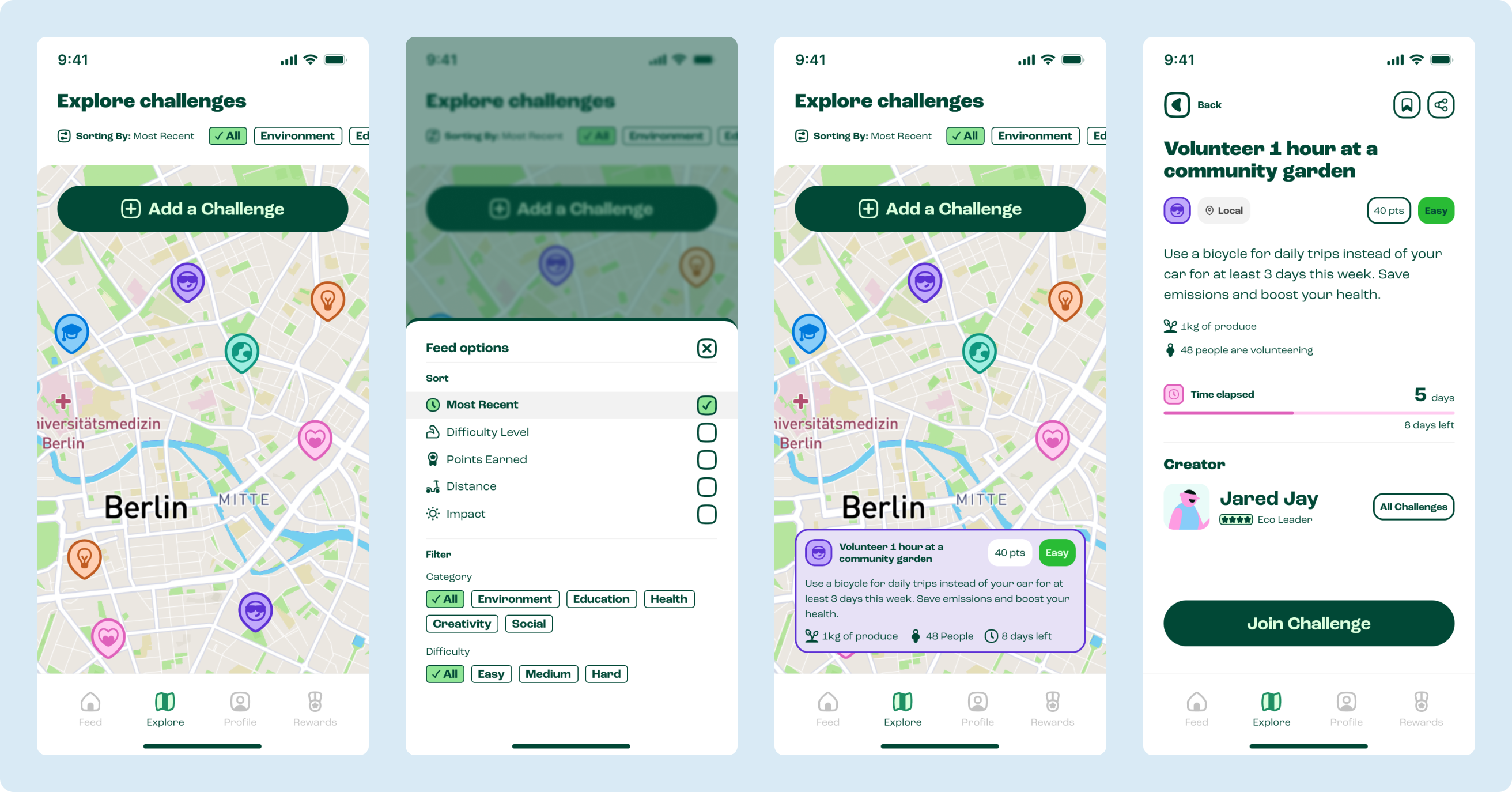
User profiles were designed to motivate continued participation. Clear summaries of completed challenges, points earned, and sharing options encourage users to promote their achievements and stay connected with the community.
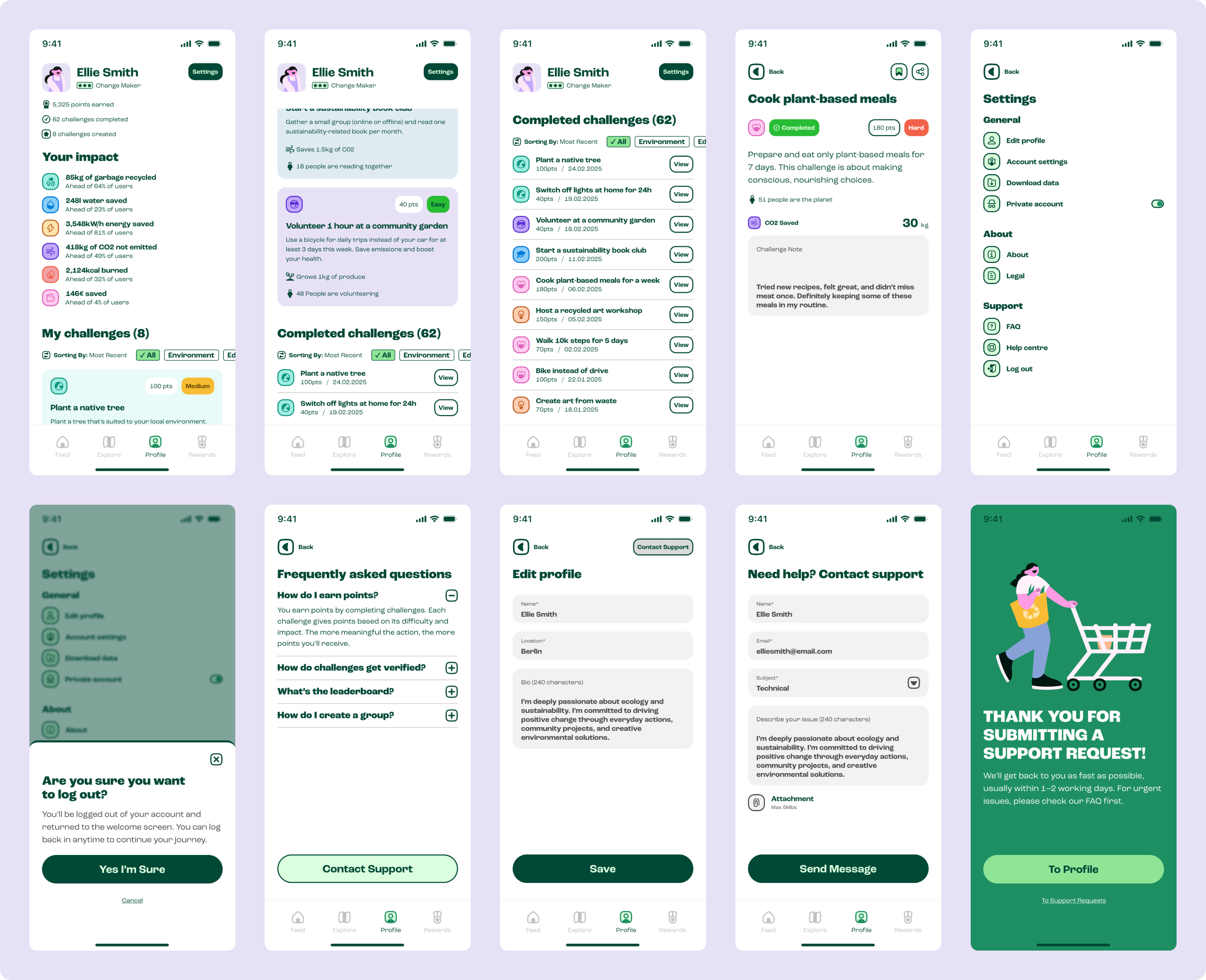
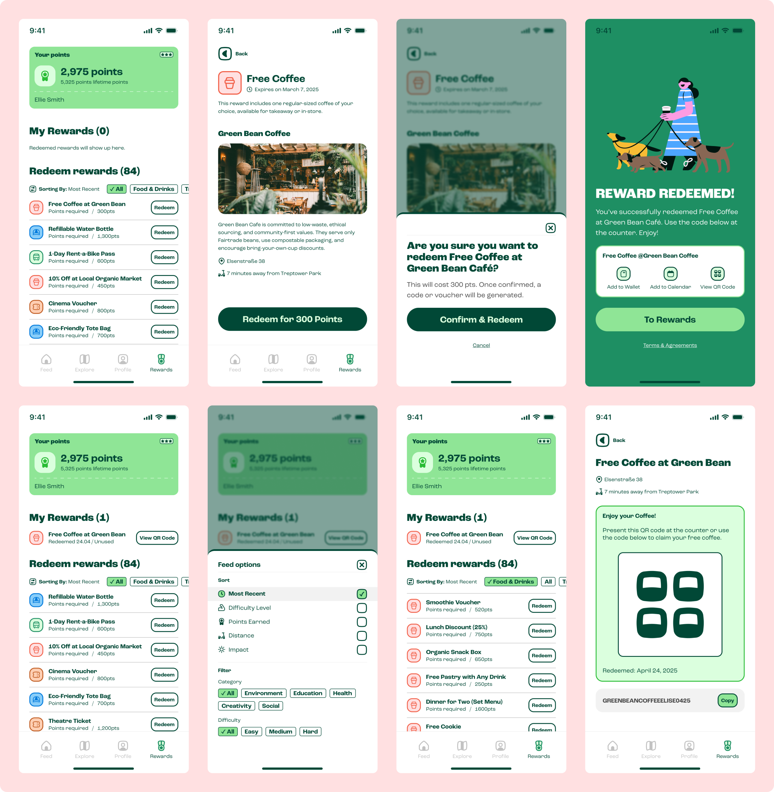
We redesigned the rewards section to make browsing and redeeming points simple and transparent. Clear categories and straightforward redemption flows emphasize the tangible benefits of participation, increasing user motivation and retention.
The new Gleam brand and redesigned app made a significant impact right after launch:
01
Our redesign simplified challenge flows and clarified onboarding, reducing steps from eight to three with better visual guidance. Analytics showed more users not only completed their first task but did so within 24 hours of signing up.
02
The new brand identity, reward structure, and clearer user experience positioned the app as a valuable partner. In just weeks, the team saw three times more inbound requests from businesses wanting to offer rewards or collaborate.
03
In-app surveys and post-launch interviews showed an exceptional satisfaction rate. Users specifically praised the clean interface, easy reward redemption, and overall sense of purpose as major improvements.
BOOK A FREE CALL
© Teeny Studio